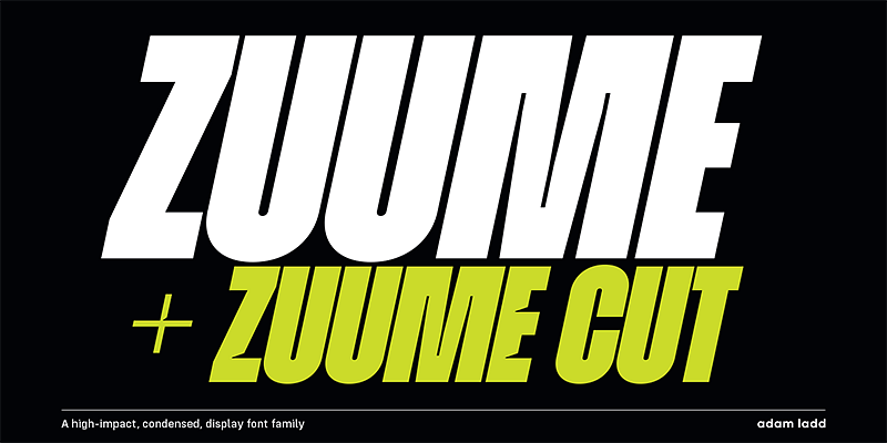
The Zuume Cut Font Family, designed by Adam Ladd from the Adam Ladd foundry, is a bold and dynamic display typeface that stands out with its striking, angular cuts and geometric structure. As an extension of the Zuume typeface family, Zuume Cut amplifies the sharpness and precision of the original design with a focus on creating unique visual cuts that bring an extra layer of personality to each letterform. Ideal for branding, headlines, and any design requiring a modern, high-impact aesthetic, Zuume Cut combines boldness with innovation in typographic design.
Adam Ladd: The Creator Behind Zuume Cut
Adam Ladd, a well-known figure in the world of contemporary type design, has consistently created fonts that merge function with creativity, offering designers versatile tools to craft compelling visual identities. His typefaces are often characterized by clean lines, modern sensibilities, and an inherent adaptability across a range of media. The Zuume Cut Font Family is no exception, embodying Ladd’s trademark precision while pushing the boundaries of geometric design with an unexpected twist.
Design Inspiration and Concept
Zuume Cut takes its design cues from modern geometric typefaces but introduces a fresh twist with strategic angular cuts that add a sense of movement and energy. This font family is designed with a strong sense of visual rhythm and sharpness, making it ideal for projects that require a bold, futuristic aesthetic. The cuts within the letterforms create an interesting tension between solid and open space, giving the typeface a sense of depth and dimension.
The font family balances minimalism with intricate detailing, resulting in a typeface that is both sleek and highly expressive. Whether used in branding, digital interfaces, or editorial design, Zuume Cut’s unique style ensures that it leaves a lasting visual impact.
Key Design Characteristics of Zuume Cut
- Angular Cut Details: The defining feature of Zuume Cut is its angular, sliced letterforms. These cuts are strategically placed within each character to enhance the geometric design, creating a sense of dynamic motion and sharpness. The sliced portions of the characters create a visual break that adds interest and depth, making the font family feel contemporary and forward-thinking.
- Geometric Construction: Zuume Cut maintains a strong geometric foundation, with clean lines and sharp angles dominating its structure. This geometry lends the font a modern, technical feel, making it an excellent choice for projects in the fields of technology, architecture, or futuristic branding.
- High Contrast and Visual Impact: Zuume Cut’s letterforms exhibit a high contrast between thick and thin strokes, which enhances its bold, commanding presence. The contrast is especially pronounced in the angular cuts, creating a striking visual effect that is ideal for headlines, logos, and display text where a bold statement is needed.
- Condensed and Space-Efficient Design: Like the rest of the Zuume family, Zuume Cut features slightly condensed proportions, making it space-efficient without compromising on legibility. This feature makes the font ideal for tight layouts where designers need to maximize space, such as in packaging, advertising, or editorial spreads.
- Bold and Modern Aesthetic: Zuume Cut’s design feels fresh and cutting-edge, making it a natural fit for projects that want to convey modernity, speed, or innovation. The font’s sharp angles and unique cuts evoke a sense of precision and forward momentum, which is perfect for tech startups, sports brands, or cutting-edge fashion labels.
Weights and Styles
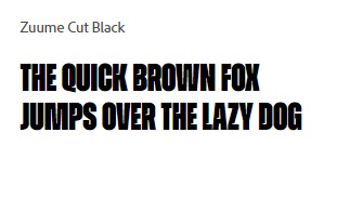
The Zuume Cut Font Family comes in a variety of weights and styles, giving designers a broad range of options to work with. Each weight maintains the boldness and angularity of the typeface while offering different levels of intensity and impact.
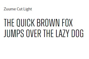
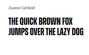
Regular and Bold
The Regular weight provides a balanced, versatile option that can be used for headlines, logos, or shorter blocks of text. It offers the perfect blend of boldness and readability, with enough visual interest to stand out in any design context. The Bold weight, on the other hand, increases the thickness of the strokes, enhancing the impact of the angular cuts and making the typeface even more powerful. This weight is ideal for high-visibility applications such as posters, signage, or branding.
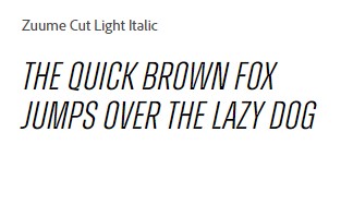
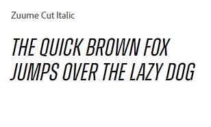
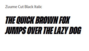
Italics
Zuume Cut also includes Italic styles, which take the sharpness of the regular forms and tilt them forward, adding a sense of motion and energy. The italics are particularly effective in dynamic layouts, where the typeface needs to convey speed or progression. These styles are perfect for action-oriented brands or projects that require a more aggressive, forward-looking aesthetic.
Condensed and Wide Variants
In addition to the standard weights, Zuume Cut offers both Condensed and Wide variants. The Condensed styles are designed to be space-efficient, allowing designers to use the typeface in tight layouts while maintaining its boldness. The Wide styles, on the other hand, spread out the letterforms, making them ideal for large-scale applications such as billboards or display text, where visual impact is paramount.


Practical Applications of Zuume Cut
With its bold, angular design, Zuume Cut is a versatile typeface that can be used across a wide variety of design applications. Its unique combination of geometric precision and expressive cuts makes it a valuable tool for designers looking to create modern, impactful designs.
Branding and Identity Design
Zuume Cut’s boldness and distinct angular cuts make it an excellent choice for branding projects. Whether for tech companies, sports brands, or fashion labels, the typeface communicates a sense of innovation and modernity that will resonate with forward-thinking audiences. Its sharp lines and geometric forms convey authority and sophistication, making it a perfect fit for brands that want to stand out in competitive markets.
Display Headlines and Editorial Design
Zuume Cut excels in headline applications where its bold forms and unique cuts can take center stage. In editorial design, it works well as a display typeface for magazine covers, section headers, and feature articles. The typeface’s sharpness and contrast draw readers’ attention immediately, making it perfect for publications that need to make a visual statement.
Web and Digital Interfaces
Zuume Cut translates well to digital design environments, thanks to its clean, geometric structure and high contrast. Its condensed forms allow designers to maximize space without sacrificing legibility, making it ideal for website headers, navigation menus, and user interfaces. In digital marketing, Zuume Cut’s bold style ensures that headlines and call-to-action buttons will capture the audience’s attention.
Packaging and Advertising
For product packaging and advertising, Zuume Cut’s unique angular cuts and sharpness provide a modern and edgy look that appeals to contemporary consumers. The font family is perfect for packaging in industries such as electronics, cosmetics, or sporting goods, where a bold, futuristic aesthetic is essential to communicating the brand’s identity. In advertising campaigns, Zuume Cut’s bold and expressive design makes it a natural fit for eye-catching billboards, posters, and digital banners.
Ideal Use Cases
Zuume Cut’s bold, geometric design with distinctive angular cuts makes it an excellent choice for industries that value modernity, innovation, and forward-thinking aesthetics. Some ideal use cases for the Zuume Cut Font Family include:
- Technology Branding: Zuume Cut’s sleek and modern design makes it a great fit for technology companies, startups, or digital platforms that want to communicate a sense of innovation and cutting-edge advancement.
- Sports and Performance Brands: The sharp, angular cuts and condensed forms of Zuume Cut lend themselves to brands associated with speed, performance, and athleticism. The typeface works well in sportswear branding, event signage, and promotional materials for high-energy, competitive environments.
- Fashion and Luxury Goods: For fashion brands looking to project sophistication with a modern edge, Zuume Cut offers a bold and distinctive look. The typeface’s sharp cuts and high contrast can enhance high-end packaging, lookbooks, and digital campaigns.
- Advertising and Marketing: Zuume Cut’s bold, high-impact style makes it ideal for advertising and marketing campaigns that require attention-grabbing headlines and dynamic layouts. Whether for print ads or digital marketing, Zuume Cut ensures that key messages stand out.
Pairing Suggestions
To create a balanced typographic hierarchy, Zuume Cut can be paired with more neutral or classic typefaces that complement its boldness and geometric precision. Some suggestions for pairing include:
- Sans-Serif: A minimalistic sans-serif like Roboto or Helvetica offers a good contrast to Zuume Cut’s angularity, especially in body text or secondary headlines.
- Serif: A classic serif font like Georgia or Merriweather can create a striking contrast when paired with Zuume Cut, adding a touch of elegance to the bold geometric design.
Conclusion
The Zuume Cut Font Family, designed by Adam Ladd, is a bold, angular typeface that offers a fresh take on modern geometric typography. Its distinctive cuts and high-contrast design make it ideal for a wide variety of design applications, from branding and editorial design to digital interfaces and advertising. With its sharp angles, condensed forms, and bold style, Zuume Cut is a versatile and powerful tool for designers who want to create impactful, modern work.
Adam Ladd’s careful craftsmanship is evident in every aspect of Zuume Cut’s design, making it a must-have for designers seeking a bold and modern typeface with an edge.

