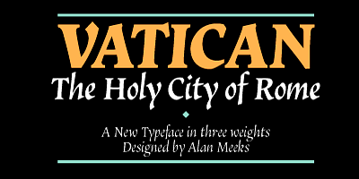
The Vatican Font Family, designed by the accomplished British type designer Alan Meeks, is a distinguished serif typeface that epitomizes the grandeur, elegance, and tradition of classic type design. Inspired by historical references and drawing upon Meeks’ deep expertise in typography, the Vatican font family is a sophisticated and meticulously crafted typeface that has been embraced by designers for its timeless appeal and versatility.
Characterized by its stately appearance and classical proportions, the Vatican font family is often associated with formal and prestigious design projects, making it a go-to choice for a wide range of applications including branding, editorial design, book covers, and luxury packaging. It reflects Alan Meeks’ meticulous approach to type design, where every curve, serif, and stroke is carefully considered to achieve both aesthetic beauty and functional clarity.
Alan Meeks: A Master of Typography
Alan Meeks has long been recognized as a master of type design, with a career that has produced numerous well-regarded fonts. His work is known for its emphasis on elegance, tradition, and usability, characteristics that are clearly reflected in the Vatican Font Family. Meeks’ approach is rooted in an appreciation for classical typography, but he is equally adept at blending historical inspiration with contemporary design needs. This balance is what makes Vatican a particularly successful and enduring typeface.
Meeks’ philosophy is to create typefaces that are not only visually stunning but also versatile and adaptable to various media and design contexts. His deep understanding of the history of typography, combined with his technical expertise, allows him to produce typefaces that can stand the test of time, much like the Vatican Font Family.
Design Features of the Vatican Font Family
The Vatican Font Family is a serif typeface that draws heavily from classical Roman letterforms. It is designed to convey authority, formality, and refinement while maintaining a high degree of legibility and usability. Its design makes it suitable for a wide range of applications where a sense of gravitas and tradition is required.
Key features of the Vatican Font Family include:
- Classical Roman Inspiration: The Vatican Font Family is deeply rooted in the tradition of classical Roman typefaces, particularly those inspired by inscriptions found in ancient Rome. The letterforms are characterized by their strong, well-defined serifs, which evoke the grandeur and authority of Roman stone carvings.
- Refined Proportions: The proportions of the Vatican font family are carefully balanced, with a focus on achieving harmony between the various elements of each letterform. The x-height is moderate, ensuring readability at smaller sizes, while the ascenders and descenders are elegantly elongated, contributing to the typeface’s formal appearance.
- High Contrast: Like many classic serif fonts, the Vatican Font Family exhibits a high contrast between thick and thin strokes. This contrast gives the typeface a sophisticated and polished appearance, making it particularly effective for use in larger sizes such as titles, headings, and display applications.
- Elegant Serifs: The serifs in the Vatican Font Family are sharp and well-defined, contributing to the typeface’s overall sense of authority and elegance. The serifs are not overly ornate, allowing for a clean and legible design that maintains a sense of tradition and formality.
- Versatile Weight Range: The Vatican Font Family includes a variety of weights and styles, ranging from regular to bold, as well as italic versions. This range of weights allows designers to create a cohesive typographic hierarchy, making the font family suitable for both text-heavy designs and more decorative or display purposes.
- Multilingual Support: As with many of Alan Meeks’ fonts, the Vatican Font Family includes support for a wide range of languages and diacritical marks. This makes it a versatile choice for international projects that require multilingual support, ensuring that the font can be used seamlessly across different language systems.
Use Cases for the Vatican Font Family
The Vatican Font Family is highly adaptable and can be used across a wide range of design projects. Its classic design and formal aesthetic make it particularly suitable for applications that require a sense of prestige and authority. Some of the most common use cases for the Vatican font family include:
- Book Covers and Publishing: Given its classical proportions and elegant serifs, the Vatican Font Family is an ideal choice for book covers, particularly for historical, religious, or literary works. Its timeless design gives a sense of gravitas to any text, making it a popular choice for titles and headings in both print and digital publications.
- Luxury Branding and Packaging: The refined and authoritative appearance of the Vatican Font Family makes it a popular choice for high-end branding and luxury packaging. Whether used for the logo of a luxury brand or on the packaging of premium products, the Vatican font conveys a sense of exclusivity and quality.
- Formal Invitations and Certificates: The formal and stately appearance of the Vatican Font Family makes it an excellent choice for use in formal invitations, certificates, and other ceremonial documents. Its classical elegance lends itself well to designs that require a touch of tradition and formality.
- Corporate Communications: The Vatican Font Family’s clean and professional aesthetic makes it well-suited for corporate branding and communication materials. It is often used in annual reports, brochures, and other business documents that require a formal and authoritative tone.
- Editorial and Magazine Design: The Vatican Font Family’s high contrast and elegant serifs make it a strong candidate for editorial design. It is particularly effective in magazine layouts and articles where a sense of refinement and sophistication is desired.
Vatican Font Family: A Classic Typeface for Modern Needs
While the Vatican Font Family is firmly rooted in classical type design traditions, it is also highly adaptable to modern design needs. Alan Meeks has ensured that the typeface works equally well in both print and digital environments, making it a versatile choice for contemporary designers.
One of the key strengths of the Vatican Font Family is its balance of beauty and functionality. While the typeface has a stately and elegant appearance, it is also highly legible, even at smaller sizes. This makes it a practical choice for text-heavy projects, as well as for display use in larger formats.
The Vatican Font Family is also versatile enough to be used across different media, from high-end print projects to digital interfaces. Its clean lines and well-balanced proportions ensure that it looks sharp and clear on screens, while its classical elegance makes it a standout choice for printed materials.
Alan Meeks’ Legacy in Typeface Design
Alan Meeks has left an indelible mark on the world of typography, and the Vatican Font Family is a shining example of his ability to create typefaces that are both beautiful and functional. Throughout his career, Meeks has been known for his commitment to craftsmanship and his deep understanding of the nuances of type design.
The Vatican Font Family reflects Meeks’ attention to detail and his passion for creating typefaces that are both timeless and relevant. By combining traditional design principles with modern usability, Meeks has created a typeface that will remain a favorite among designers for years to come.
Conclusion
The Vatican Font Family, designed by Alan Meeks, is a classic serif typeface that embodies the best of traditional type design while remaining adaptable to modern design contexts. Its elegant serifs, refined proportions, and high contrast make it a perfect choice for projects that require a sense of formality and prestige. Whether used for book covers, luxury branding, or corporate communications, the Vatican Font Family exudes authority and sophistication.
Alan Meeks’ expertise in type design is evident in every aspect of the Vatican Font Family, from its meticulously crafted letterforms to its versatile range of weights and styles. As a result, the Vatican Font Family continues to be a beloved typeface for designers seeking to create timeless and elegant designs.

