The Trajan Font Family, designed by Carol Twombly and Robert Slimbach for Adobe Originals, stands as one of the most iconic and influential typefaces in the modern typographic landscape. Rooted in the grandeur of Roman inscriptions, Trajan exudes timeless elegance and authority. Its connection to classical typography, particularly the inscriptions on the Trajan’s Column in Rome, gives it an aura of historical significance, while its adaptation into a digital typeface speaks to the enduring relevance of ancient typographic forms.
Twombly and Slimbach, both legendary type designers at Adobe, meticulously studied the original letterforms from the Roman period, translating them into a typeface that has become synonymous with formality, tradition, and timelessness. Trajan has since become a go-to font for movie posters, corporate branding, editorial design, and various other applications where a stately, formal appearance is desired.
Historical Roots of the Trajan Typeface
The Trajan Font Family is directly inspired by the Trajan Column, a monumental structure erected in 113 AD in Rome, celebrating the victory of Roman Emperor Trajan in the Dacian Wars. The inscriptions on this column are often considered the pinnacle of Roman lettering, characterized by beautifully proportioned capital letters with sharp serifs and a balanced geometric structure.
These Roman capital letters have stood the test of time, influencing type design for centuries. The classical majesty of the Roman alphabet, with its precise proportions and elegant forms, serves as the basis for the Trajan font, which distills the essence of these letterforms into a usable, modern typeface.
Design Characteristics of Trajan
The Trajan Font Family is exclusively composed of capital letters, following its historical roots. The original Roman inscriptions featured only uppercase letters, as lowercase letters were not part of the Roman alphabet. This unique aspect sets Trajan apart from other typefaces, giving it a monumental and authoritative appearance.
Some of the key design characteristics of the Trajan Font Family include:
- Classic Roman Proportions: Trajan retains the distinctive proportions and balance of the Roman capitals. The letters are designed with a vertical emphasis, featuring a combination of straight and curved lines that give the typeface its elegant form.
- Sharp Serifs: One of the defining features of Trajan is its sharp, clean serifs. These serifs, which mirror the inscriptions on Trajan’s Column, lend the typeface an air of precision and formality, making it ideal for official and ceremonial contexts.
- Geometric Precision: Like the Roman inscriptions that inspired it, Trajan is built on a foundation of geometric precision. Each letterform is meticulously constructed, ensuring that the overall balance of the typeface is preserved. This makes it ideal for use in large-scale applications, such as movie posters, signage, or book covers, where clarity and impact are crucial.
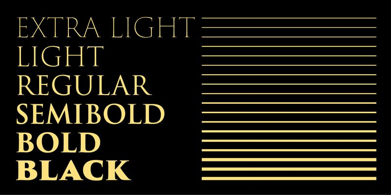
- Limited Weights and Styles: Unlike many modern typefaces, which offer an extensive range of weights and styles, Trajan is available in a relatively limited selection, usually including Regular and Bold weights. This reflects its intended use as a display typeface, designed to make a strong, singular statement rather than to be used in body text or complex typographic hierarchies.
The Role of Carol Twombly and Robert Slimbach in Creating Trajan
Carol Twombly and Robert Slimbach are both towering figures in the world of typography, having designed some of the most significant typefaces of the digital age. Carol Twombly, in particular, is known for her deep knowledge of historical type design and her ability to breathe new life into classical forms. Before Trajan, she had already made her mark with typefaces such as Adobe Caslon and Adobe Garamond, both of which were revivals of historical designs.
For Trajan, Twombly meticulously studied the original inscriptions on Trajan’s Column, translating the beauty and balance of those forms into a modern typeface that could be used in digital and print media. Her attention to detail and respect for the historical source material made Trajan one of the most authentic revivals of Roman capitals in the modern era.
Robert Slimbach, known for his precise craftsmanship and innovative approach to type design, played a crucial role in the refinement and expansion of Trajan. His expertise in both digital and classical typography ensured that the typeface would work seamlessly in a variety of design contexts. Together, Twombly and Slimbach created a typeface that honors its historical roots while offering the versatility needed for contemporary design projects.
Trajan’s Place in Modern Design
Since its release, Trajan has become a favorite among designers for projects requiring a typeface that conveys authority, tradition, and grandeur. It has been used extensively in the film industry, often appearing on movie posters for epic films, historical dramas, and thrillers. Its sharp, clean lines and all-capital design make it a striking choice for titling and display purposes.
Some of the primary uses of Trajan include:
- Movie Posters: Perhaps the most famous application of Trajan is in film posters. Its association with epic, dramatic, and historical films has given it an almost cinematic quality. The bold, capital letters of Trajan command attention and convey a sense of importance, making it an ideal choice for blockbuster films and high-budget productions.
- Book Covers: Trajan is frequently used for book covers, especially for titles that seek to convey a sense of history, authority, or seriousness. Its classical design lends itself well to literary works, non-fiction, and historical books, where a sense of formality and timelessness is required.
- Corporate Identity and Branding: For brands that want to project an image of strength, tradition, and trustworthiness, Trajan is an excellent choice. Its clean, monumental appearance makes it well-suited for use in logos, corporate identity systems, and other branding materials where a strong, authoritative presence is desired.
- Institutional and Ceremonial Use: Trajan’s association with Roman inscriptions and its classical design make it a fitting choice for institutional and ceremonial uses. It can often be found in governmental publications, certificates, and memorials, where a formal and dignified typeface is required.
- Signage and Wayfinding: The clear, sharp forms of Trajan make it an effective typeface for signage and wayfinding systems. Its legibility at large sizes and its clean, unembellished letterforms allow it to stand out in both indoor and outdoor applications.
Why Trajan Remains Relevant
Despite being based on letterforms that are over 2,000 years old, Trajan has maintained its relevance in modern design for several reasons:
- Timelessness: The classical proportions of Roman capitals have an enduring appeal. Whether used in ancient inscriptions or modern branding, these letterforms convey a sense of permanence and authority. Trajan, as a digital revival of these forms, benefits from this timeless quality, making it an evergreen choice for formal and ceremonial design.
- Versatility: While Trajan is often associated with formal, high-end applications, its clean lines and simple letterforms give it a surprising versatility. It can be used in a variety of contexts, from corporate branding to editorial design, and it always maintains its clarity and impact.
- Monumental Design: Trajan’s all-capitals design gives it a monumental quality that few other typefaces can match. This makes it particularly well-suited for projects that require a typeface with presence and authority, such as movie posters, book covers, and institutional documents.
Conclusion
The Trajan Font Family, designed by Carol Twombly and Robert Slimbach for Adobe Originals, is a masterful revival of classical Roman capitals that has become one of the most iconic typefaces in modern design. Rooted in the inscriptions of Trajan’s Column, this typeface carries with it a sense of history, grandeur, and authority that few other typefaces can match.
Its clean, geometric forms, sharp serifs, and timeless proportions make it a versatile tool for designers working in a wide range of industries, from film and publishing to corporate branding and institutional design. Whether used in formal documents, signage, or dramatic film posters, Trajan continues to evoke the same sense of awe and admiration that the original Roman letterforms inspired centuries ago.
Trajan’s enduring popularity is a testament to the skill and vision of Carol Twombly and Robert Slimbach, whose meticulous work has ensured that this ancient style of lettering remains relevant and impactful in the digital age.

