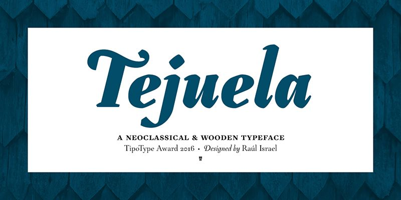
The Tejuela Font Family is a remarkable creation that merges history, culture, and contemporary typography. Designed by Raúl Israel from TipoType, Tejuela draws inspiration from traditional elements of Southern Chile, particularly those tied to wooden shingle architecture, known locally as “tejuelas.” These shingles—iconic for their craftsmanship and distinctive patterns—reflect the cultural heritage of Chile’s Chiloe archipelago. Raúl Israel’s work captures this unique aesthetic, transforming an architectural element into a typeface that reflects beauty, history, and versatility.
Concept and Inspiration
The word “tejuela” in Spanish refers to small wooden tiles or shingles used to cover roofs or walls. In Southern Chile, particularly in the Chiloe region, these shingles are used in an overlapping style to create intricate, mosaic-like facades. Tejuela embodies this craftsmanship in the form of letter shapes. Raúl Israel took inspiration from the intricate patterns of overlapping wood, translating them into characters that convey both strength and delicate artistry.
The design reflects the natural environment and artisan traditions of the region. Each curve and edge within the Tejuela Font Family appears as though crafted with the same care and precision as those of handmade shingles. The font provides an emotional link to the cultural heritage of Chile, breathing new life into an ancient tradition. In creating Tejuela, Raúl Israel not only aimed to design a font family but also sought to celebrate the cultural identity of his homeland, bringing visual storytelling to the forefront of modern typography.
Characteristics of Tejuela
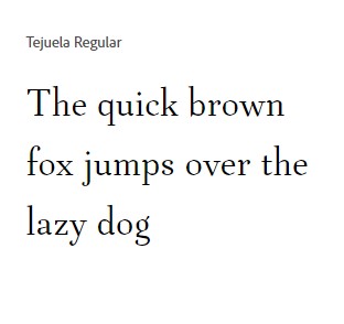
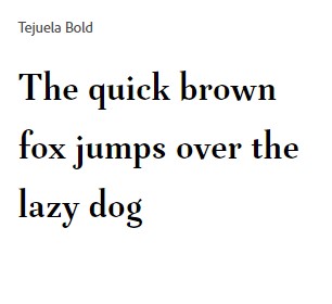
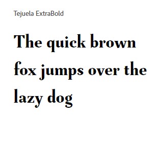
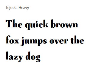
Tejuela is characterized by its contemporary yet artisanal features, embodying the juxtaposition of old-world craftsmanship and modern design principles. The font family is composed of various weights that range from Thin to Black, offering a versatile selection for diverse uses. The family is characterized by distinct letterforms that have sharp contrasts, resembling the cut edges of wood—sometimes rigid, sometimes gently rounded, giving the entire typeface a feeling of refined craftsmanship.
Weights and Styles
The Tejuela Font Family is a highly adaptable type system, featuring numerous weights and styles that accommodate a broad spectrum of design needs. The availability of styles from Thin to Black allows designers to play with hierarchy, tone, and emphasis, which makes Tejuela a perfect choice for different projects—from branding and editorial designs to signage and web applications.
The heavier weights convey solidity and a sense of robustness, akin to the shingles from which the typeface takes its name, while the lighter weights are graceful and elegant, ideal for body text or subtle branding. Every weight is meticulously designed to maintain visual consistency, and all are imbued with a sense of artisanal authenticity.


Features and Versatility
The unique characteristics of Tejuela, such as the angled terminals and sharp cuts, make it instantly recognizable. It retains a high level of legibility across different sizes, ensuring versatility for both display and text purposes. Its versatility allows it to seamlessly transition from rustic, heritage-driven designs to modern, sleek applications. The letterforms feature a mixture of sharp and curved elements, giving Tejuela an exquisite balance of softness and strength—perfect for those looking to evoke warmth, history, and a handmade touch.
Furthermore, the Tejuela Font Family includes a range of OpenType features, such as stylistic alternates, ligatures, and discretionary ligatures, giving designers creative control over how the font appears in different contexts. These elements allow the typeface to adapt to various visual identities, maintaining its authenticity while providing fresh variations that enhance its usability.
Applications of Tejuela
Tejuela is ideal for projects that demand a strong sense of identity and connection to culture. It works well in branding projects that aim to evoke authenticity, heritage, and craftsmanship. The textured, organic feel of Tejuela also makes it suitable for packaging, especially for artisanal products, crafts, and organic goods. Its warmth and character convey a sense of genuine storytelling, making it highly effective for establishing brand trust and emotional connection.
In editorial contexts, Tejuela shines with its elegance and readability. Its different weights allow for an effective typographic hierarchy, making it ideal for use in magazines, books, and other printed materials. Its striking display qualities also make Tejuela a great choice for posters, headlines, and promotional materials that need to draw immediate attention.
For digital platforms, Tejuela provides a distinctiveness that sets brands apart in a highly competitive online environment. The font’s adaptability ensures that it performs well on different devices and screen sizes without compromising its visual appeal or readability. Its handcrafted quality evokes a sense of nostalgia, while its modern touches make it suitable for contemporary web design.
Cultural Significance
What makes Tejuela unique is the way it is tied so closely to cultural heritage. Raúl Israel has taken an element that is deeply rooted in Chilean history—the wooden shingles—and transformed it into something that transcends its original form. The font acts as a tribute to the artisans who have kept this traditional craft alive through the centuries, while also showcasing Chile’s rich cultural landscape to the rest of the world. The visual qualities of the font evoke feelings of craftsmanship, heritage, and warmth—elements often lacking in more sterile, modern typefaces.
Tejuela’s celebration of cultural identity and local craftsmanship also aligns it with the broader movement of “slow design,” where the emphasis is placed on meaningful, sustainable, and culturally resonant design choices. By choosing Tejuela, designers are not just choosing a typeface; they are also selecting a piece of history and an artisanal spirit that speaks to authenticity and a slower, more deliberate way of creating.
Conclusion
The Tejuela Font Family is a beautiful embodiment of tradition meeting modernity, of culture meeting design. It stands as a testament to how deeply cultural roots can influence visual arts, and how these traditions can be translated into a language that speaks to both history and contemporary aesthetics. Raúl Israel, through his work with TipoType, has created a typeface that is not only a tool for communication but also a bridge to a rich cultural past—inviting designers and viewers alike to appreciate the beauty and intricacy of Chilean craftsmanship.
Whether used for branding, editorial design, or digital interfaces, Tejuela offers warmth, identity, and a handcrafted touch, making it a versatile choice for projects that seek to connect with their audiences on a deeper level. Its ability to evoke emotion, combined with its versatility and attention to detail, ensures that Tejuela will continue to inspire and captivate designers and viewers for years to come.

