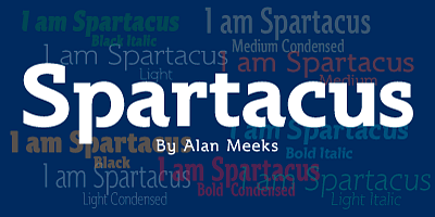
The Spartacus Font Family, designed by the celebrated British type designer Alan Meeks, is a bold and striking typeface that captures the strength, power, and timeless appeal of classical Roman design. Inspired by the legendary gladiator Spartacus, this font family embodies the spirit of heroism, rebellion, and endurance. Meeks has created a typeface that exudes confidence and authority while maintaining a sense of refinement and balance, making Spartacus a versatile choice for designers looking to make a statement.
With its strong serifs, bold letterforms, and well-defined proportions, the Spartacus Font Family stands out as a commanding presence in any design project. Whether used in branding, editorial layouts, signage, or advertising, Spartacus delivers a sense of strength and professionalism. Meeks’ ability to blend historical inspiration with modern functionality ensures that this typeface is both timeless and adaptable to today’s design needs.
Alan Meeks: A Master of Type Design
Alan Meeks is widely respected in the world of type design for his ability to create fonts that combine beauty, functionality, and versatility. Over the years, his work has spanned a wide range of styles, from formal serif fonts to more contemporary sans-serifs and decorative scripts. What sets Meeks apart is his deep understanding of typography’s historical roots and his skill in reinterpreting those traditions for modern use.
The Spartacus Font Family is a testament to Meeks’ mastery of classical typography. Drawing inspiration from the monumental inscriptions of ancient Rome, Meeks has crafted a typeface that feels both ancient and contemporary, giving designers the tools to create impactful, authoritative designs.
The Design Philosophy Behind Spartacus
The Spartacus Font Family takes its inspiration from the strong, bold letterforms of Roman inscriptions. The name “Spartacus” evokes images of power, rebellion, and endurance—qualities that are reflected in the typeface’s design. Meeks has drawn from the typography of classical Roman monuments, known for their sharp, angular serifs and bold proportions, while adding modern refinements to ensure that Spartacus works in contemporary design contexts.
Spartacus is a typeface that conveys strength and authority. Its bold, well-defined letterforms command attention, making it ideal for use in display typography, headlines, and signage. At the same time, the typeface’s balanced proportions and attention to detail ensure that it remains legible and functional, even in smaller sizes or more text-heavy applications.
Meeks designed Spartacus to be versatile, offering a range of weights and styles that allow it to adapt to different design contexts. Whether used for corporate branding, editorial layouts, or creative projects, Spartacus delivers a sense of power and sophistication that elevates any design.
Key Features of the Spartacus Font Family
The Spartacus Font Family is distinguished by several key design features that make it a standout choice for designers looking to create bold, impactful typography. These features contribute to the typeface’s strength, versatility, and timeless appeal:
- Bold and Commanding Letterforms: The most defining feature of Spartacus is its bold, well-defined letterforms. The typeface is designed to be strong and commanding, with thick strokes and sharp, angular serifs that give it a sense of authority and confidence. The bold letterforms are ideal for display typography, headlines, and other contexts where the text needs to stand out and make a statement.
- Sharp, Angular Serifs: Spartacus features strong, angular serifs that are inspired by classical Roman inscriptions. These serifs add structure and formality to the letterforms, while also enhancing the typeface’s legibility. The sharp serifs give the typeface a timeless, monumental quality, making it perfect for use in formal or authoritative design projects.
- Balanced Proportions: Despite its bold appearance, Spartacus maintains a sense of balance and proportion. The typeface’s x-height, ascenders, and descenders are carefully calibrated to ensure that the letterforms remain legible and visually harmonious, even in smaller sizes. This makes Spartacus suitable for a wide range of applications, from display typography to body text.
- High Contrast Between Strokes: Spartacus features a noticeable contrast between thick and thin strokes, a characteristic commonly found in classical serif typefaces. This contrast adds visual interest and depth to the letterforms, making the typeface more dynamic and engaging. The high contrast also enhances the readability of the typeface in larger sizes, such as headlines or signage.
- Versatile Weight Range: The Spartacus Font Family offers a variety of weights, from light to bold, providing designers with the flexibility to create typographic hierarchies and adapt the typeface to different design needs. The lighter weights are ideal for more subtle, refined designs, while the bold weights make a strong impact in display typography and other high-visibility applications.
- Extended Character Set: Spartacus includes an extended character set, offering support for multiple languages, diacritical marks, and typographic symbols. This makes the typeface suitable for international projects and ensures that it can be adapted to a wide range of linguistic and cultural contexts.
- Classic Roman Inspiration with Modern Adaptability: While Spartacus is deeply rooted in the traditions of Roman typography, Meeks has carefully designed the typeface to work in modern design environments. Its clean, bold lines and sharp serifs give it a timeless quality, while its versatility in weights and styles ensures that it remains functional and adaptable to today’s design needs.
Use Cases for the Spartacus Font Family
The bold and authoritative design of the Spartacus Font Family makes it suitable for a wide range of design applications. Its strong, commanding presence lends itself to projects that require a sense of power, authority, and timeless elegance. Below are some of the most common use cases for Spartacus:
- Branding and Corporate Identity: Spartacus is an excellent choice for corporate branding and identity design, particularly for companies or organizations that want to convey strength, reliability, and professionalism. The typeface’s bold letterforms and sharp serifs give logos, business cards, letterheads, and other branding materials a sense of authority and gravitas.
- Editorial and Publishing Design: The balanced proportions and high contrast of Spartacus make it a great option for editorial design, particularly for use in headlines, titles, and pull quotes. The typeface’s bold, striking appearance ensures that it commands attention in magazine layouts, newspapers, and other editorial contexts.
- Signage and Display Typography: Spartacus’ strong, bold letterforms make it highly effective for signage and display typography. Whether used in retail settings, corporate environments, or public spaces, the typeface’s commanding presence ensures that it stands out and communicates authority. The high contrast between strokes also makes Spartacus highly legible in larger formats.
- Formal Documents and Certificates: The refined, classical design of Spartacus makes it suitable for formal documents, certificates, awards, and official communications. The typeface’s sharp serifs and bold proportions convey a sense of tradition, strength, and professionalism, making it ideal for contexts where formality and authority are important.
- Creative and Luxury Branding: Spartacus can also be used in creative and luxury branding projects that require a bold, sophisticated typeface. Whether for high-end fashion, luxury products, or creative agencies, Spartacus delivers a sense of exclusivity and refinement that elevates the brand’s identity.
- Advertising and Marketing: The bold, impactful nature of Spartacus makes it a great choice for advertising and marketing campaigns that need to grab attention and make a strong impression. Whether used in print ads, billboards, or digital media, Spartacus’ powerful letterforms ensure that the message is communicated clearly and effectively.
Spartacus: A Typeface for Timeless Strength and Authority
The Spartacus Font Family is a bold and striking typeface that embodies the strength and authority of classical Roman typography. Alan Meeks has expertly crafted a typeface that draws from the traditions of ancient Roman inscriptions while ensuring that it remains adaptable to modern design contexts. Whether used for corporate branding, editorial design, signage, or creative projects, Spartacus delivers a sense of power, professionalism, and timeless elegance.
Meeks’ attention to detail and his deep understanding of typography are evident in every aspect of the Spartacus Font Family. The typeface is designed to be versatile and functional, offering a range of weights and styles that allow it to adapt to different design needs. For designers seeking a typeface that conveys strength, authority, and sophistication, Spartacus is an excellent choice.
Conclusion
The Spartacus Font Family, designed by Alan Meeks, is a bold serif typeface that combines classical Roman inspiration with modern adaptability. Its strong, angular serifs, bold letterforms, and balanced proportions make it a versatile and authoritative choice for a wide range of design projects. Whether used in corporate branding, editorial design, signage, or luxury packaging, Spartacus delivers a sense of power and professionalism that elevates any project.
Alan Meeks has once again demonstrated his mastery of type design with Spartacus, creating a font family that is both beautiful and functional. For designers looking for a typeface that combines timeless elegance with modern usability, the Spartacus Font Family offers a powerful tool that can make a lasting impact.

