The Skolar Font Family, designed by David Březina and published by Rosetta Type Foundry, is a sophisticated and versatile serif typeface that has become synonymous with legibility, versatility, and character. Specifically crafted to meet the demanding needs of academic and editorial content, Skolar combines traditional typographic elements with a contemporary aesthetic. Its wide range of weights, well-considered proportions, and diverse language support make it an excellent choice for text-heavy environments. This article delves into the origins, features, and applications of the Skolar Font Family, showcasing why it is a favorite among typographers and designers alike.
Origins and Inspiration
David Březina, a prominent type designer and typographer, created Skolar with a specific focus on readability and versatility. Developed in 2008, Skolar was designed to serve the needs of scholarly, educational, and academic publishing. The typeface is a reflection of Březina’s deep understanding of both traditional type design and the demands of modern editorial work.
Skolar draws inspiration from classic serif typefaces, with nods to the humanist tradition, but it is unmistakably modern. Březina sought to create a typeface that could handle the rigors of long-form text while maintaining a unique personality. The result is a robust serif family that balances functionality and style, making it an ideal choice for a wide range of applications, from academic publications to branding.
Design Characteristics of the Skolar Font Family
1. Humanist Roots and Modern Touches
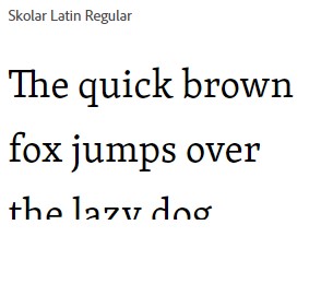
Skolar is built on the foundation of humanist typefaces, which are known for their warmth, natural forms, and emphasis on readability. This is evident in Skolar’s letterforms, which feature subtle curves, moderate stroke contrast, and open counters. The humanist influence makes the typeface approachable and legible, while its modern details—such as its sharp serifs and distinctive terminals—give it a fresh and contemporary feel.
The typeface’s humanist roots help bridge the gap between traditional and modern design, making Skolar an attractive option for projects that need to convey both authority and approachability. Its forms are neither overly decorative nor purely functional, allowing the typeface to blend seamlessly into diverse design contexts.
2. Wide Range of Weights and Styles
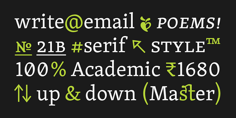
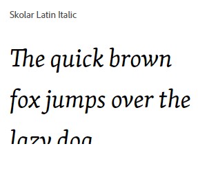
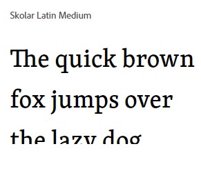
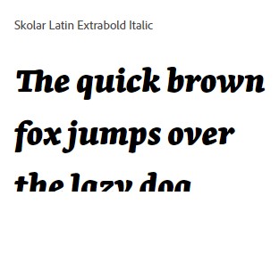
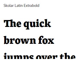
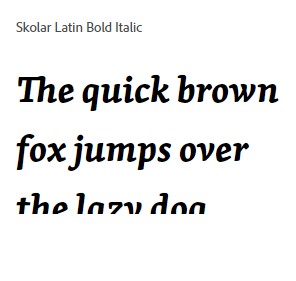
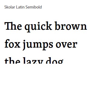
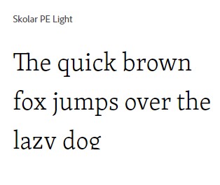
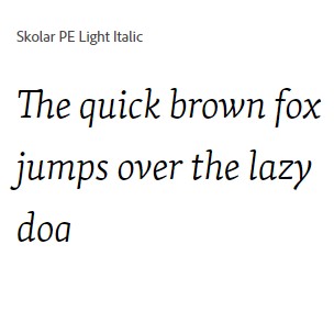
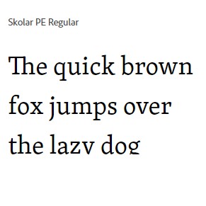
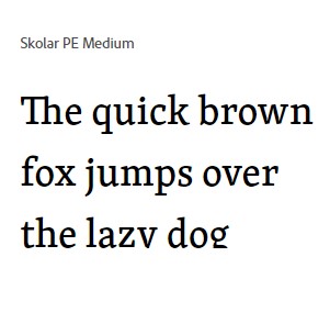
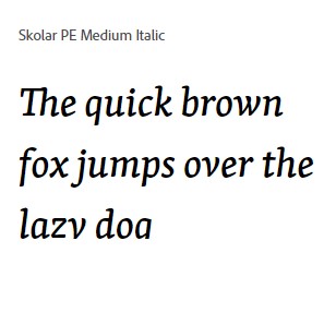
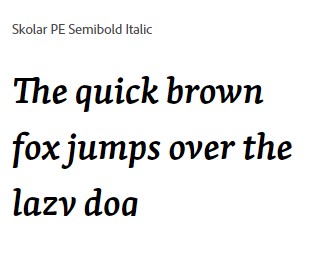
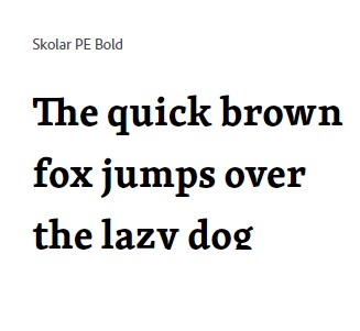
The Skolar Font Family includes a wide selection of weights and styles, ranging from Thin to Black, each with its corresponding italics. This extensive range allows designers to create strong typographic hierarchies and adapt the font to various contexts, from subtle emphasis to bold, eye-catching headlines. The italics are particularly notable for their fluidity and elegance, adding a dynamic and sophisticated touch to any text.
The typeface’s flexibility is further enhanced by the availability of small caps, ligatures, superscripts, and other typographic features. These elements make Skolar highly adaptable, allowing it to be used effectively in everything from academic journals to promotional materials.
3. Exceptional Legibility
One of Skolar’s standout features is its exceptional legibility, which makes it well-suited for text-heavy environments. The generous x-height, open counters, and carefully balanced letter proportions all contribute to the typeface’s readability, even at small sizes. The moderate stroke contrast and distinct serifs help guide the reader’s eye smoothly across the page, reducing fatigue during extended reading sessions.
Skolar’s legibility is enhanced by its careful attention to spacing and kerning, ensuring that letters do not feel cramped or too loosely spaced. This makes the typeface particularly effective for body text, where reader comfort is a priority. Whether it’s used in print or on screen, Skolar maintains its clarity and elegance, providing a pleasant reading experience.
4. Support for Multilingual Text
A significant advantage of the Skolar Font Family is its extensive language support. Designed to be truly multilingual, Skolar includes a wide range of characters to accommodate Latin, Cyrillic, Greek, and many other scripts. This makes it an ideal choice for international publications, academic research, and any project that requires broad language coverage.
The careful design of each character ensures that Skolar maintains a consistent visual identity across different languages. This consistency is crucial for maintaining a unified look in multilingual texts, where a mismatch in character design can create visual disharmony. Skolar’s thoughtful approach to language support helps ensure that every text, regardless of language, looks cohesive and professional.


Applications of the Skolar Font Family
The versatility and legibility of the Skolar Font Family make it a powerful tool for a wide range of design applications. From academic publishing to branding, Skolar’s adaptability allows it to excel in different environments.
1. Academic and Scholarly Publications
Skolar’s primary strength lies in its ability to handle complex, text-heavy content, making it a natural choice for academic and scholarly publications. Its exceptional legibility ensures that readers can comfortably engage with long articles, essays, and research papers, while its humanist design lends a sense of warmth and approachability to the text.
The availability of multiple weights and styles allows for clear typographic hierarchy, helping readers navigate dense content with ease. The inclusion of small caps, superscripts, and other typographic features is particularly useful for academic writing, where these elements are often needed for citations, footnotes, and references.
2. Editorial Design
Skolar is also well-suited for editorial design, including magazines, newspapers, and journals. Its range of weights allows designers to create dynamic layouts, with bold headlines, elegant subheadings, and highly readable body text. The typeface’s distinctive character and subtle details add visual interest to editorial content, ensuring that it stands out without overwhelming the reader.
The italics in the Skolar Font Family are particularly effective for editorial use, adding a sense of movement and emphasis to pull quotes, captions, and sidebars. The typeface’s versatility allows it to adapt to both traditional and modern editorial styles, making it a valuable asset for any publication.
3. Branding and Identity
Skolar’s balance of tradition and modernity makes it a strong choice for branding and identity design. Its humanist roots convey warmth and approachability, while its sharp details and strong letterforms give it a sense of authority and professionalism. This combination makes Skolar suitable for brands that want to communicate reliability, expertise, and a human touch.
The typeface’s extensive range of weights and styles allows for flexibility in branding applications, from logos and taglines to marketing materials and packaging. Its multilingual capabilities also make it ideal for brands with an international presence, ensuring a consistent look and feel across different languages and markets.
4. Web and Digital Interfaces
In the digital realm, Skolar continues to shine as a versatile and readable typeface. Its open forms, generous x-height, and balanced proportions make it highly legible on screen, even at smaller sizes. This makes Skolar an excellent choice for websites, digital publications, and apps that require a clear and professional typographic solution.
The typeface’s modern yet classic design ensures that it works well in a variety of digital contexts, from educational platforms to corporate websites. The availability of multiple weights allows designers to create a visually engaging experience, with clear hierarchy and emphasis where needed.
Technical Features and OpenType Support
The Skolar Font Family is packed with technical features that enhance its usability and adaptability. OpenType features such as ligatures, fractions, old-style figures, and stylistic alternates provide designers with the tools they need to create polished, professional typography. Small caps, superscripts, and subscripts are also included, making Skolar particularly useful for academic and editorial projects.
The typeface’s extensive character set supports a wide range of languages, ensuring that it meets the needs of international projects. This level of detail and consideration makes Skolar a reliable choice for designers working in diverse linguistic and cultural environments.
Conclusion
The Skolar Font Family, designed by David Březina for Rosetta Type Foundry, is a masterful blend of tradition and modernity. Its humanist design, wide range of weights, and exceptional legibility make it an ideal choice for academic, editorial, branding, and digital projects. Whether used in a scholarly journal, a contemporary magazine, or a professional website, Skolar provides the clarity, warmth, and versatility needed to elevate the typographic experience.
David Březina’s careful attention to detail and deep understanding of both the demands of modern design and the nuances of traditional type have resulted in a typeface that is both highly functional and full of character. Skolar is not just a tool for communication; it is a typeface that enhances the reading experience, bringing text to life in a way that is both engaging and accessible. For designers and typographers looking for a typeface that combines readability, flexibility, and personality, the Skolar Font Family is an outstanding choice.

