
The Quiche Text Font Family, designed by Adam Ladd, brings a blend of classical elegance and modern design, offering a versatile typeface that feels equally at home in editorial, branding, or digital interfaces. As part of Adam Ladd’s broader portfolio, this family is an extension of his penchant for creating fonts that are both aesthetically appealing and functionally versatile.
Design and Inspiration
The Quiche Text Font Family draws its inspiration from the high-contrast, geometric forms of Didone-style typefaces. These fonts are characterized by their dramatic contrast between thick and thin strokes, along with their sharp, hairline serifs. What sets Quiche Text apart is how it maintains this classical feel while adapting it for optimal readability and modern usage. The result is a typeface that feels timeless yet relevant to contemporary design needs.
Adam Ladd, known for his thoughtful approach to typography, designed Quiche Text with flexibility and usability in mind. It’s tailored specifically for body text, ensuring that it remains legible even at smaller sizes. While other members of the Quiche family are more suited for display purposes, Quiche Text was designed to be the workhorse in large bodies of text, offering clarity and comfort to the reader without sacrificing its inherent style.
Styles and Weights
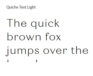
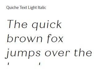
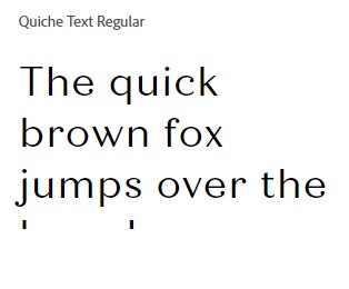
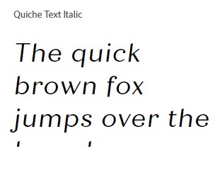
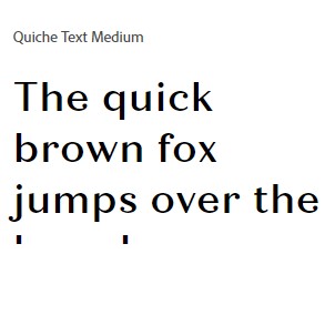
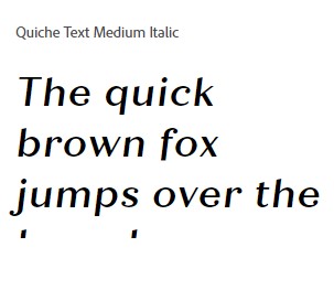
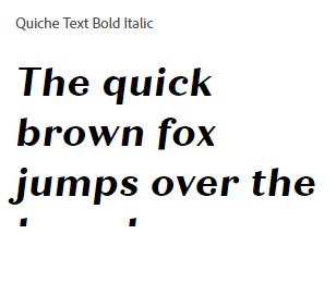
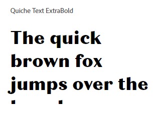
The Quiche Text Font Family includes a wide range of weights, from light to bold, each carefully crafted to provide contrast and emphasis where needed. In total, the family offers seven weights: Light, Regular, Medium, SemiBold, Bold, ExtraBold, and Black, along with their respective italic versions. This variety allows designers to easily create hierarchy and visual interest in any project, whether it’s a magazine layout, a website, or a corporate report.
Each weight is consistent in its geometric proportions, making it easy to pair different styles within the family. The italics are especially noteworthy for their grace, featuring slightly more fluid and cursive-like forms that give them a softer, more dynamic feel compared to their upright counterparts.
Readability and Usage
The design of Quiche Text places a strong emphasis on readability. Ladd meticulously adjusted the letterforms to ensure optimal clarity at various sizes, making this typeface perfect for extended reading on both digital screens and print media. The x-height is relatively generous, which increases legibility in small sizes and ensures that lowercase letters are easily distinguishable.
The font’s moderate stroke contrast and carefully shaped serifs provide a pleasing reading experience without overwhelming the eye. This makes Quiche Text an excellent choice for long-form content such as books, academic papers, or websites that require a lot of text.
Versatility Across Media
What sets the Quiche Text Font Family apart is its versatility. While it is designed primarily for text, its clean, elegant forms also make it a solid option for headlines, subheadings, and even branding materials. Its wide range of weights and styles means it can be used in various contexts without losing its distinct identity.
In branding, for instance, the font’s high-contrast letterforms lend a sense of sophistication and authority, making it an excellent choice for luxury brands, fashion, or editorial layouts. At the same time, its functional design ensures that it remains accessible, appealing to a broader audience in corporate, educational, or digital environments.
Pairing and Compatibility
One of the strengths of the Quiche Text Font Family is its ability to pair well with other typefaces. Its modern yet timeless feel makes it highly compatible with both serif and sans-serif fonts, depending on the desired effect. For instance, pairing Quiche Text with a minimalist sans-serif like Helvetica or Quicksand can create a striking balance between classic and contemporary styles. On the other hand, combining it with more decorative display fonts can create a more playful, layered design.
Within the broader Quiche family, Quiche Text pairs effortlessly with Quiche Display and Quiche Flare, providing designers with a comprehensive toolkit for diverse projects. The consistency in style across these families ensures that the typography feels cohesive, even when different weights and forms are used together.


Technical Features
The Quiche Text Font Family is packed with features that make it a robust and flexible tool for designers. It includes a range of OpenType features such as ligatures, stylistic alternates, and case-sensitive forms. These features allow designers to customize their text further, adding stylistic flair without sacrificing readability.
Additionally, the font supports an extensive range of languages, making it a good choice for global projects. Whether you’re designing for an English, French, or German audience—or even languages with extended Latin characters—Quiche Text has the glyphs to support your needs.
Final Thoughts
In a world where readability and elegance are often seen as mutually exclusive, the Quiche Text Font Family manages to bridge the gap. Its design combines the sophistication of a Didone-style serif with the practicality and clarity needed for long-form content. This makes it a perfect choice for designers who want to infuse their projects with a sense of timeless elegance while still keeping functionality at the forefront.
Adam Ladd’s careful attention to detail and his understanding of both form and function shine through in this font family. Quiche Text not only meets the needs of modern design but also elevates the typography experience with its refined aesthetics and versatile application. Whether you’re working on print, digital, or branding projects, the Quiche Text Font Family is a valuable asset that will enhance your design’s visual appeal and readability.

