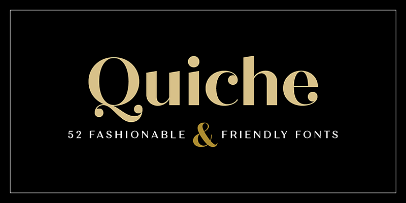
The Quiche Display Font Family, designed by Adam Ladd, is a sophisticated and versatile typeface that combines elegance with a modern aesthetic. As a well-known type designer, Adam Ladd has a reputation for creating fonts that cater to both functionality and creative expression. Quiche Display continues this tradition, offering a refined serif font that excels in display settings, such as headlines, titles, logos, and branding.
Inspired by the art deco style and modern typographic trends, Quiche Display brings together elements of high-fashion and editorial sophistication, making it a favorite choice for designers looking to inject a sense of elegance and personality into their projects. The font family’s clean, curvaceous letterforms give it an air of luxury while maintaining a timeless quality, making it suitable for both contemporary and classic designs.
The Design Philosophy Behind Quiche Display
Adam Ladd’s approach to Quiche Display reflects his dedication to balancing form and function. The font is designed with versatility in mind, capable of making an impact in a wide variety of design contexts while remaining stylish and legible. Ladd has crafted a typeface that seamlessly blends modern design sensibilities with the ornamental flair of early 20th-century typography, especially drawing on the influence of art deco design.
The elegance of Quiche Display comes from its carefully constructed curves, high-contrast strokes, and refined details that set it apart from traditional serif fonts. Ladd’s goal was to create a typeface that commands attention in display settings while providing flexibility in weight and style, ensuring that it can be used across various media types and industries.
Key Characteristics of Quiche Display
The Quiche Display Font Family is distinguished by several key characteristics that give it its unique flair and make it a powerful tool for designers:
- High-Contrast Strokes: One of the defining features of Quiche Display is its high-contrast strokes, with thick and thin lines creating a dynamic, eye-catching rhythm in the letterforms. This high contrast enhances the font’s visual appeal, particularly at larger sizes, and makes it ideal for use in display typography such as magazine covers, posters, and logos.
- Elegant Serifs: The font’s serifs are bold yet graceful, giving it a refined and luxurious look. The curves are soft and rounded, lending the font a sense of warmth and approachability despite its polished appearance.
- Curvaceous Letterforms: The overall design of Quiche Display is dominated by smooth, curvaceous shapes. The rounded letterforms contribute to the font’s stylish and feminine aesthetic, making it especially suitable for fashion and lifestyle brands, editorial design, and upscale branding projects.
- Geometric Precision: Despite its decorative nature, Quiche Display maintains geometric precision in its structure. The balance between the curvy forms and geometric shapes creates a harmonious blend of ornamentation and clarity, ensuring the typeface remains legible even at smaller sizes.
- Multiple Weights and Styles: Ladd designed Quiche Display as a font family with multiple weights and styles, offering designers flexibility in their projects. The variety of weights allows for contrast and hierarchy in typographic layouts, making it easy to use the font family across different design elements, from headlines and titles to body copy.
Versatility of Quiche Display in Design Applications
The Quiche Display Font Family is highly versatile, making it a popular choice for a wide range of design applications. Whether used in print or digital media, Quiche Display brings a sense of sophistication and elegance to any project. Here are some key areas where the typeface shines:
Branding and Logos
For brands that want to convey a sense of luxury, elegance, and sophistication, Quiche Display is an excellent choice. Its high-contrast strokes and elegant serifs make it ideal for logo design, wordmarks, and brand identity projects. Whether used in fashion, beauty, hospitality, or high-end retail, Quiche Display communicates refinement and style. The font’s multiple weights also allow for consistency across different brand touchpoints, such as packaging, websites, and advertising materials.
Editorial and Magazine Design
The high-contrast nature of Quiche Display makes it a great fit for editorial and magazine layouts. Its bold, stylish letterforms create striking headlines and pull quotes that draw the reader’s eye, while the lighter weights can be used effectively for section headers or introductions. The font’s sophisticated design lends itself particularly well to fashion magazines, lifestyle publications, and luxury catalogs, where typography plays a key role in establishing tone and visual hierarchy.
Print and Packaging Design
Packaging design often requires fonts that can stand out while remaining true to a brand’s aesthetic. With Quiche Display, designers have a typeface that is both bold and elegant, ensuring that product packaging has a high-impact visual presence. Its stylish curves and polished serifs work well for premium product packaging in industries such as cosmetics, perfumes, fine foods, and beverages.
Web and Digital Design
As digital media continues to evolve, so does the need for typefaces that look great on screens. Quiche Display is optimized for use in digital environments, ensuring that its high-contrast strokes and refined curves render beautifully on websites, apps, and social media platforms. The font family’s range of weights makes it suitable for everything from bold homepage headers to more subtle navigation text or calls to action.
Features of the Quiche Display Font Family
Quiche Display offers a range of OpenType features and design options that make it even more versatile and adaptable for designers. Some of the key features include:
- Multiple Weights and Styles: The font family includes a broad selection of weights, from thin and light to bold and extra bold. This variety allows designers to create hierarchy and contrast within their layouts, adding visual interest while maintaining consistency.
- Extended Language Support: Quiche Display offers extensive language support, making it accessible to designers working on international projects. The font family supports a wide range of Latin-based languages, ensuring it can be used across different linguistic and cultural contexts.
- Ligatures and Stylistic Alternates: To add an extra layer of refinement, Quiche Display includes ligatures and stylistic alternates that enhance the overall aesthetic of the typeface. These features give designers greater control over the visual flow of their text, making it easier to create unique and custom typography.
- Ornaments and Flourishes: The font family also includes a selection of decorative ornaments and flourishes that can be used to complement the typeface in design projects. These additional design elements add to the versatility of Quiche Display, allowing designers to create more dynamic and embellished layouts.
The Aesthetic Appeal of Quiche Display
The Quiche Display Font Family stands out as a perfect blend of elegance, modernity, and high-fashion aesthetics. Its high-contrast design, combined with curvaceous letterforms and elegant serifs, gives the font a luxurious and refined feel. Yet, it remains approachable and flexible enough for a variety of applications, from corporate branding to editorial design.
The font’s aesthetic appeal is heightened by its ability to evoke a sense of timelessness. While Quiche Display is clearly modern in its execution, it also draws on elements of vintage typography, particularly from the art deco era, which lends it a sense of timeless charm. This makes it an excellent choice for designers who want to create a classic yet contemporary look.
Use Case Scenarios
High-End Fashion Branding
Quiche Display is the perfect typeface for a high-end fashion brand looking to create a logo or wordmark that conveys elegance and sophistication. The font’s stylish curves and refined serifs align with the aesthetic needs of luxury fashion houses, where typography plays a significant role in establishing the brand’s identity.
Luxury Hotel Brochures
For a luxury hotel chain looking to design marketing materials that exude refinement and style, Quiche Display offers the perfect solution. Its elegant letterforms work beautifully in large headings and titles, while the lighter weights can be used for subheads and body text, creating a cohesive and polished look throughout the brochure.
Upscale Packaging Design
In the world of premium product packaging, typography is key to conveying quality and luxury. Quiche Display’s high-contrast strokes and stylish serifs make it an ideal choice for upscale packaging designs, particularly in industries such as cosmetics, fine dining, or boutique retail. The font’s decorative elements can also be used to add an extra layer of sophistication to the overall design.
Conclusion
The Quiche Display Font Family by Adam Ladd is a masterclass in combining elegance, modernity, and versatility. With its high-contrast strokes, curvaceous letterforms, and refined serifs, Quiche Display brings a sense of sophistication to any design project. Its ability to adapt to various media, from branding and packaging to editorial design and digital applications, makes it an invaluable tool for designers seeking to create stylish and impactful visual communications.
Whether used for high-end fashion branding, luxury packaging, or editorial layouts, Quiche Display stands out as a font that not only grabs attention but also conveys a sense of refined elegance and timeless charm. For those looking to infuse their designs with a touch of luxury and sophistication, Quiche Display is a typeface that delivers on all fronts.

