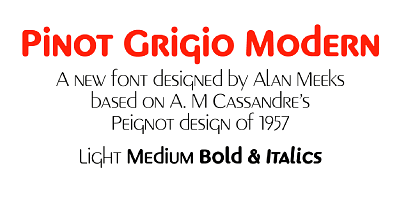
The Pinot Grigio Modern Font Family, designed by the highly respected British type designer Alan Meeks, is a modern serif typeface that perfectly captures the essence of sophistication with a contemporary edge. Much like the crisp and elegant qualities of the wine it shares a name with, Pinot Grigio Modern exudes refinement while offering the functionality and versatility needed in today’s diverse design landscape. This font family is a prime example of Meeks’ ability to merge classical design principles with modern aesthetics, creating a typeface that is both timeless and current.
Whether used for branding, editorial design, packaging, or formal invitations, Pinot Grigio Modern is a font family that offers both style and substance. Its clean lines, elegant serifs, and balanced proportions make it an ideal choice for designers looking to create polished, professional typography with a hint of luxury. Meeks, known for his precise craftsmanship and typographic mastery, has once again delivered a typeface that stands out for its beauty and versatility.
Alan Meeks: A Master of Typography
Alan Meeks is a name that carries significant weight in the world of type design. With a career spanning decades, he has consistently created fonts that blend traditional craftsmanship with modern usability, making them relevant across a wide range of design applications. Meeks’ work is marked by his meticulous attention to detail and his ability to create typefaces that are not only aesthetically appealing but also practical and highly functional.
In designing the Pinot Grigio Modern Font Family, Meeks was inspired by the desire to create a typeface that captured the elegance of classical serif fonts while embracing the simplicity and clarity that modern design demands. The result is a typeface that feels both luxurious and accessible, making it suitable for a variety of design contexts.
Design Philosophy and Inspiration
The Pinot Grigio Modern Font Family draws its design inspiration from classic serif typefaces but is reimagined for the modern era. The name “Pinot Grigio” evokes thoughts of fine wine—crisp, refined, and elegant—qualities that are reflected in the typeface itself. Meeks has infused the typeface with a sense of luxury and sophistication, much like the experience of enjoying a glass of fine wine, while ensuring that it remains clean and functional for modern use.
Pinot Grigio Modern is designed to be versatile, offering designers a typeface that can adapt to a variety of contexts without losing its distinct personality. The typeface’s refined letterforms, sharp serifs, and subtle contrast between strokes give it a polished look that is perfect for high-end branding, editorial layouts, and product packaging. At the same time, its clean and modern design ensures that it remains highly legible and effective in digital environments.
Key Features of the Pinot Grigio Modern Font Family
The Pinot Grigio Modern Font Family stands out for several key design features that contribute to its elegance, versatility, and usability. These characteristics make the font family an excellent choice for designers seeking a modern serif typeface that offers both style and function:
- Elegant and Refined Serifs: The most striking feature of Pinot Grigio Modern is its sharp, elegant serifs. The serifs are finely detailed, giving the typeface a sense of sophistication without being overly ornate. This balance between refinement and simplicity ensures that the font remains versatile enough for both formal and casual design applications.
- Balanced Proportions and High Legibility: One of the defining characteristics of Pinot Grigio Modern is its well-balanced proportions. The x-height, ascenders, and descenders are carefully calibrated to ensure that the typeface maintains high legibility at both small and large sizes. This makes Pinot Grigio Modern suitable for a variety of uses, from body text to headlines and display settings.
- Subtle Contrast Between Strokes: The typeface features a subtle contrast between thick and thin strokes, a hallmark of classic serif typography. This contrast adds visual interest and depth to the letterforms, making the typeface particularly effective in larger sizes, such as titles, headlines, or packaging design. The contrast is delicate enough that the typeface remains clean and readable, even in smaller sizes.
- Versatile Weight Range: The Pinot Grigio Modern Font Family offers a range of weights, from light to bold, giving designers the flexibility to create dynamic typographic hierarchies. The lighter weights are ideal for body text, offering excellent readability, while the bolder weights provide impact and emphasis in headings, titles, and display text. This range of weights allows the typeface to adapt to a variety of design contexts, from minimalist layouts to more elaborate designs.
- Clean, Modern Aesthetic with Classic Roots: While Pinot Grigio Modern is deeply rooted in classical serif typefaces, its clean lines and modern proportions give it a fresh, contemporary feel. The typeface is designed to look timeless yet current, making it suitable for both traditional and modern design projects. This blend of classic and modern elements makes Pinot Grigio Modern a highly versatile typeface that can be used across a range of industries and design applications.
- Extended Character Set: Pinot Grigio Modern includes an extended character set, offering support for multiple languages, diacritical marks, and typographic symbols. This makes the typeface ideal for international projects, ensuring that it can be used in multilingual designs without compromising its elegance or functionality.
Use Cases for the Pinot Grigio Modern Font Family
The versatility and refined design of the Pinot Grigio Modern Font Family make it suitable for a wide range of design applications. Its clean, modern aesthetic combined with its classic roots makes it an excellent choice for projects that require both sophistication and functionality. Below are some of the most common use cases for Pinot Grigio Modern:
- Branding and Corporate Identity: Pinot Grigio Modern is an ideal choice for corporate branding and identity design. The typeface’s clean lines and refined serifs convey professionalism, reliability, and elegance, making it perfect for logos, business cards, letterheads, and other branding materials. Its modern yet classic feel ensures that the brand will remain relevant and timeless.
- Editorial and Publishing Design: The balanced proportions and high legibility of Pinot Grigio Modern make it an excellent option for editorial design, particularly in books, magazines, and newspapers. Its subtle contrast and refined details make it ideal for body text, while its bolder weights are perfect for headlines and subheadings. The typeface’s modern aesthetic ensures that editorial layouts remain fresh and engaging.
- Luxury Packaging and Product Design: Pinot Grigio Modern’s elegant serifs and clean lines make it well-suited for luxury packaging and product design. Whether used for high-end cosmetics, fashion, or gourmet food packaging, the typeface adds a touch of sophistication and exclusivity to any product. The typeface’s versatility in weights also allows designers to create cohesive, stylish packaging designs.
- Formal Invitations and Stationery: The refined elegance of Pinot Grigio Modern makes it a popular choice for formal invitations, wedding stationery, and event materials. Its sharp serifs and graceful proportions give it a polished look that is perfect for occasions that demand a sense of formality and sophistication.
- Web and Digital Design: Pinot Grigio Modern is designed to perform well in digital environments, making it an excellent choice for websites, apps, and digital presentations. The typeface’s clean, modern design ensures that it remains legible on screens of all sizes, while its range of weights allows for dynamic, engaging layouts.
- Signage and Display Typography: With its bold, striking letterforms, Pinot Grigio Modern works beautifully in signage and display typography. Whether used in retail settings, exhibitions, or large-scale advertising, the typeface’s clean lines and high contrast make it highly legible and visually appealing from a distance.
Pinot Grigio Modern: A Typeface for Timeless Elegance and Modern Functionality
The Pinot Grigio Modern Font Family is a remarkable achievement in type design, offering a perfect balance between classical elegance and modern usability. Alan Meeks has created a typeface that is both visually striking and highly versatile, making it a valuable tool for designers across various industries. Whether used in corporate branding, editorial layouts, luxury packaging, or digital design, Pinot Grigio Modern delivers a sense of refinement and sophistication that elevates any project.
Meeks’ attention to detail and his deep understanding of typography are evident in every aspect of the Pinot Grigio Modern Font Family. The typeface is designed to be adaptable to a wide range of design applications, while its elegant, refined appearance ensures that it remains relevant and impactful across different design contexts. For designers seeking a typeface that combines authority, beauty, and versatility, Pinot Grigio Modern is an excellent choice.
Conclusion
The Pinot Grigio Modern Font Family, designed by Alan Meeks, is a sophisticated serif typeface that blends classical design principles with modern usability. Its elegant serifs, clean lines, and balanced proportions make it a versatile and timeless choice for a wide range of design projects, from branding and packaging to editorial design and digital media.
Alan Meeks has once again demonstrated his mastery of type design with Pinot Grigio Modern, creating a typeface that is both beautiful and functional. For designers looking for a font that conveys professionalism, elegance, and timeless style, the Pinot Grigio Modern Font Family offers a powerful tool that can elevate any project.

