
The Park Lane Font Family, designed by the renowned British type designer Alan Meeks, is a testament to the elegance and refinement of traditional serif fonts. Known for his expertise in crafting fonts with timeless appeal, Meeks’ work on the Park Lane family is no exception. Park Lane is a sophisticated typeface that blends classical influences with modern usability, making it a favorite for high-end branding, editorial design, and other creative projects requiring a touch of formality and distinction.
Alan Meeks: A Master of Refined Typography
Alan Meeks has long been recognized for his work in type design, with a career spanning several decades. His approach to typography is rooted in his understanding of the traditional principles of type design, but he also has an innate ability to adapt those principles to contemporary design needs. Park Lane is a reflection of his mastery, offering designers a type family that is at once steeped in classical tradition but adaptable to modern design contexts.
Throughout his career, Meeks has developed a broad range of typefaces, many of which have been embraced by designers worldwide for their high-quality design, clarity, and versatility. Fonts like Park Lane emphasize Meeks’ dedication to precision and his deep appreciation for the artistry of letterforms, elements that shine through in every glyph and character of the Park Lane font family.
A Nod to Tradition with Modern Flexibility
The Park Lane Font Family is a serif typeface that exudes a sense of classic luxury. Its design is heavily influenced by traditional typefaces, particularly those of the transitional and modern serif families, but with subtle modern touches that make it highly adaptable to contemporary design applications. The letterforms have a stately presence, with well-balanced proportions and elegant curves, but they also maintain a level of simplicity and clarity that ensures they remain legible in a variety of contexts.
At its core, Park Lane is a type family designed to convey formality, elegance, and sophistication. These qualities make it an ideal choice for luxury brands, invitations, book covers, and any other design that requires a high level of refinement and class. The typeface is equally at home in both print and digital formats, demonstrating its versatility across different media.
Design Features of Park Lane
The Park Lane Font Family is known for several distinct design features that contribute to its timeless appeal. Some of the key characteristics of this font family include:
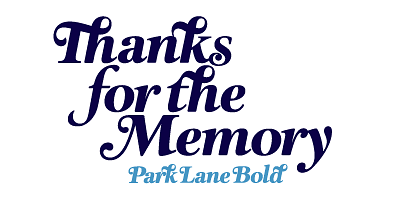
- Elegant Serif Structure: Park Lane features delicately designed serifs that add a sense of grace and formality to the letterforms. The serifs are not overly ornate but are carefully constructed to enhance readability while maintaining a luxurious appearance.
- High Contrast: The typeface exhibits a noticeable contrast between thick and thin strokes, a hallmark of the transitional serif style. This contrast adds to the overall elegance of the font and makes it particularly effective for use in larger sizes, such as headlines and titles.
- Refined Curves: The curves of the letterforms are smooth and fluid, contributing to the typeface’s sophisticated aesthetic. Meeks has carefully balanced the angles and curves to ensure that each letter maintains harmony with the others, resulting in a cohesive and polished look.
- Extended Character Set: The Park Lane Font Family includes an extended character set, supporting a wide range of languages and typographic symbols. This makes it a practical choice for international use and for projects that require multilingual support.
- Multiple Weights and Styles: Park Lane is a full-fledged font family, offering a range of weights from light to bold, as well as italic styles. This versatility allows designers to use the font in various typographic hierarchies, from body text to display settings, without needing to switch between different typefaces.
- Luxury and Refinement: The overall tone of Park Lane is one of luxury. Its refined detailing and formal design elements make it the perfect choice for projects that aim to convey a sense of exclusivity and high quality.
Use Cases for Park Lane
Because of its elegant and refined aesthetic, the Park Lane Font Family is often used in contexts that demand a sense of sophistication and professionalism. Some of the most common use cases for Park Lane include:
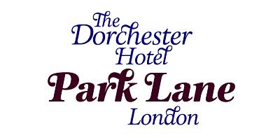
- Branding for High-End Products: Park Lane is an ideal choice for luxury brands, particularly those in the fashion, jewelry, or hospitality industries. Its classic and elegant appearance helps to convey a sense of exclusivity and quality, making it perfect for logos, packaging, and promotional materials for premium products.
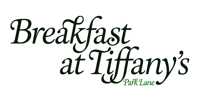
- Editorial Design: In editorial contexts, Park Lane is frequently used for titles, headings, and callouts in magazines, books, and newspapers. Its high contrast and elegant curves ensure that it commands attention while remaining legible and easy to read in larger formats.
- Formal Invitations and Stationery: The formal and traditional look of Park Lane makes it a popular choice for invitations, particularly for weddings, galas, or corporate events. The typeface’s luxurious appearance adds a touch of sophistication to any printed material, making it perfect for engraved invitations, menus, or formal announcements.
- Book Covers and Interior Design: Park Lane’s classic look also makes it a great choice for book design, especially for genres that require a more formal or historical tone. Whether used on book covers or as the primary typeface for chapter titles and headings, Park Lane contributes to an overall aesthetic of elegance and gravitas.
- Corporate and Professional Communication: Park Lane’s professional and refined design makes it suitable for corporate communication materials such as annual reports, brochures, and business cards. Its timeless quality ensures that it will remain relevant and effective in any formal business context.
The Timeless Appeal of the Park Lane Font Family
What sets Park Lane apart from many other serif fonts is its ability to strike a perfect balance between tradition and modernity. While the font is deeply rooted in classical type design principles, it has been designed with enough subtle modern adjustments to make it functional in contemporary settings. This gives Park Lane a timeless appeal, ensuring that it will remain a staple in the designer’s toolkit for years to come.
Alan Meeks has masterfully crafted Park Lane to be a typeface that evokes a sense of elegance and exclusivity, while still being versatile enough to be used in a wide range of applications. This combination of beauty and functionality is what makes Park Lane such a powerful and enduring type family, and why it continues to be a favorite among designers who are looking for a refined and sophisticated serif font.
Conclusion
The Park Lane Font Family, designed by Alan Meeks, is a classic serif typeface that embodies elegance, sophistication, and timeless beauty. Its design is rooted in traditional typographic principles, but with enough modern adjustments to make it highly usable in today’s design landscape. Whether used in luxury branding, editorial design, or formal invitations, Park Lane continues to be a go-to typeface for designers who seek to create a sense of refinement and class in their work. Alan Meeks’ attention to detail and mastery of type design ensure that the Park Lane Font Family will remain a beloved classic in the world of typography for many years to come.

