The Novel Sans Font Family, designed by Christoph Dunst from Atlas Fonts, is a standout typeface that perfectly blends modern functionality with classical typographic proportions. This humanist sans-serif font family is part of the larger Novel Superfamily, which includes complementary styles such as Novel Mono, Novel Display, and Novel Serif. Novel Sans is renowned for its clarity, flexibility, and refined aesthetics, making it an ideal choice for a wide variety of design applications, from editorial work to corporate branding.
Christoph Dunst has designed Novel Sans to be a harmonious and versatile typeface that retains the classical elegance of traditional serif fonts while providing the simplicity and modernity that sans-serif fonts offer. This thoughtful blend of styles makes it particularly valuable for projects that demand a clean, legible font without sacrificing sophistication.
The Designer: Christoph Dunst
Christoph Dunst is a prominent type designer and the founder of Atlas Fonts, a foundry known for creating typefaces that balance form and function. Dunst’s work often involves reimagining traditional type forms for modern use, and Novel Sans is a prime example of his ability to create a typeface that is both timeless and contemporary. With his deep understanding of typography, Dunst has crafted the Novel Sans family to meet the needs of modern designers, while still honoring the traditions of classic humanist typefaces.
Humanist Design with a Modern Twist
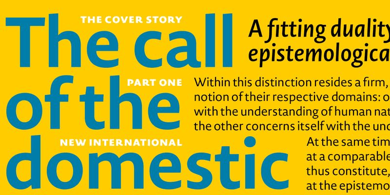
The Novel Sans Font Family is a humanist sans-serif, which means it draws inspiration from traditional serif typefaces. Humanist sans-serif fonts tend to have more organic, calligraphic forms compared to geometric or grotesque sans-serifs, and they are known for their readability and elegance. Novel Sans retains this humanist influence, but Dunst has modernized it with a more streamlined and clean design, making it highly versatile for both print and digital media.
One of the most notable features of Novel Sans is its carefully balanced proportions. Dunst has paid close attention to the width, weight, and spacing of the characters, ensuring that each letterform is legible and harmonious. This attention to detail gives Novel Sans its distinctive, sophisticated look while maintaining the clean, unobtrusive nature of a sans-serif typeface.
Key Features and Characteristics
1. Wide Range of Weights and Styles
The Novel Sans Font Family offers an extensive range of weights, from Light to Black, along with corresponding italics. This variety gives designers the flexibility to create nuanced and dynamic designs without having to switch between different typefaces. The ability to use different weights and styles within the same font family ensures that projects maintain a consistent visual identity, whether it’s in headlines, body text, or captions.
The italic styles in Novel Sans are particularly well-crafted, with a subtle slope and refined curves that add a touch of elegance without overpowering the overall design. This makes the italics suitable for both emphasis in body text and for use in more decorative or expressive contexts.
2. Legibility and Readability
Novel Sans excels in legibility, making it a perfect choice for both long-form text and display use. Its humanist roots ensure that the letterforms are open and well-proportioned, contributing to excellent readability even at smaller sizes. The generous x-height, wide counters, and open apertures enhance its clarity, making it ideal for print media such as books, magazines, and brochures, as well as digital interfaces like websites and apps.
The careful balance between stroke thickness and spacing allows Novel Sans to retain its legibility across a variety of media, from high-resolution print to low-resolution screens. This makes it a versatile option for designers working across different platforms.
3. Neutral and Modern Aesthetic
Novel Sans has a neutral yet distinctive appearance, which makes it highly versatile. Its humanist design provides a warmth and personality that is often lacking in more mechanical sans-serif typefaces. At the same time, its modern, clean lines ensure that it remains unobtrusive and professional, making it a popular choice for corporate branding, editorial design, and user interfaces.
The font family’s neutral aesthetic allows it to pair well with other typefaces, including serif fonts like Novel Serif or Novel Mono, making it an excellent choice for projects that require a range of typographic expressions. Its ability to adapt to both formal and informal settings makes it a go-to typeface for a wide variety of projects.
4. Extensive Language Support
Like many of Christoph Dunst’s typefaces, Novel Sans offers extensive language support, covering a wide range of Latin-based languages as well as additional scripts. This feature makes Novel Sans suitable for international projects, enabling designers to maintain a consistent typographic style across different languages and regions. The font’s extensive character set includes accented characters, ligatures, and a variety of numerals, further enhancing its versatility.
5. Functional and Creative Uses
The Novel Sans Font Family has a wide range of applications, thanks to its balance of legibility, elegance, and neutrality. It is particularly effective in the following contexts:
A. Editorial Design
Novel Sans is an excellent choice for editorial design due to its readability and versatility. Whether used for headlines, subheads, or body text, Novel Sans provides a clean and elegant solution for magazines, newspapers, and books. Its wide range of weights allows for dynamic typographic hierarchy, while its neutral appearance ensures that it complements a variety of design styles.
B. Corporate Branding
With its clean and professional appearance, Novel Sans is ideal for corporate branding and identity systems. The typeface’s flexibility allows it to be used across a wide range of brand applications, from logos to business cards, websites, and presentations. Its modern yet timeless aesthetic makes it a strong choice for brands that want to convey trust, professionalism, and reliability.
C. Web and App Design
Novel Sans is optimized for digital use, making it a popular choice for websites, apps, and other user interfaces. Its legibility at small sizes ensures that it performs well in body text, while its more dramatic weights and italics can be used effectively for headlines and emphasis. The typeface’s neutral design makes it adaptable to a variety of web and app designs, from clean, minimalist interfaces to more vibrant, creative layouts.
D. Advertising and Marketing
The neutral, modern aesthetic of Novel Sans makes it suitable for a wide range of advertising and marketing materials. Whether it’s used in print ads, social media graphics, or digital campaigns, Novel Sans provides a strong, clear typographic solution that helps communicate messages effectively. Its versatility across different weights and styles allows it to adapt to various brand voices and marketing strategies.
Seamless Integration with the Novel Superfamily
One of the standout features of the Novel Sans Font Family is its ability to integrate seamlessly with other typefaces in the Novel Superfamily. This includes Novel Mono, Novel Display, and Novel Serif, all of which share the same typographic DNA. This harmony between typefaces allows designers to create cohesive and flexible typographic systems for projects that require a range of typographic voices.
For example, Novel Sans can be paired with Novel Serif for projects that require a balance between modernity and tradition, or with Novel Mono for projects that demand a structured, technical look. This versatility within the superfamily makes Novel Sans an essential part of any designer’s toolkit.
Conclusion
The Novel Sans Font Family, designed by Christoph Dunst from Atlas Fonts, is a masterclass in typographic design. Its humanist roots, combined with modern sensibilities, make it a highly versatile and elegant typeface that works across a wide range of applications. Whether used in editorial design, corporate branding, web interfaces, or advertising, Novel Sans provides the perfect balance of clarity, legibility, and sophistication.
Dunst’s thoughtful design ensures that Novel Sans retains its timeless appeal while meeting the needs of modern designers. Its extensive range of weights, styles, and language support further enhances its flexibility, making it an essential typeface for projects that require both functionality and beauty. When combined with other typefaces from the Novel Superfamily, Novel Sans offers endless possibilities for creating cohesive, dynamic, and visually engaging designs.

