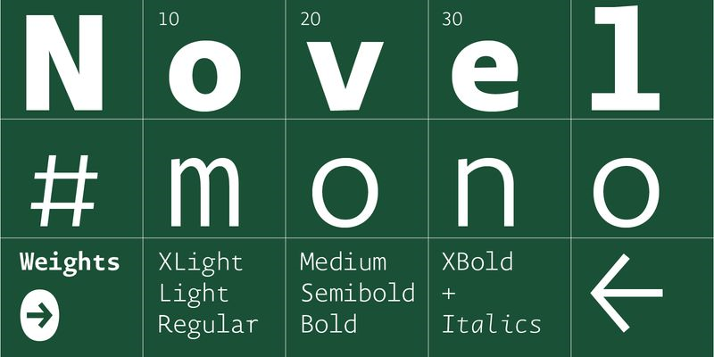
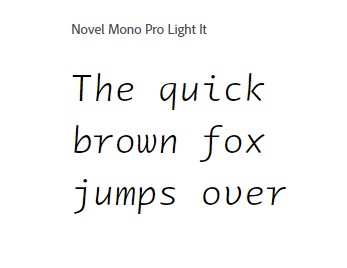
The Novel Mono Font Family, designed by Christoph Dunst from Atlas Fonts, is a sophisticated and modern take on the classic monospaced typeface. Known for its impeccable design, attention to detail, and versatility, Novel Mono brings new life to a style of typography traditionally associated with coding, tabular data, and technical documents. Dunst, a master of contemporary type design, has infused this typeface with both precision and personality, making it an ideal choice for a variety of design applications.
As part of the Novel Superfamily, which includes Novel Sans, Novel Serif, and Novel Display, Novel Mono shares the same typographic DNA, allowing it to pair seamlessly with other fonts in the family while maintaining its unique, monospaced character. Whether you’re designing for editorial, branding, or web development, Novel Mono provides a distinct, clean aesthetic that holds its own in both technical and creative contexts.
The Designer: Christoph Dunst
Christoph Dunst is a highly respected figure in the world of typography. As the founder of Atlas Fonts, he has gained recognition for creating typefaces that strike a balance between functionality and beauty. His designs often blend modern aesthetics with traditional typographic values, and Novel Mono is no exception. With Novel Mono, Dunst demonstrates his skill in adapting the monospaced format to the needs of contemporary design without losing the characteristics that make this style so useful in specific contexts.
What is a Monospaced Typeface?
Before diving into the details of Novel Mono, it’s important to understand what makes a monospaced typeface unique. Unlike proportional typefaces, where each character can have a different width, monospaced fonts allocate the same amount of horizontal space to every character. This means that the letter “i” will take up as much space as the letter “m,” for example. Monospaced fonts were initially designed for typewriters and have since been widely used in technical settings such as programming, data tables, and system interfaces.
Monospaced fonts are valued for their precision and uniformity, making them indispensable in contexts where alignment and clarity are essential. They are frequently used in coding environments because the equal spacing of characters enhances readability and makes debugging easier. However, monospaced fonts have evolved beyond their utilitarian roots to find a place in modern graphic design, where their clean, structured appearance adds a sense of order and stability to creative projects.
A Closer Look at Novel Mono
1. Design Aesthetics
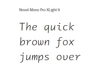
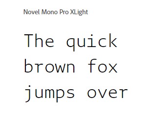
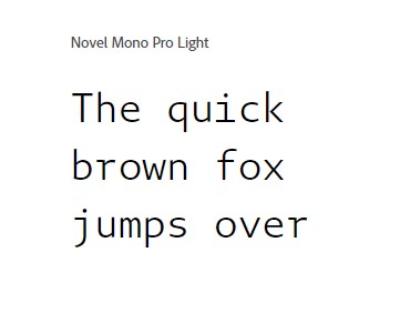
The Novel Mono Font Family stands out for its clean, modern lines and exceptional readability. Christoph Dunst has taken the basic principles of monospaced design and refined them, creating a typeface that is both highly functional and visually appealing. While many monospaced fonts can feel mechanical or rigid, Novel Mono introduces subtle curves and refined details that give it a softer, more approachable feel. This makes it well-suited for a range of design applications, from technical documents to editorial layouts.
The typeface’s proportions are well-balanced, ensuring that the uniform spacing does not compromise its legibility or aesthetics. The open counters, generous x-height, and clean stroke contrast make it easy to read, even at smaller sizes. These qualities make Novel Mono a versatile choice for both digital and print applications.
2. Versatile Weight Range
Novel Mono offers a range of weights, from Light to Bold, providing flexibility for designers. The lighter weights are ideal for projects requiring a more delicate touch, while the bolder weights are perfect for headlines, emphasis, and creating a strong visual impact. This variety allows designers to use the same font family for both functional and creative purposes without having to switch between different typefaces, ensuring a consistent visual identity throughout a project.
3. Legibility and Readability
One of the primary reasons designers choose monospaced fonts is for their exceptional legibility, particularly in coding and data-heavy environments. Novel Mono excels in this area, providing a clear and easy-to-read typeface that enhances comprehension, whether it is used for technical content, body text, or digital interfaces. The even spacing between characters creates a sense of order and uniformity, making it easier to scan and process information.
In creative applications, Novel Mono’s readability makes it an excellent choice for editorial design, where a clean and structured look is often desired. Its monospaced structure can add an intriguing layer of visual interest, breaking away from more traditional proportional typefaces while maintaining a sense of clarity and coherence.
4. Extended Language Support
Like other fonts in the Novel Superfamily, Novel Mono supports an extensive range of languages, making it a practical choice for international projects. This wide range of language support ensures that Novel Mono can be used in multilingual settings without sacrificing design consistency or legibility.
5. Functional and Creative Applications
The Novel Mono Font Family is ideal for a broad spectrum of applications. Its precision and clarity make it a go-to choice for developers and programmers, but its refined design also makes it suitable for creative fields like branding, editorial design, and even advertising. Below are some of the most common uses for Novel Mono:
A. Coding and Technical Documents
Monospaced fonts are synonymous with coding environments, and Novel Mono’s even spacing and clear design make it an excellent choice for programming. Its modern aesthetic ensures that it not only functions well but also looks good, making it an ideal font for code editors, user interfaces, and documentation. The structured, orderly nature of Novel Mono reduces eye strain during long hours of coding, making it a favorite among developers.
B. Data Tables and Spreadsheets
In data-heavy environments, such as tables and spreadsheets, monospaced fonts like Novel Mono are invaluable. The equal spacing between characters ensures that numbers and letters align perfectly, making data easier to read and interpret. Novel Mono’s modern design adds a touch of elegance to otherwise mundane tables, enhancing both readability and aesthetics.
C. Editorial Design
Novel Mono shines in editorial design, where its clean lines and structured appearance add a fresh, modern touch. Its monospaced nature brings a unique visual rhythm to text-heavy layouts, making it an excellent choice for magazines, newspapers, and online publications. It can be used for both body text and headlines, offering versatility and consistency across a variety of content formats.
D. Branding and Identity
For brands that value structure, order, and modernity, Novel Mono can play a pivotal role in defining a visual identity. Its balanced design allows it to be used in logos, business cards, and other branding materials where a clean, professional look is desired. Novel Mono’s versatility in weight also makes it suitable for a variety of brand expressions, from sleek and minimal to bold and authoritative.
E. Web and App Design
Novel Mono’s clean, readable design makes it an excellent choice for digital interfaces, including websites and apps. Its monospaced structure provides clarity in navigation menus, buttons, and text-heavy sections, while its modern aesthetic ensures that it integrates seamlessly into contemporary web designs. Additionally, Novel Mono’s extensive language support ensures that it functions well in global contexts, making it a versatile choice for web and app developers.
Seamless Integration with the Novel Superfamily
One of the key advantages of Novel Mono is its ability to integrate seamlessly with other typefaces in the Novel Superfamily, including Novel Sans and Novel Serif. The shared design elements between these typefaces ensure that they work harmoniously together, making it easy for designers to create cohesive typographic systems.
For instance, Novel Mono can be used for technical elements like code snippets or tabular data, while Novel Sans or Novel Serif can be employed for body text or headlines. This flexibility allows designers to maintain a consistent visual identity across different typographic styles without sacrificing functionality or aesthetics.
Conclusion
The Novel Mono Font Family by Christoph Dunst from Atlas Fonts is a perfect blend of function and form. Its precision, clarity, and versatility make it an ideal choice for a wide range of applications, from coding and technical documents to branding and editorial design. As part of the broader Novel Superfamily, it provides designers with the flexibility to create cohesive and visually engaging projects while maintaining the unique characteristics of a monospaced font.
Dunst’s thoughtful design elevates the monospaced genre, transforming it from a purely functional tool into a sophisticated typographic choice. Whether used on its own or in combination with other typefaces from the Novel Superfamily, Novel Mono is a valuable asset to any designer’s toolkit, offering both practicality and aesthetic appeal.

