The Novel Font Family, designed by Christoph Dunst from Atlas Fonts, is a beautifully crafted typeface that seamlessly blends traditional typographic elements with modern sensibilities. As its name suggests, Novel is an elegant and sophisticated font family that offers a wide range of possibilities for designers who are looking to add both functionality and aesthetic appeal to their projects. Dunst’s design of the Novel Font Family exemplifies his ability to respect the classical principles of typography while also pushing boundaries to create something contemporary and highly usable.
The Tradition of Serif Typefaces and Novel’s Unique Approach
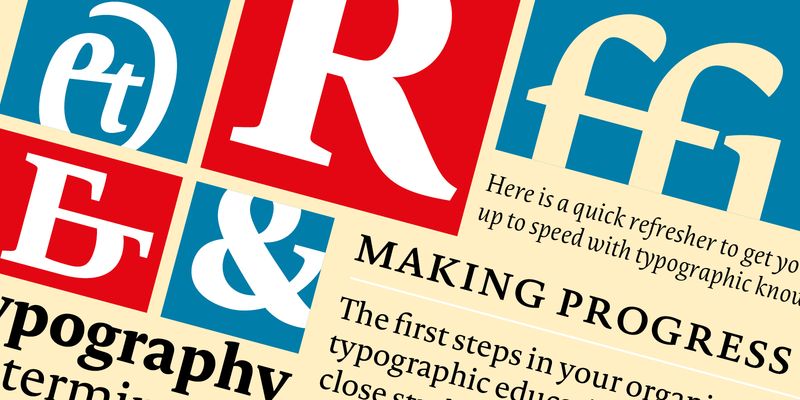
Serif typefaces have long been a staple in the world of typography, dating back to the earliest printed works in the Renaissance. These fonts are characterized by the small lines or strokes attached to the end of the larger strokes in the letters, often giving them a more formal, elegant, and readable appearance. Historically used in books, newspapers, and other long-form text formats, serif fonts have been praised for their legibility and classical beauty.
The Novel Font Family builds on this tradition, but Christoph Dunst brings his signature design approach to the table by making the font both timeless and versatile for modern usage. Novel is not just another serif font; it is an entire family of typefaces designed to work in a variety of applications, offering both beauty and utility across multiple design platforms. Dunst’s approach was to create a font that respects the rich heritage of serif typography but infuses it with modern design touches that make it ideal for contemporary print and digital environments.
Design Characteristics of the Novel Font Family
The Novel Font Family stands out due to its meticulous design and attention to detail. Several key design characteristics define this typeface and make it an excellent choice for a wide variety of design applications:
- Elegant Serif Forms: At its core, Novel is a serif font family, and Dunst has designed the serif details with great precision. The serifs in Novel are sharp, refined, and subtle, giving the font an air of sophistication while maintaining high legibility. These serifs add a sense of formality and tradition to the typeface, making it perfect for editorial design, branding, and print work.
- Balanced Proportions: Novel’s letterforms are meticulously proportioned, offering a harmonious blend of readability and style. The x-height (the height of lowercase letters) is well-balanced with the ascenders and descenders, ensuring that the text remains easy to read even in smaller sizes. This balance also contributes to the font’s versatility, making it suitable for both body text and headings.
- Wide Range of Weights and Styles: One of the standout features of the Novel Font Family is its wide range of weights and styles. From light to bold, the family provides multiple options for designers to choose from depending on the tone and emphasis needed. This flexibility allows Novel to be used across various media, whether for book design, magazine layouts, or corporate branding. The family also includes italic styles that complement the upright forms, giving designers even more typographic options.
- Modern Design Touches: While Novel takes inspiration from classical serif fonts, it incorporates several modern design elements. The sharpness of its serifs and the clean, crisp strokes give it a contemporary feel that makes it stand out from more traditional serif fonts. This modern twist ensures that Novel works equally well in print and digital formats, making it a versatile tool for today’s designers.
- Enhanced Legibility: Legibility is a key consideration in the design of any serif font, and Novel excels in this area. The clarity of each letterform ensures that the typeface is easy to read, even in long blocks of text. This makes Novel ideal for editorial work, books, and other text-heavy formats where readability is essential. The carefully considered proportions, along with the subtle contrast between thick and thin strokes, contribute to the font’s overall legibility.
- Extended Character Set: The Novel Font Family offers a comprehensive character set that includes not only standard uppercase and lowercase letters but also numerals, punctuation, and a variety of special characters. This wide character set supports multiple languages, making Novel an excellent choice for international design projects. The inclusion of ligatures and stylistic alternates further enhances the creative possibilities of the typeface.
The Aesthetic Appeal of Novel
The aesthetic appeal of the Novel Font Family lies in its ability to combine the old with the new. On one hand, Novel feels like a classic serif font that would be perfectly at home in a printed book or a formal editorial layout. On the other hand, it incorporates modern design elements that make it feel fresh and relevant for contemporary design projects. This balance between tradition and innovation is what makes Novel such a versatile and appealing typeface.
The sharp, clean serifs give the typeface a sense of authority and professionalism, making it well-suited for corporate branding, annual reports, and other formal applications. At the same time, the elegance of the letterforms gives it a refined beauty that makes it ideal for luxury branding, high-end editorial design, and book publishing. Novel’s ability to adapt to different design contexts without losing its core identity is one of its greatest strengths.
Ideal Applications for Novel
Novel is an incredibly versatile typeface that can be used in a wide variety of design contexts. Its range of weights and styles, combined with its legibility and aesthetic appeal, make it a valuable tool for both print and digital design projects. Some of the most common and effective uses for Novel include:
- Editorial and Book Design: Serif fonts have long been associated with the printed word, and Novel is no exception. Its clarity, legibility, and elegant design make it an excellent choice for editorial layouts, magazines, newspapers, and book design. Whether used for body text or headlines, Novel brings a sense of refinement and sophistication to any editorial project.
- Corporate Branding and Identity: The professional, authoritative feel of Novel makes it a great choice for corporate branding. Its clean lines and sharp serifs convey a sense of trust and reliability, which is essential for companies that want to project a strong and professional image. The flexibility of the font family also allows it to be used across a company’s entire brand identity, from logos and business cards to websites and corporate documents.
- Luxury Branding: For brands in the luxury sector, Novel’s elegant and refined aesthetic is a perfect match. The sharp serifs and clean letterforms give the typeface a sense of exclusivity and sophistication, making it ideal for high-end products, fashion brands, and premium services.
- Web and Digital Design: While serif fonts have traditionally been associated with print, Novel works beautifully in digital contexts as well. The sharpness and clarity of its letterforms ensure that it remains legible on screens, making it an excellent choice for websites, digital publications, and mobile apps. The font’s modern design elements also give it a contemporary edge that works well in web and digital environments.
- Signage and Display: Novel’s bold and impactful weights make it a great choice for signage and large-scale display applications. Its clean lines and sharp serifs ensure that it remains legible even from a distance, making it suitable for everything from outdoor signage to exhibition displays.
Christoph Dunst’s Typographic Vision
Christoph Dunst is known for his ability to create typefaces that balance classical design principles with modern functionality, and the Novel Font Family is a perfect example of this approach. His work is characterized by a deep understanding of typographic history, which he combines with a forward-thinking design sensibility that meets the needs of today’s designers.
With Novel, Dunst has created a font family that honors the tradition of serif typography while also pushing the boundaries of what a serif typeface can be. The clean, modern elements of Novel ensure that it remains relevant in contemporary design contexts, while its roots in classical typography give it a timeless quality that will never go out of style.
Dunst’s commitment to creating typefaces that are both aesthetically beautiful and highly functional is evident in every aspect of the Novel Font Family. From its elegant serif forms to its wide range of weights and styles, Novel is a testament to Dunst’s ability to create typefaces that are not only visually striking but also practical and versatile.
Conclusion
The Novel Font Family, designed by Christoph Dunst from Atlas Fonts, is a modern serif typeface that combines elegance, clarity, and versatility. Its refined letterforms and sharp serifs make it a perfect choice for a wide range of design applications, from editorial work and corporate branding to luxury packaging and web design. As part of Christoph Dunst’s larger body of work, Novel exemplifies his ability to blend traditional typography with contemporary design elements, creating a typeface that feels both timeless and cutting-edge.
Whether you’re working on a printed book, a high-end magazine, or a corporate identity project, the Novel Font Family offers the perfect balance of form and function, making it an essential tool for any designer looking for a serif typeface that is both beautiful and highly usable.

