The Novel Display Font Family, designed by Christoph Dunst from Atlas Fonts, is a typographic marvel that embodies the essence of modern design while paying homage to classical proportions. Dunst’s deep understanding of typography and his ability to balance form and function have resulted in a type family that stands out for its versatility, elegance, and clarity. It is part of the broader Novel Superfamily, which includes a variety of typefaces designed to work harmoniously together, allowing designers to create cohesive visual identities across different media.
The Designer: Christoph Dunst
Christoph Dunst, a renowned type designer and founder of Atlas Fonts, has a reputation for creating fonts that strike a perfect balance between aesthetics and utility. With the Novel Display Font Family, Dunst continues to push the boundaries of modern type design, crafting a typeface that is not only visually striking but also highly readable in large sizes. His approach to typography is rooted in a deep respect for tradition, combined with a forward-thinking vision that meets the needs of contemporary designers.
A Closer Look at the Novel Display Font Family
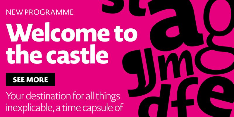
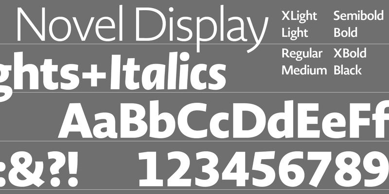
The Novel Display Font Family is specifically designed for large-size applications, making it ideal for headlines, posters, branding, and editorial projects. Its high contrast between thick and thin strokes, coupled with its sharp serifs and open counters, makes it a bold yet elegant choice for any design that requires a strong visual presence. The family offers a range of weights, from light to bold, allowing for flexibility in tone and style while maintaining a consistent visual language.
Key Features and Characteristics
- High Contrast and Sharp Details
One of the most defining features of the Novel Display Font Family is its high contrast between thick and thin strokes. This creates a dynamic rhythm in the text, drawing the reader’s eye to the most important elements. The sharp serifs and precise curves give the typeface a sophisticated and refined look, making it ideal for high-end editorial design and luxury branding. - Optimized for Large Sizes
As a display typeface, the Novel Display family is optimized for use in larger sizes, where its details can truly shine. The fine details and high contrast are especially effective in headlines, magazine covers, and advertising materials, where visual impact is paramount. The typeface’s clarity and legibility, even at very large sizes, ensure that it remains functional as well as beautiful. - Versatile Weight Range
The font family comes in multiple weights, from Light to Bold, providing designers with the flexibility to create a range of moods and styles within the same type family. The lighter weights offer a more delicate, refined appearance, while the bold weights are perfect for making strong, impactful statements. This versatility makes the Novel Display Font Family an excellent choice for projects that require a diverse typographic palette. - Sophisticated Elegance
With its refined proportions and carefully crafted details, Novel Display exudes sophistication and elegance. The typeface is a perfect choice for upscale branding and editorial projects where a touch of class is required. Whether used in fashion magazines, luxury product packaging, or high-end websites, the font’s elegance makes it a compelling option for designers looking to elevate their projects. - Extended Language Support
Like many of Dunst’s creations, the Novel Display Font Family offers extensive language support, making it a practical choice for international projects. This broad range of linguistic capabilities allows designers to use the typeface in a variety of contexts, from global marketing campaigns to multilingual publications.
Applications in Design
The Novel Display Font Family has a wide range of applications due to its ability to maintain both form and function in large sizes. Some of the key areas where this typeface excels include:
1. Editorial Design
The high contrast and sharpness of Novel Display make it an excellent choice for magazine covers, editorial headlines, and feature articles. Its elegance adds a touch of refinement to fashion magazines, while its boldness can bring energy to creative and art publications.
2. Branding and Identity
Novel Display is a strong candidate for luxury branding and corporate identity projects. Its sharp, refined look makes it ideal for high-end brands in industries such as fashion, beauty, and luxury goods. The versatility of the font family allows for a cohesive identity system across various brand touchpoints, including logos, packaging, and digital applications.
3. Advertising
With its striking appearance and bold presence, Novel Display is perfect for advertising campaigns that need to grab attention. Whether on billboards, posters, or digital ads, the typeface’s ability to command attention ensures that key messages are conveyed with impact.
4. Web Design
The clear and sharp characteristics of Novel Display translate well to the screen, making it a strong option for website headers, hero images, and other large-scale typographic elements on the web. Its elegant, high-contrast design can help convey a premium feel for websites in industries such as fashion, beauty, and luxury services.
The Novel Superfamily: A Holistic Approach to Typography
The Novel Display Font Family is part of the broader Novel Superfamily, a collection of typefaces that includes Novel Sans, Novel Mono, and Novel Serif, among others. This comprehensive range of fonts allows designers to create typographically harmonious projects by combining various styles and weights from within the same superfamily. The Novel Superfamily’s range of styles offers an unmatched level of flexibility, making it a favorite among designers working on complex projects that require a variety of typographic solutions.
Seamless Pairing with Novel Sans and Novel Serif
One of the most powerful features of the Novel Display Font Family is its ability to pair seamlessly with Novel Sans and Novel Serif. The shared DNA between these typefaces ensures that they work together cohesively, even in projects that require a diverse range of typographic expressions. For example, Novel Display can be used for headlines and large text, while Novel Sans or Novel Serif can be employed for body text, creating a harmonious and balanced visual hierarchy.
Conclusion
The Novel Display Font Family, designed by Christoph Dunst from Atlas Fonts, is a testament to the power of modern typography. Its high-contrast forms, sharp serifs, and versatile weights make it an essential tool for designers seeking to create impactful, elegant, and functional designs. Whether used in editorial layouts, branding projects, or advertising campaigns, Novel Display delivers a strong visual presence that elevates the overall aesthetic of any design. As part of the broader Novel Superfamily, it offers designers the flexibility to work across a range of typographic styles while maintaining a consistent and cohesive look.
For anyone seeking a sophisticated, high-performing display typeface that bridges the gap between classic and contemporary design, the Novel Display Font Family is an exceptional choice. Its thoughtful design, extensive language support, and versatility make it a valuable addition to any designer’s toolkit, ensuring that it remains relevant in a wide range of creative contexts for years to come.

