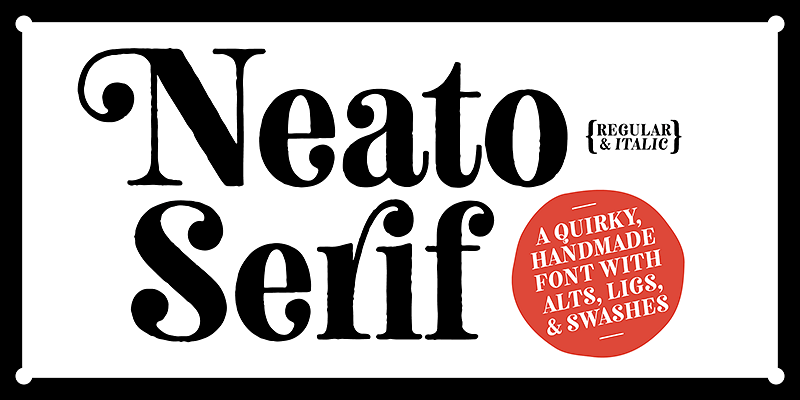
The Neato Serif Font Family is a delightful addition to the catalog of type designer Adam Ladd, offering a unique balance of playful charm and traditional elegance. Designed by Adam Ladd, who is known for his eclectic and diverse font designs, the Neato Serif brings versatility to the forefront while maintaining a distinctive, approachable style.
The Design Philosophy Behind Neato Serif
Adam Ladd’s approach to Neato Serif reflects his broader philosophy of creating typefaces that are both functional and expressive. This font family was crafted with an emphasis on clean, geometric forms combined with the warmth of hand-drawn touches. The result is a serif typeface that feels both structured and friendly, making it suitable for a wide variety of applications. Whether used for branding, editorial design, or web typography, Neato Serif provides an inviting and visually appealing option for designers.
Characteristics of Neato Serif
At its core, Neato Serif blends the traditional elements of serif fonts with contemporary nuances. The typeface is defined by its:
- Geometric Shapes: The design incorporates geometric serifs that are slightly softened to avoid the rigidity often associated with other serif typefaces. These shapes give the font a modern, clean feel.
- Playful Curves: What sets Neato Serif apart is the playful curves found throughout its letterforms. The gentle arches and organic strokes add warmth to the typeface, making it feel more approachable while retaining its professional tone.
- Elegant Proportions: The typeface features well-balanced proportions, with clear distinctions between thick and thin strokes, creating a contrast that enhances legibility while maintaining a sense of sophistication.
- Readable at Various Sizes: The font is designed to perform well in both large display contexts and small body text, making it highly adaptable. Its clarity and defined structure ensure it remains readable even at smaller sizes.
The Versatility of Neato Serif
One of the greatest strengths of the Neato Serif Font Family is its versatility. This type family includes multiple weights and styles, allowing designers to create a cohesive yet varied visual language within a single project. From headlines and titles to long-form text, Neato Serif can adapt to different roles with ease.
Its versatility can be attributed to the range of weights available, from light and elegant to bold and assertive. This means that Neato Serif can be used effectively across a range of projects, including:
- Editorial Design: The elegance of Neato Serif makes it a perfect fit for editorial and magazine layouts. Its readability and character help guide the eye through long passages of text while still drawing attention to headers and subheadings.
- Branding: The playful yet sophisticated design of Neato Serif makes it an ideal choice for branding projects. It conveys professionalism without being overly formal, making it suitable for brands that want to project both trust and creativity.
- Web Typography: As the web increasingly becomes a primary medium for reading, Neato Serif stands out as a highly legible and visually appealing choice for web typography. Its design ensures that it remains sharp and clear on digital screens, while its personality helps it stand out in a crowded digital landscape.
- Packaging Design: With its approachable yet refined look, Neato Serif can be used to great effect in packaging design. It can convey both a sense of quality and a creative flair, making it suitable for product packaging in various industries, including food, fashion, and tech.
Font Features
The Neato Serif Font Family comes equipped with a robust set of OpenType features, allowing designers even more flexibility and control. Some of the key features include:
- Ligatures: These special character combinations enhance the flow of text and give it a more organic feel. They are especially useful in display settings, adding flair and polish to logos, titles, and headers.
- Stylistic Alternates: Neato Serif includes alternate letterforms for added creativity. These alternates allow designers to introduce variety and subtle visual differences, adding extra personality to their work.
- Extended Language Support: The font family is designed with global accessibility in mind. It supports a wide range of Latin-based languages, making it a versatile choice for projects that span different regions and linguistic groups.
- Numerals and Punctuation: The font family includes a comprehensive set of numerals and punctuation marks, ensuring it can be used across diverse typesetting needs, from editorial layouts to financial reports.
The Aesthetic Appeal of Neato Serif
The aesthetic appeal of Neato Serif lies in its ability to strike the right balance between tradition and modernity. The serif detailing nods to classical typefaces, while the soft curves and geometric forms bring a contemporary edge. This duality makes it an appealing choice for both nostalgic and forward-thinking design projects.
In display settings, Neato Serif can evoke a sense of authority and trustworthiness, while in body text, it feels light and easy to read. Its adaptability to various design contexts means it can serve as both the centerpiece of a project or play a supporting role without losing its distinctive character.
Neato Serif in Use: Case Studies
Branding for a Modern Café
Imagine a modern, cozy café looking to establish a brand identity that is both warm and contemporary. Neato Serif would be an excellent choice for the café’s logo and branding materials. The font’s blend of playful curves and geometric precision would echo the café’s inviting atmosphere, while its professionalism would communicate quality and attention to detail.
A Stylish Fashion Magazine
For a fashion magazine looking to combine elegance with a touch of fun, Neato Serif offers the perfect typographic solution. The magazine could use the bold weights of Neato Serif for headlines and section titles, while relying on the lighter weights for body text. The result would be a cohesive yet dynamic reading experience that aligns with the magazine’s stylish and sophisticated tone.
Conclusion
The Neato Serif Font Family by Adam Ladd represents a masterful blend of classic and contemporary design principles. With its playful curves, geometric forms, and versatile range of weights, Neato Serif is an ideal choice for designers seeking a typeface that can do it all—whether it’s for branding, editorial design, or web typography.
By choosing Neato Serif, designers are opting for a typeface that is not only functional but also brimming with personality, making it a standout option in today’s crowded typographic landscape. With its open and inviting design, Neato Serif is sure to leave a lasting impression on any project it graces.

