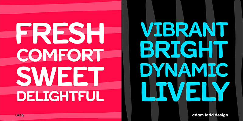
The Likely Sans Font Family, designed by Adam Ladd, stands as a testament to the evolving landscape of modern typography. Known for his ability to create fonts that combine clarity, adaptability, and personality, Adam Ladd has once again delivered a typeface family that offers flexibility for a wide range of design applications. Likely Sans is more than just a sans-serif font—it’s a comprehensive toolkit for modern designers seeking a balance between functionality and aesthetics.
Adam Ladd’s Design Philosophy
Adam Ladd is recognized for his ability to create fonts that serve both creative and practical needs. Whether it’s a bold display font or a clean sans-serif for body text, his designs often incorporate a balance between readability and visual appeal. With Likely Sans, Ladd takes a utilitarian approach, creating a font family that embodies the essence of simplicity and versatility. Ladd’s deep understanding of design trends and typographic history allows him to produce fonts that feel fresh yet familiar, and Likely Sans is a perfect example of this talent.
The Inspiration Behind Likely Sans
At its core, Likely Sans was designed to meet the needs of modern designers who require a font that can adapt to various design environments. In an age where digital, print, and branding projects often overlap, a flexible sans-serif typeface like Likely Sans is indispensable. The simplicity of the font allows it to function as both a workhorse for long-form text and a stylish option for headlines and branding.
Likely Sans draws inspiration from classic geometric sans-serif fonts, but with modern refinements that make it particularly well-suited for contemporary design work. It strikes a balance between minimalism and character, offering clean lines and proportions without feeling sterile. The subtle nuances in the curves and angles give the font a unique, approachable personality, which can bring warmth to otherwise minimalistic designs.
Font Styles and Variants
One of the standout features of the Likely Sans Font Family is its extensive range of styles and weights. This versatility ensures that designers have the tools they need for any type of project, from sleek digital interfaces to polished print layouts.
- Likely Sans Regular: The core style of the family, Likely Sans Regular offers a neutral tone that works well in body text or subheadings. Its clean and balanced design provides excellent readability, making it a go-to choice for websites, mobile apps, and editorial design.
- Likely Sans Bold: Likely Sans Bold takes the foundation of the regular style and adds weight and presence. This makes it ideal for headlines, logos, and other display applications where the text needs to make a strong visual impact without overpowering the overall design.
- Likely Sans Italic: Adding a dynamic slant, the italic variant brings a sense of motion and emphasis to the family. It’s perfect for emphasizing text or creating hierarchy within designs, while still maintaining the clarity and simplicity of the regular style.
- Likely Sans Light: A lighter weight of Likely Sans, this variant is perfect for more delicate applications where subtlety is key. It’s excellent for use in fine print, captions, or understated brand identities that require a more refined touch.
- Likely Sans Extra Bold: For designs that demand maximum attention, the Extra Bold weight delivers a commanding presence. This style is ideal for striking headlines, large banners, or any application where the type needs to take center stage.
- Additional Weights: Likely Sans offers a full range of weights from thin to black, giving designers complete control over typographic contrast and emphasis. The consistency across these weights ensures that the font remains cohesive, no matter which combination is used.
Key Features of Likely Sans
The Likely Sans Font Family is packed with features that make it a reliable choice for designers working in a variety of mediums. From branding to user interfaces, Likely Sans offers flexibility, readability, and character. Here are some of the key features that set it apart:
- Geometric Roots with Modern Refinements: Likely Sans takes inspiration from geometric sans-serif fonts, known for their clean, precise forms. However, it incorporates subtle humanist elements, such as softened curves and more natural letter shapes, which add warmth and approachability to the design. This balance between geometry and humanism makes the font adaptable across different industries and design styles.
- Optimized for Both Digital and Print: With its clean lines and carefully crafted letterforms, Likely Sans works equally well in both digital and print environments. Whether it’s used for responsive websites, mobile apps, or high-quality print materials, the font’s clarity and versatility shine through. Its optimized proportions ensure that it performs well in a wide range of sizes, from small captions to large headlines.
- Extensive Language Support: Likely Sans includes comprehensive language support, making it a versatile option for international projects. The font family covers a broad range of Latin-based languages, ensuring that it can be used in multilingual projects without sacrificing design cohesion.
- OpenType Features: The Likely Sans Font Family includes several OpenType features, such as ligatures, alternate characters, and numeral styles. These options provide designers with extra creative flexibility, allowing them to fine-tune the typography for specific design needs. Whether you’re looking to add some subtle flair with alternate glyphs or ensure consistency in numeric data with tabular figures, Likely Sans has you covered.
- Balanced Proportions for Readability: One of the standout characteristics of Likely Sans is its excellent readability. The balanced x-height, carefully spaced letterforms, and open apertures ensure that the font remains legible across all sizes and weights. This makes it a reliable choice for body text, user interfaces, and long-form content, where clarity is crucial.
Ideal Use Cases for Likely Sans
The Likely Sans Font Family’s combination of versatility, readability, and style makes it suitable for a wide variety of design projects. Below are some of the most common use cases:
- Branding and Identity Design: Likely Sans’ clean and modern design makes it a strong candidate for branding projects. Its geometric precision combined with its approachable personality makes it suitable for brands in tech, fashion, healthcare, and more. The extensive weight options allow designers to create cohesive brand hierarchies, from logos to marketing materials.
- User Interfaces and Digital Design: Likely Sans is an excellent choice for user interface (UI) design due to its clarity and adaptability. Its clean letterforms ensure readability on screens of all sizes, from mobile devices to desktops. Whether it’s used in navigation menus, buttons, or body text, Likely Sans enhances the user experience with its legibility and simplicity.
- Editorial and Print Design: For magazines, newspapers, and books, Likely Sans offers a contemporary typeface that can work across various text levels, from headlines to captions. Its range of weights and styles allows designers to create distinct typographic hierarchies while maintaining visual cohesion throughout the publication.
- Web and Social Media Graphics: In the fast-paced world of web and social media design, where attention spans are short, Likely Sans delivers impactful yet clean typography. It can be used for headlines, calls to action, or body text, ensuring that the message is clear and visually appealing in digital formats.
- Packaging and Retail Design: With its clean and modern look, Likely Sans is a great option for packaging design, especially in industries that value minimalism and elegance. Whether for high-end retail products or tech gadgets, the font family can help create a polished and sophisticated look.
Conclusion
The Likely Sans Font Family, designed by Adam Ladd, is an outstanding example of contemporary type design that emphasizes versatility, clarity, and style. With its geometric roots, modern refinements, and wide range of weights and styles, Likely Sans offers designers a flexible toolkit for any project. Whether you’re working on branding, editorial layouts, UI design, or digital graphics, Likely Sans provides the reliability and aesthetic appeal needed to elevate your design. Its thoughtful construction and attention to detail ensure that it performs well across various mediums, making it a valuable asset in any designer’s font library.

