The Kestrel Script Font Family, designed by the esteemed British type designer Alan Meeks, is an exquisite script typeface that exudes elegance, sophistication, and fluidity. Known for his mastery in creating typefaces that seamlessly combine traditional artistry with modern functionality, Meeks’ work on the Kestrel Script family brings a new level of grace to the world of script typography. This font family is a versatile and beautifully designed script that evokes a handwritten quality, making it an excellent choice for a wide range of design applications that demand a personal, luxurious, or creative touch.
Characterized by its flowing strokes, graceful curves, and finely detailed letterforms, the Kestrel Script Font Family captures the essence of traditional calligraphy while providing modern usability. It stands out as a perfect solution for designers looking to create a sense of refined elegance, whether it be in branding, invitations, signage, or editorial design. Alan Meeks’ attention to detail and his deep understanding of classical script elements are fully realized in the Kestrel Script family, making it a remarkable addition to his expansive body of work.
Alan Meeks: A Versatile Designer with a Classic Touch
Alan Meeks has established himself as a versatile type designer known for his ability to create fonts that range from classic serifs to modern sans-serifs, as well as decorative scripts. His career has spanned several decades, during which he has crafted typefaces that not only remain relevant but are also widely appreciated for their precision and beauty.
Meeks’ approach to type design is rooted in traditional principles, but he applies them with a modern sensibility that makes his fonts highly functional for contemporary design contexts. The Kestrel Script Font Family is an example of Meeks’ ability to capture the artistic qualities of classical calligraphy while creating a typeface that is adaptable to today’s digital and print environments. His deep understanding of the form, structure, and history of type design allows him to craft fonts like Kestrel Script that stand out for their elegance and clarity.
The Inspiration Behind Kestrel Script
The Kestrel Script Font Family takes its inspiration from traditional calligraphy, particularly the elegant and expressive forms of cursive handwriting. The typeface is designed to mimic the fluid motion of a calligrapher’s pen, with its smooth, connected letterforms and delicate flourishes. This results in a typeface that feels both natural and dynamic, with each letter appearing as though it has been carefully penned by hand.
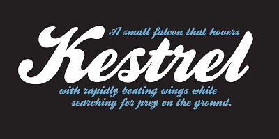
The name “Kestrel” is a nod to the grace and agility of the bird of prey, qualities that are reflected in the sweeping curves and fluidity of the font’s letterforms. Like the kestrel in flight, the typeface is poised and refined, with a sense of movement that gives it a lively and organic feel. Meeks has carefully designed the Kestrel Script family to capture the balance between structure and freedom, creating a script that is both formal and expressive.
Key Design Features of Kestrel Script
The Kestrel Script Font Family is distinguished by several key design features that make it a standout choice among script fonts. These features contribute to its versatility and appeal, allowing it to be used across a wide range of design applications:
- Flowing, Connected Letterforms: Kestrel Script is characterized by its smoothly connected letters, which mimic the fluid motion of a pen in cursive writing. This creates a sense of continuity and grace, making the typeface feel both elegant and natural. The connections between letters are seamless, ensuring that the text flows beautifully when set in longer lines.
- Elegant Flourishes and Swashes: One of the most notable features of Kestrel Script is its elegant flourishes and swashes, which add a touch of decorative charm to the letterforms. These embellishments enhance the overall sophistication of the typeface, making it ideal for formal applications such as invitations, branding, and high-end packaging. The flourishes are carefully balanced to avoid overwhelming the design, allowing the typeface to remain legible and refined.
- Versatile Weight Range: The Kestrel Script Font Family includes a range of weights, from light to bold, providing designers with flexibility in how they use the font. The lighter weights are perfect for delicate, feminine designs, while the bolder weights add impact and contrast in headlines or display settings. This versatility makes the font family suitable for both large-scale uses, such as signage, and more intimate applications, such as wedding invitations or stationery.
- Handwritten Aesthetic with Modern Functionality: While Kestrel Script retains the organic and handcrafted quality of traditional calligraphy, it is optimized for modern design needs. The font family is highly legible even at smaller sizes, making it suitable for body text in editorial and print design, as well as for larger display purposes. Its digital-friendly structure ensures that the typeface maintains clarity and detail on screen, making it an excellent choice for web and mobile applications.
- Extended Character Set: Kestrel Script supports a wide range of languages, offering an extended character set that includes diacritical marks, ligatures, and alternate characters. This makes the font family suitable for international use and allows designers to customize the typography to suit their specific needs, adding variety and personality to their designs.
- Refined Letterform Proportions: The proportions of the letterforms in Kestrel Script are carefully designed to ensure harmony and balance. The ascenders and descenders are gracefully elongated, contributing to the typeface’s overall elegance, while the x-height is moderate enough to ensure readability. This careful attention to proportion allows the typeface to retain its beauty and clarity across different sizes and media.
Use Cases for Kestrel Script
The Kestrel Script Font Family’s graceful and luxurious appearance makes it an ideal choice for a wide variety of design applications, particularly those that require a personal, elegant touch. Its versatility and timeless appeal allow it to be used across a range of projects, from formal invitations to branding and beyond.
- Wedding Invitations and Stationery: One of the most popular uses of Kestrel Script is in wedding invitations and other formal stationery. Its elegant flourishes and handwritten feel make it the perfect choice for designs that aim to convey a sense of romance and sophistication. The font family’s range of weights allows designers to create beautiful typographic hierarchies for invitations, menus, place cards, and more.
- Luxury Branding and Packaging: Kestrel Script is a natural fit for luxury branding and packaging, where its refined letterforms can elevate the perceived value of a product or brand. Whether used in a logo or on product packaging, the typeface’s sense of elegance and exclusivity makes it ideal for high-end goods such as cosmetics, fashion, or gourmet foods.
- Editorial Design and Magazine Layouts: The Kestrel Script Font Family’s versatility extends to editorial design, where it can be used for headings, pull quotes, and other display elements. Its stylish curves and graceful flow make it an excellent choice for magazine layouts that require a touch of glamour and personality. The font’s legibility at smaller sizes also makes it suitable for use in captions or subheadings.
- Signage and Event Graphics: The bold, impactful weights of Kestrel Script make it suitable for signage and event graphics, particularly in contexts that demand a sense of formality or celebration. Whether used for a gala, exhibition, or luxury event, Kestrel Script adds a touch of grandeur and elegance that commands attention.
- Personal and Handcrafted Goods: The handwritten aesthetic of Kestrel Script lends itself well to designs that aim to convey a personal or artisanal feel. It is a popular choice for handmade goods, artisanal products, and personal branding, where its organic, flowing forms can create a sense of authenticity and craftsmanship.
The Timeless Appeal of Kestrel Script
The enduring appeal of the Kestrel Script Font Family lies in its ability to balance the beauty of traditional calligraphy with the needs of modern design. Alan Meeks has expertly crafted a typeface that feels at once timeless and contemporary, offering designers the flexibility to use it in a wide variety of contexts. Its elegance, combined with its functional clarity, ensures that Kestrel Script remains a relevant and valuable tool in the designer’s toolkit.
Whether used for formal invitations, luxury branding, or creative editorial layouts, Kestrel Script delivers a sense of elegance and sophistication that elevates any design. Its versatility across weights, languages, and design applications makes it a typeface that will continue to inspire and delight designers for years to come.
Conclusion
The Kestrel Script Font Family, designed by Alan Meeks, is a masterful example of script typography that combines the elegance of traditional calligraphy with the versatility of modern type design. With its flowing letterforms, elegant flourishes, and refined proportions, Kestrel Script is a typeface that can bring a sense of sophistication and grace to a wide range of design projects.
Whether used in weddings, luxury branding, or editorial design, Kestrel Script offers designers a versatile and beautiful tool to create timeless, elegant, and visually captivating designs. Alan Meeks’ attention to detail and his ability to blend tradition with modernity have resulted in a font family that remains both relevant and deeply admired in the world of typography.

