The Heimat Stencil Font Family, designed by Christoph Dunst from Atlas Fonts, is an extraordinary blend of modern geometric design and traditional stencil aesthetics. This typeface is part of the larger Heimat superfamily, which includes Heimat Sans, Heimat Didone, Heimat Mono, and Heimat Display. Each member of the Heimat superfamily brings a distinct approach to typography, and Heimat Stencil is no exception. By combining the rugged, utilitarian look of stencil fonts with Dunst’s signature geometric precision, Heimat Stencil emerges as a bold, versatile font family suitable for a range of applications from branding to editorial design.
The Origins and Evolution of Stencil Fonts
Stencil fonts have a rich history in typography, traditionally used for practical applications such as labeling, signage, and military markings. The characteristic breaks in the letterforms, designed to prevent the stencil from collapsing during use, gave these fonts a utilitarian look that was both functional and distinctive. Over time, stencil fonts have evolved beyond their functional origins to become a popular aesthetic choice in graphic design, particularly for projects requiring a bold, industrial feel.
Heimat Stencil takes this stencil heritage and reimagines it for the modern age. Christoph Dunst, known for his innovative approach to type design, has infused Heimat Stencil with geometric rigor and contemporary style, creating a typeface that feels fresh and relevant while still honoring the traditional elements of stencil typography.
Design Characteristics of Heimat Stencil
Heimat Stencil is meticulously designed to balance the bold, industrial nature of stencil fonts with the clean, geometric aesthetics that define the Heimat superfamily. Several key design features contribute to the typeface’s unique visual appeal:
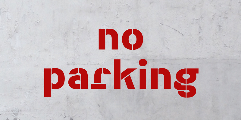
- Geometric Precision: Like the other members of the Heimat superfamily, Heimat Stencil is built on a foundation of geometric shapes. The letterforms are based on simple shapes such as circles, rectangles, and squares, creating a clean, modern look that is consistent across the entire font family. The precision of the geometry ensures that Heimat Stencil remains clear and legible, even with the characteristic stencil breaks in the letterforms.
- Rugged Stencil Breaks: The most distinctive feature of Heimat Stencil is, of course, the breaks in the letterforms that define stencil fonts. These breaks are carefully placed to maintain the structural integrity of the typeface while adding a rugged, industrial feel. The breaks also enhance the geometric nature of the design, giving the typeface a bold, graphic quality that stands out in both print and digital media.
- Bold and Impactful: Heimat Stencil is designed to make a statement. The bold letterforms and high contrast between the thick and thin strokes ensure that the typeface commands attention. Whether used in large headlines or striking signage, Heimat Stencil delivers a strong visual impact that makes it perfect for projects requiring a bold typographic presence.
- Versatile Weight Options: Heimat Stencil offers a range of weights, from light to bold, allowing designers to choose the appropriate level of emphasis for their projects. The lighter weights are ideal for subtler, more refined applications, while the bolder weights are perfect for making a strong visual statement. This flexibility makes Heimat Stencil a versatile tool for a wide range of design contexts.
- Clean and Minimalist Aesthetic: While Heimat Stencil has a rugged, industrial feel, it also maintains the minimalist aesthetic that defines the Heimat superfamily. The clean lines and geometric forms give the typeface a modern, polished look, making it suitable for contemporary design projects that require a balance of boldness and sophistication.
- Wide Character Set: Heimat Stencil comes with a comprehensive character set, including uppercase and lowercase letters, numerals, punctuation, and special characters. This wide range of characters ensures that the font family can handle diverse design needs, from simple logos to complex multilingual projects.
The Aesthetic Appeal of Heimat Stencil
Heimat Stencil’s aesthetic is a unique fusion of industrial and modern design. The stencil breaks in the letterforms evoke a sense of utility and functionality, while the geometric construction lends the typeface a clean, modern edge. This combination creates a font that is both visually striking and highly functional, making it ideal for a variety of design applications.
The bold, graphic quality of Heimat Stencil makes it a great choice for projects where typography needs to stand out. Its rugged, industrial aesthetic is particularly well-suited for branding and packaging in sectors like fashion, technology, and manufacturing, where a bold, contemporary look is essential. At the same time, the minimalist design ensures that Heimat Stencil remains versatile enough to work in more subtle contexts, such as editorial layouts or web design.
Ideal Applications for Heimat Stencil
Heimat Stencil’s bold, geometric design makes it a versatile typeface that can be used in a wide range of applications. Some of the best uses for Heimat Stencil include:
- Branding and Identity Design: Heimat Stencil’s bold, industrial aesthetic makes it an excellent choice for brands that want to project a modern, strong, and confident image. Whether used in logos, packaging, or corporate identity materials, Heimat Stencil’s striking letterforms ensure that the brand stands out. Its rugged look is especially well-suited for industries such as tech, fashion, and architecture, where a bold, cutting-edge aesthetic is crucial.
- Signage and Display: The stencil breaks and bold letterforms make Heimat Stencil perfect for signage and display applications. Its strong geometric shapes ensure that it remains legible even from a distance, making it ideal for use in outdoor signage, wayfinding systems, or large-scale advertising campaigns. The bold impact of the typeface helps capture attention and communicate messages clearly.
- Posters and Flyers: Heimat Stencil’s graphic, attention-grabbing style makes it a great choice for posters and flyers. Whether promoting events, products, or exhibitions, the boldness of the typeface ensures that the message is delivered effectively. Its industrial aesthetic also lends itself to projects that require a contemporary, edgy look.
- Editorial Design: While Heimat Stencil is bold enough for large headlines, it can also be used in more refined editorial contexts. The lighter weights of the font family work well for subheadings and smaller text, creating visual hierarchy in magazine spreads or brochures. The clean lines and geometric forms of Heimat Stencil ensure that it remains readable and professional, even in complex editorial layouts.
- Web and Digital Design: Heimat Stencil’s modern, minimalist design translates well to digital environments. Its bold, graphic quality ensures that it stands out on screens, making it an excellent choice for websites, digital advertisements, and user interfaces. The geometric precision of the typeface ensures that it remains crisp and clear, even at smaller sizes.
Christoph Dunst’s Design Vision
Christoph Dunst is known for his ability to blend traditional typographic elements with modern, innovative design. The Heimat superfamily, and specifically Heimat Stencil, reflects his commitment to creating typefaces that are both functional and aesthetically striking. Dunst’s work is characterized by a deep understanding of typographic history, which he combines with a forward-thinking approach to type design.
Heimat Stencil, in particular, is a testament to Dunst’s ability to transform a utilitarian font style like the stencil into something modern and versatile. The typeface honors the practical origins of stencil fonts while elevating them to a new level of design sophistication. This balance between functionality and creativity is a hallmark of Dunst’s work and is evident throughout the Heimat superfamily.
The Heimat Superfamily: A Unified Typographic System
Heimat Stencil is part of the Heimat superfamily, a cohesive collection of typefaces that includes Heimat Sans, Heimat Mono, Heimat Didone, and Heimat Display. Each member of the superfamily shares a common geometric design language, making them compatible with one another in a wide range of design contexts. Designers can mix and match different styles from the Heimat superfamily to create a unified visual identity across multiple platforms, from print to digital.
The Heimat superfamily’s versatility makes it a valuable tool for designers working on projects that require consistency and flexibility. By using multiple styles from the Heimat superfamily, designers can create a cohesive visual language while still having the freedom to experiment with different typographic styles and aesthetics.
Conclusion
The Heimat Stencil Font Family, designed by Christoph Dunst from Atlas Fonts, is a bold, geometric typeface that brings a modern edge to the traditional stencil font style. With its clean lines, industrial breaks, and versatile weight options, Heimat Stencil is a valuable tool for designers seeking a strong typographic presence. Whether used for branding, signage, editorial layouts, or digital design, Heimat Stencil delivers both visual impact and functionality.
As part of the Heimat superfamily, Heimat Stencil shares its design DNA with other typefaces like Heimat Sans and Heimat Didone, making it a cohesive part of a larger typographic system. Christoph Dunst’s innovative approach to type design ensures that Heimat Stencil is not only visually striking but also highly usable, making it a standout choice in modern design.

