The Heimat Sans Font Family, designed by Christoph Dunst from Atlas Fonts, is a sophisticated sans-serif typeface that captures the essence of modern geometric design while maintaining high readability and versatility. As a part of the Heimat superfamily, which includes other styles like Heimat Mono, Heimat Display, and Heimat Didone, Heimat Sans is designed to serve a wide range of purposes, making it an ideal tool for branding, editorial work, digital design, and much more. Its minimalist design and geometric foundations place it among the most elegant and functional sans-serif typefaces available today.
The Roots of Geometric Sans-Serif Typefaces
Sans-serif fonts have long been the go-to for designers seeking a clean, modern look. The geometric sans-serif category, in particular, is known for its reliance on basic shapes such as circles, squares, and triangles, creating an almost mathematical precision in letterform construction. This approach to design has been popular since the early 20th century, with typefaces like Futura and Avenir serving as iconic examples.
Heimat Sans builds upon this geometric tradition but takes it further by injecting contemporary elements into the typeface. While adhering to the rigid geometric construction that defines this genre, Christoph Dunst adds a unique, modern flair that makes Heimat Sans feel both timeless and cutting-edge. This balance allows the font to work well in both formal and informal design contexts.
Key Features and Design Characteristics
Heimat Sans is meticulously designed with attention to detail, making it stand out in the vast landscape of geometric sans-serif fonts. Several key characteristics define the visual language and functionality of Heimat Sans:
- Geometric Foundations: At its core, Heimat Sans is built upon the principles of geometric design. Its letterforms are based on basic shapes, resulting in a consistent and harmonious look. The rounded shapes of letters like “O” and “C” reflect perfect circles, while the straight lines in characters like “H” and “E” evoke a strong sense of order and precision.
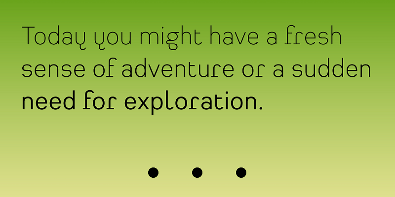
- Minimalist and Clean: One of the hallmarks of Heimat Sans is its minimalist design. The font does away with excessive ornamentation, focusing instead on clarity and simplicity. This minimalist approach gives Heimat Sans a sleek, modern aesthetic, making it an ideal choice for contemporary design projects.
- Versatility and Flexibility: Heimat Sans is designed to be versatile, with a range of weights and styles that offer flexibility to designers. Whether you’re looking for a light and airy typeface for body text or a bold, impactful font for headlines, Heimat Sans has a weight that will suit your needs. The various weights ensure that Heimat Sans can be used for a wide range of design applications, from editorial layouts to user interfaces.
- Humanist Influence: While Heimat Sans adheres to geometric principles, it also incorporates subtle humanist influences, softening the rigid geometry with slightly rounded corners and a more approachable feel. This helps to balance the technical precision of the font with a sense of warmth and friendliness, making it suitable for brands and projects that require a more human touch.
- Strong Vertical Stress: Heimat Sans maintains a strong vertical stress throughout its letterforms, contributing to its clean and orderly appearance. This characteristic gives the font a sense of stability and professionalism, making it particularly effective for corporate branding and editorial design.
- Wide Character Set: Heimat Sans offers a comprehensive character set, including uppercase and lowercase letters, numerals, punctuation, and special characters. It supports multiple languages, making it a versatile tool for international projects. The font also includes ligatures and alternate characters, allowing designers to explore creative typographic variations.
- Highly Legible: One of the most important aspects of any sans-serif font is its legibility, and Heimat Sans excels in this area. Whether used in small body text or large headlines, the clarity of each letterform ensures that the font remains readable across different mediums, from print to digital. This makes it an excellent choice for websites, mobile apps, magazines, and signage.
The Heimat Sans Aesthetic
Heimat Sans has a strong, confident presence, thanks to its geometric precision and minimalist design. The typeface is clean, modern, and uncluttered, making it highly adaptable for various design contexts. Whether you’re working on a corporate website, a tech startup’s branding, or a sleek editorial spread, Heimat Sans brings a sense of professionalism and modernity to the project.
Because of its strong geometric shapes and clean lines, Heimat Sans conveys a sense of stability, trust, and efficiency. It is a font that feels reliable and structured, which is why it’s an excellent choice for projects that require a clean, organized, and authoritative look.
Applications of Heimat Sans
Heimat Sans is incredibly versatile and can be used in a wide variety of applications, from branding and editorial work to digital design and signage. Some of its most common uses include:
- Branding and Corporate Identity: Heimat Sans is an ideal choice for companies that want to project a modern, professional image. Its clean, geometric design conveys trustworthiness and reliability, making it particularly well-suited to corporate branding. The versatility of the font also allows it to be used across a company’s entire visual identity, from logos and business cards to websites and presentations.
- Web and App Design: In digital environments, legibility is key, and Heimat Sans delivers clarity and readability across a wide range of screen sizes and resolutions. Its geometric forms and minimalist design make it particularly effective in web and app design, where simplicity and user-friendliness are paramount.
- Editorial and Print Design: Heimat Sans is an excellent choice for editorial design, whether in magazines, newspapers, or books. Its clean lines and wide range of weights make it easy to create visual hierarchies in layouts, ensuring that both body text and headlines are easy to read and visually appealing.
- Signage and Wayfinding: The clarity and legibility of Heimat Sans make it a great option for signage and wayfinding systems, where quick readability from a distance is essential. Its strong geometric structure ensures that the font remains legible even at large sizes, making it a perfect choice for indoor and outdoor signage.
- Advertising and Marketing: For brands that want to create bold, attention-grabbing advertising campaigns, Heimat Sans provides a strong visual impact. Its clean, structured appearance helps to create a sense of authority and professionalism, while its geometric design ensures that it stands out in crowded advertising spaces.
Christoph Dunst’s Design Philosophy
Christoph Dunst, the founder of Atlas Fonts and the designer behind Heimat Sans, has a deep understanding of typography and a clear vision for how typefaces should function in modern design contexts. His work is characterized by a commitment to both form and function, ensuring that his typefaces are not only visually striking but also practical and highly usable.
In Heimat Sans, Dunst has created a font that embodies the modern design principles of clarity, precision, and simplicity. His geometric approach to type design ensures that Heimat Sans is clean and structured, while subtle humanist influences give the typeface a warmth and approachability that sets it apart from more rigid geometric sans-serif fonts.
Dunst’s dedication to creating typefaces that are both aesthetically pleasing and functionally effective is evident in the Heimat superfamily, where each member works harmoniously with the others to create a cohesive typographic system. Heimat Sans, as part of this superfamily, shares its design DNA with other fonts like Heimat Mono and Heimat Didone, allowing designers to create visual consistency across a wide range of projects.
The Heimat Superfamily: A Typographic System
The Heimat superfamily is a carefully curated collection of typefaces, each with its own unique characteristics but designed to work together in a unified system. Heimat Sans, as the sans-serif member of the family, plays a crucial role in this system, offering a clean, geometric alternative to its serif and display counterparts.
Designers who use multiple members of the Heimat superfamily in their projects benefit from a cohesive visual language that maintains consistency while offering enough variety to keep the design interesting. Whether used for branding, editorial layouts, or web design, the Heimat superfamily provides a versatile typographic solution for any project.
Conclusion
The Heimat Sans Font Family, designed by Christoph Dunst from Atlas Fonts, is a masterclass in modern geometric type design. Its clean, structured letterforms, minimalist aesthetic, and versatile functionality make it a valuable tool for designers working in a wide range of applications, from corporate branding to editorial layouts. As part of the Heimat superfamily, Heimat Sans offers a cohesive and reliable option for any project that requires clarity, precision, and modernity.
With its balance of geometric rigor and humanist warmth, Heimat Sans is a timeless and essential typeface for contemporary designers. It embodies Christoph Dunst’s commitment to creating typefaces that are both beautiful and functional, making it a standout choice in today’s competitive landscape of sans-serif fonts.

