The Heimat Mono Font Family, designed by Christoph Dunst from Atlas Fonts, is a distinctive typeface that merges the precision of monospaced fonts with the bold, geometric aesthetics for which the Heimat superfamily is known. Heimat Mono combines the rigid, uniform nature of monospaced typefaces—where each character takes up the same horizontal space—with Dunst’s innovative approach to type design, resulting in a versatile and visually striking font family. It’s part of the broader Heimat superfamily, designed to be a cohesive yet diverse set of fonts that work harmoniously across various design contexts.
The Evolution of Monospaced Fonts
Monospaced typefaces, often referred to as fixed-width or non-proportional fonts, have historically been associated with technical applications, such as programming, coding, or typewriters. These fonts are characterized by their uniformity, where each letter or character occupies an identical amount of space, regardless of its width. While monospaced fonts were originally designed for functional purposes, they have recently gained popularity for their minimalist, retro-futuristic aesthetic, often used in modern design projects to convey simplicity, technical sophistication, or a nostalgic nod to older technologies.
Heimat Mono builds on this legacy by introducing a geometric and modern flair. While maintaining the monospaced characteristics that make such fonts ideal for technical or tabular work, Christoph Dunst brings a contemporary edge to the design, transforming Heimat Mono into a versatile tool for creative professionals seeking a clean, structured, and visually unique typeface.
Key Design Features of Heimat Mono
Heimat Mono is distinguished by several key design features that set it apart from traditional monospaced fonts. Christoph Dunst has taken the principles of fixed-width typefaces and injected them with a bold, modern energy, making Heimat Mono suitable for both technical and creative applications. Some of its defining features include:
- Geometric Precision: Like other members of the Heimat superfamily, Heimat Mono is built on strong geometric foundations. The shapes of the letterforms are meticulously crafted to maintain a consistent and precise structure, reflecting the uniformity required in monospaced typefaces. This geometric rigor ensures that the typeface remains clean, legible, and well-balanced, even when used at larger sizes.
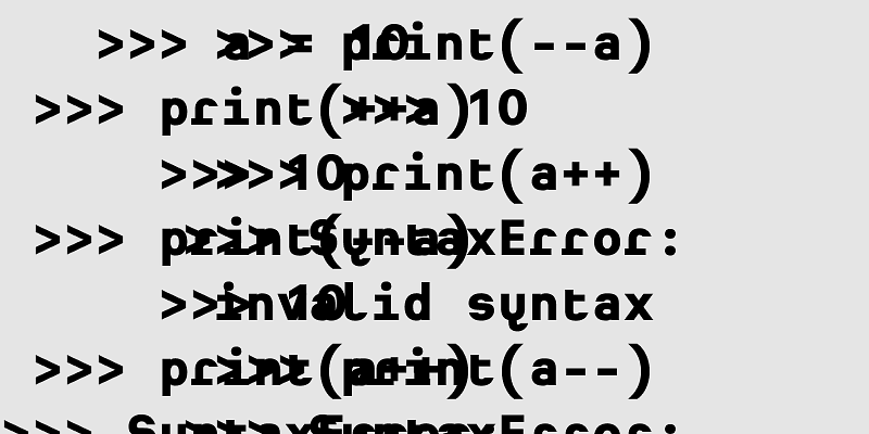
- Monospaced Structure: The most distinctive feature of Heimat Mono is its monospaced design, where every character occupies the same horizontal space. This fixed-width structure is crucial for applications where alignment and uniformity are essential, such as coding environments or data tables. However, unlike more utilitarian monospaced fonts, Heimat Mono brings an element of style to the table, making it just as effective in creative design projects.
- Bold and Minimalist Letterforms: Heimat Mono’s letterforms are bold and minimalist, staying true to the geometric principles of the Heimat superfamily. The characters are clean and straightforward, without excessive ornamentation, which allows them to stand out clearly in both large and small sizes. The minimalism of the design also lends itself to modern, cutting-edge design projects where simplicity and clarity are paramount.
- Functional Flexibility: While Heimat Mono is a fixed-width typeface, it doesn’t sacrifice versatility for the sake of uniformity. Christoph Dunst has carefully designed each character to ensure that the typeface remains highly readable and functional in a variety of contexts. This makes Heimat Mono an excellent choice for use in technical documents, coding interfaces, or editorial layouts, as well as more artistic applications like posters, web design, and branding.
- Comprehensive Character Set: Heimat Mono comes equipped with a comprehensive set of characters, including uppercase and lowercase letters, numerals, punctuation, and a wide range of special characters. This ensures that the typeface is flexible enough to handle a wide variety of design needs, from complex multilingual projects to more standard text-based content.
- Weight Variations: Heimat Mono offers a range of weight options, giving designers the flexibility to choose the level of emphasis they need for their projects. Whether you’re looking for a lightweight font for body text or a bold option for headlines, Heimat Mono provides options to suit different design scenarios.
The Aesthetic Appeal of Heimat Mono
Monospaced fonts like Heimat Mono have a unique aesthetic appeal that makes them stand out from proportional fonts. Their uniform spacing creates a sense of order and structure, which can be particularly effective in designs that require a minimalist or modernist look. The geometric nature of Heimat Mono enhances this aesthetic, giving the font a clean, mechanical appearance that feels both futuristic and retro at the same time.
While many monospaced fonts are seen as utilitarian, Heimat Mono transcends that stereotype by offering a typeface that is not only functional but also visually engaging. Its bold, geometric shapes make it an ideal choice for projects that require a strong visual presence, while its monospaced nature ensures that it remains highly readable and practical for technical uses.
Ideal Applications for Heimat Mono
Heimat Mono’s combination of fixed-width structure and modern design makes it a versatile typeface that can be used in a wide range of applications. Some of the most common and effective uses for Heimat Mono include:
- Coding and Programming: Monospaced fonts are a staple in coding and programming environments because they ensure that each character aligns perfectly, making it easier to read and debug code. Heimat Mono is an excellent choice for developers who want a font that combines the technical advantages of monospaced fonts with a more visually appealing design.
- Technical Documents: In contexts where clarity and precision are critical, such as manuals, user guides, or data-heavy reports, Heimat Mono’s clean lines and fixed-width design ensure that the information is easy to follow. Its geometric aesthetic also gives these documents a professional and modern appearance.
- Branding and Visual Identity: For brands that want to project a modern, minimalist image, Heimat Mono can be an effective choice. Its bold, structured design communicates a sense of reliability, precision, and forward-thinking, making it particularly well-suited to tech companies, startups, and brands that want to emphasize innovation.
- Editorial Design: Heimat Mono’s geometric, minimalist aesthetic makes it an attractive option for editorial design projects, such as magazines, book layouts, or websites. Its clean and orderly appearance can help create visually striking headlines or body text that stands out from more traditional typefaces.
- Posters and Signage: The bold nature of Heimat Mono makes it an excellent choice for posters, signage, and other forms of large-scale graphic design. Its geometric structure ensures that the type remains clear and legible from a distance, while its unique monospaced design adds an element of modernity and style.
Christoph Dunst’s Design Philosophy and the Heimat Superfamily
Christoph Dunst, the founder of Atlas Fonts and the creative mind behind Heimat Mono, is known for his innovative approach to typeface design. His work is characterized by a deep understanding of typography’s historical roots, combined with a forward-thinking approach to creating fonts that meet the needs of contemporary designers.
The Heimat Mono Font Family is part of the broader Heimat superfamily, which includes other styles like Heimat Didone, Heimat Sans, Heimat Stencil, and Heimat Display. Each typeface in the superfamily shares a common geometric design language, allowing them to be used together in a cohesive typographic system. This versatility makes the Heimat superfamily a valuable tool for designers working across multiple platforms, as it provides a consistent visual identity while offering enough variety to suit different design contexts.
Dunst’s design philosophy emphasizes both beauty and functionality. While Heimat Mono is visually striking, it is also designed to be practical and highly usable. The geometric precision of the typeface ensures that it remains legible and effective, even in technical applications, while its modern aesthetic makes it a valuable asset in creative design work.
Conclusion
The Heimat Mono Font Family by Christoph Dunst is a bold and geometric take on the traditional monospaced font. Combining the precision and functionality of fixed-width typefaces with a modern, minimalist design, Heimat Mono offers a versatile tool for designers working across a wide range of applications. Whether used for coding, technical documents, branding, or editorial design, Heimat Mono’s clean lines and uniform structure ensure that it delivers both clarity and visual impact.
As part of the Heimat superfamily, Heimat Mono exemplifies Christoph Dunst’s commitment to creating cohesive, innovative typefaces that meet the needs of modern designers. Its balance of form and function makes it a valuable asset in today’s design landscape, offering both the technical advantages of monospaced fonts and the aesthetic appeal of a bold, contemporary typeface.

