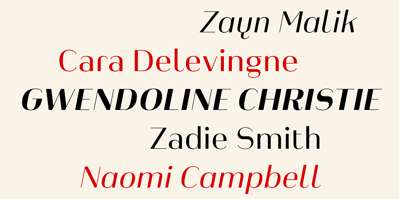
The Heimat Display Font Family, designed by Christoph Dunst from Atlas Fonts, is a bold and captivating typeface that pushes the boundaries of traditional display typography. Known for his innovative approach to type design, Dunst has created a font family that is both aesthetically striking and functionally versatile. Heimat Display, with its geometric construction and assertive character, is crafted to capture attention and make a statement in large-scale applications.
The Heimat Superfamily: A Cohesive Design Approach
Heimat Display is part of the larger Heimat superfamily, which includes other members such as Heimat Sans, Heimat Mono, Heimat Didone, and Heimat Stencil. Each typeface in the superfamily is designed to work together harmoniously, allowing designers to mix and match styles across projects while maintaining a cohesive visual identity.
The Heimat superfamily is rooted in a geometric design philosophy, where precision and structure play a key role. Heimat Display continues this tradition, offering a typeface that is bold, structured, and visually impactful. It is intended for use in large headlines, posters, signage, and other display applications where typography takes center stage.
Design Characteristics of Heimat Display
Heimat Display is designed to stand out. Its most defining feature is its bold, geometric construction, which is both modern and assertive. This typeface is not meant to be subtle or understated; rather, it is designed to command attention. The key design characteristics of Heimat Display include:
- Geometric Letterforms: Heimat Display is based on clean, geometric shapes, giving it a structured, almost mathematical appearance. The precision of its design makes it visually striking and ensures that the typeface retains clarity and legibility even at large sizes.
- Bold Weight Variations: Heimat Display features a range of bold weights, allowing designers to choose between different levels of intensity depending on the project. These weights are designed to make the text pop, ensuring that it grabs attention in both digital and print formats.
- Minimalist Design with High Impact: The simplicity of Heimat Display’s letterforms is one of its strongest assets. While the design is minimalist, the boldness of the typeface ensures that it creates maximum impact. This makes it ideal for applications like posters, billboards, and other forms of visual communication where the type needs to convey a message quickly and effectively.
- Wide Character Set: Heimat Display comes with a wide array of characters, including uppercase and lowercase letters, numerals, punctuation, and special characters. This makes it a versatile tool for designers working in different languages or requiring typographic flexibility in their projects.
- Optimized for Display Use: As the name suggests, Heimat Display is optimized for display purposes. Its design is meant to be seen at large sizes, where the boldness of its forms can be fully appreciated. Whether used in signage, posters, or headlines, the typeface delivers clarity and impact.
The Functional Side of Heimat Display
While Heimat Display is a bold, statement-making typeface, it is also designed with functionality in mind. Christoph Dunst is known for creating fonts that are not just visually appealing but also highly usable. Heimat Display follows this philosophy by balancing form and function. The typeface’s clean lines and geometric construction ensure that it remains legible even at large sizes, making it a practical choice for designers working on high-visibility projects.
The versatility of Heimat Display comes from its range of weights and the clarity of its letterforms. It performs well across various media, from print to digital. In print applications, such as posters or magazine covers, Heimat Display stands out for its boldness and presence. In digital environments, the typeface’s clarity ensures that it remains readable on screens, making it suitable for web design, digital signage, and user interfaces.
Ideal Applications for Heimat Display
Heimat Display’s bold, geometric nature makes it ideal for projects where typography needs to be the focal point. Some of the best applications for Heimat Display include:
- Posters and Flyers: Whether for advertising, events, or exhibitions, Heimat Display’s bold letterforms make it a perfect choice for posters and flyers. Its ability to capture attention at a glance ensures that the message gets across effectively.
- Signage and Wayfinding: The clarity and impact of Heimat Display make it suitable for use in signage and wayfinding systems, where readability from a distance is key. Its structured design ensures that it remains legible even in challenging conditions, such as outdoor environments.
- Branding and Identity Design: For brands that want to make a bold, modern statement, Heimat Display is an excellent choice. Its geometric design can help establish a strong visual identity, especially for brands that want to convey a sense of modernity, strength, and confidence.
- Headlines and Titles: In editorial design, Heimat Display is perfect for creating bold headlines and titles that grab attention. Its boldness ensures that it stands out on magazine covers, book titles, and other editorial applications.
- Digital and Web Design: Heimat Display’s clean, geometric forms make it well-suited for digital design. It performs well on screens, ensuring that the type remains clear and readable in web design, digital advertisements, and other online platforms.
Christoph Dunst’s Typographic Vision
Christoph Dunst, the creative force behind Atlas Fonts, is a designer known for pushing the boundaries of traditional typography. His work is characterized by a deep understanding of typographic history, combined with a desire to innovate and create fonts that meet the demands of modern design. Heimat Display is a reflection of this vision, blending timeless design principles with a forward-thinking approach.
Dunst’s philosophy revolves around the idea that typefaces should not only be beautiful but also functional. Heimat Display is a perfect example of this balance, offering a typeface that is visually bold but also highly usable across different design contexts. His work on the Heimat superfamily further demonstrates his commitment to creating cohesive, versatile typographic systems that allow designers to build a unified visual language across multiple projects.
A Typeface for Modern Design
In the world of modern typography, there is a growing demand for fonts that are not just decorative but also functional and versatile. Heimat Display meets this demand by offering a bold, geometric typeface that works across various media and applications. Its ability to create visual impact while maintaining clarity and legibility makes it an essential tool for designers working in today’s fast-paced, visually-driven world.
Heimat Display’s minimalist yet powerful design ensures that it remains relevant in a wide range of design contexts, from branding and editorial work to digital design and advertising. The typeface is a reflection of the evolving needs of designers who seek to create work that is both aesthetically pleasing and functionally effective.
Conclusion
The Heimat Display Font Family by Christoph Dunst from Atlas Fonts is a bold, geometric typeface designed for modern display applications. Its clean, structured letterforms and range of bold weights make it an ideal choice for projects that require visual impact and clarity. As part of the Heimat superfamily, Heimat Display offers compatibility with other typefaces in the system, allowing designers to create cohesive, unified visual identities.
With its roots in both traditional and modern typographic principles, Heimat Display is a testament to Christoph Dunst’s ability to blend history with innovation. Whether used in posters, branding, signage, or digital design, Heimat Display is a typeface that makes a statement, offering both beauty and functionality in equal measure.

