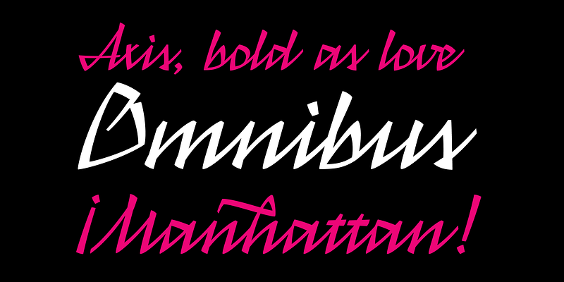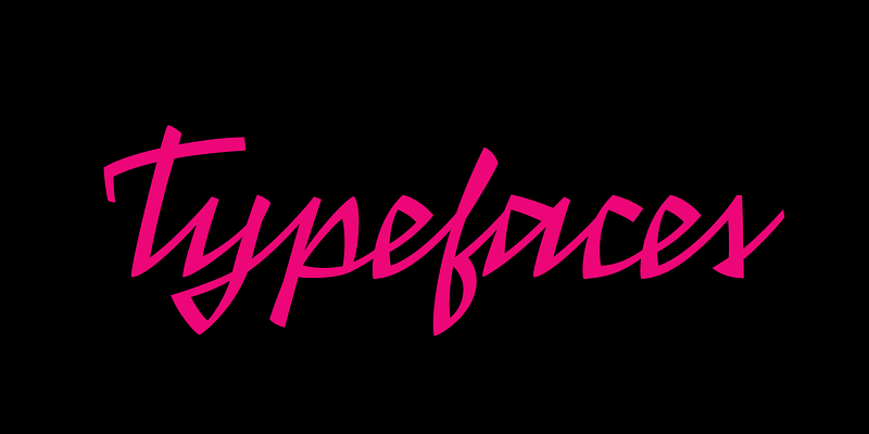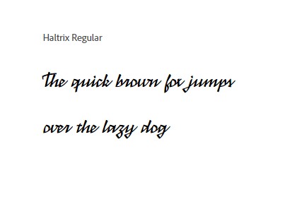
The Haltrix Font Family, designed by Daniel Sabino from Blackletra, exemplifies modern design with a distinctive futuristic edge. Known for pushing boundaries, Sabino’s Haltrix is an innovative typeface that blends contemporary aesthetics with a bold, technical structure. As a part of the Blackletra foundry’s diverse collection, Haltrix stands out for its unique interpretation of geometric forms, clean lines, and striking letterforms, making it ideal for cutting-edge projects that need a forward-thinking visual identity.
The Designer: Daniel Sabino and His Creative Vision
Daniel Sabino, the mastermind behind Blackletra, is a Brazilian designer known for creating fonts that challenge the status quo. With a deep appreciation for both classic type design and contemporary trends, Sabino has a keen ability to merge the old with the new. In Haltrix, this fusion is evident through its modern, technological aesthetic paired with a sense of precision and control that echoes traditional design philosophies. Sabino’s previous work, often characterized by sharp detail and creativity, makes Haltrix a natural progression in his design portfolio.
A Futuristic Typeface with Versatile Uses
Haltrix is more than just a bold font—it’s a vision of the future. Its sleek, geometric forms convey a sense of movement and dynamism, perfect for technology branding, digital interfaces, and futuristic-themed projects. From websites and apps to printed materials and logos, Haltrix serves as an adaptable choice for designers seeking to inject a sense of modernity into their work. It reflects both the technological world we live in and the forward trajectory of typography itself.
The Haltrix Font Family is crafted to meet the needs of modern designers, offering multiple weights and styles that provide versatility across various media. Its bold structure holds strong in headlines, while the lighter weights provide clarity in smaller text settings. Haltrix works exceptionally well in high-tech environments, science fiction themes, and forward-thinking editorial design, where the clear, sharp lines contribute to a futuristic visual language.

Design Characteristics of the Haltrix Font Family
One of the defining elements of Haltrix is its geometric foundation. Every letterform is structured with precision, employing straight lines and balanced curves that create a harmonious aesthetic. Despite its mechanical appearance, Haltrix retains a certain level of warmth, allowing it to work in more playful or informal contexts as well. This makes it a strong choice for creative industries looking to blend the technical with the artistic.
- Geometric Precision: Haltrix has a firm geometric base, with a focus on sharp angles and straight lines. Its design showcases mathematical precision, making it feel both clean and assertive.
- Balanced Contrast: The font family includes a range of weights, from light to heavy, enabling designers to create contrast within the same type family. This flexibility allows Haltrix to be used for both emphasis and subtlety in design projects.
- Strong Legibility: While many futuristic typefaces sacrifice legibility for style, Haltrix manages to balance both. The clear, structured letterforms ensure that the text remains readable, even at smaller sizes, making it ideal for digital environments and print alike.
- Stylized Details: Subtle details in the letterforms, such as angled cuts in the letter “A” or unconventional terminals, give Haltrix a distinct personality. These design choices set it apart from more traditional geometric fonts, adding a unique flair that hints at innovation and progress.
Blackletra: A Foundry of Innovation
Blackletra, the type foundry led by Daniel Sabino, is known for its experimental approach to typography. With a commitment to originality and excellence, Blackletra’s catalog features fonts that challenge conventions and elevate design projects. Haltrix fits perfectly into Blackletra’s ethos, representing a bold departure from the standard sans-serifs and serif fonts that dominate the market.
Blackletra has always been a space where Sabino’s creativity can flourish. The foundry combines classical influences with modern sensibilities, resulting in fonts that feel at once timeless and cutting-edge. Haltrix reflects this duality—its structured forms speak to a sense of control and tradition, while its innovative details push the boundaries of modern type design.
Ideal Use Cases for Haltrix
The Haltrix Font Family shines in a range of applications, particularly where boldness and modernity are essential. The versatility in its design allows it to excel in both display and body text, making it useful across multiple design contexts. Here are some prime examples where Haltrix can truly stand out:
- Technology Branding: Haltrix’s futuristic aesthetic makes it the perfect fit for tech companies, startups, and digital services. Its clean lines and geometric forms speak to innovation, progress, and technological advancement.
- Editorial Design: In editorial design, especially in magazines or books focused on science, technology, and futurism, Haltrix can be used to create striking headlines and visually engaging layouts.
- Web and Mobile Interfaces: As the world increasingly moves into digital spaces, fonts like Haltrix are essential for creating interfaces that feel modern and intuitive. Its legibility and clean design make it a go-to choice for web design, apps, and digital platforms.
- Logos and Branding: With its distinctive letterforms, Haltrix lends itself well to logo design. The font’s balance between modernity and style ensures that logos are memorable and unique.
- Posters and Promotional Materials: Haltrix’s bold style is also perfect for posters, billboards, and other promotional materials where it can grab attention and make a strong visual impact.

Conclusion: A Bold Typeface for the Modern World
The Haltrix Font Family, designed by Daniel Sabino from Blackletra, is a striking example of what happens when modern technology meets timeless design principles. It’s a font family built for the future, with versatility and precision at its core. Whether used in high-tech branding, editorial layouts, or digital interfaces, Haltrix is a bold choice for designers looking to create something truly modern and innovative.
With its futuristic aesthetics and adaptable features, Haltrix promises to remain a relevant and powerful tool for designers well into the future. Sabino’s vision and expertise, combined with Blackletra’s reputation for innovation, ensure that Haltrix will continue to be a go-to typeface for those looking to push the boundaries of typography.
