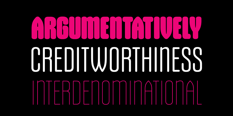
The Gothiks Round Font Family, designed by Daniel Sabino of Blackletra, represents a modern take on a classic typographic style. While it incorporates elements from early gothic or grotesque fonts, Gothiks Round distinguishes itself by blending these traditional influences with a softer, more approachable aesthetic. This balance of geometric precision and roundness makes the typeface both versatile and visually appealing across a range of applications.
The Design Concept
Gothiks Round draws inspiration from the early 20th-century grotesque sans-serif typefaces, a period characterized by the exploration of minimalist and industrial type design. However, unlike the rigid and austere nature of traditional grotesques, Daniel Sabino infused this font with rounded forms, giving it a contemporary feel that contrasts with the harsher, angular characteristics of its predecessors.
The rounding of corners and edges softens the overall look of the font, making it more accessible and friendly, without sacrificing its clean, geometric structure. This harmonious combination of strength and softness is ideal for both digital and print environments, lending itself to various design needs.
A Deep Dive into the Family
The Gothiks Round Font Family is a comprehensive set of styles, offering a wide array of weights and styles that allow designers to create a cohesive visual language in their projects. Whether for branding, editorial layouts, signage, or digital interfaces, this typeface provides flexibility and adaptability. The range includes:
- Light
- Regular
- Medium
- Bold
- Black
Each weight delivers unique qualities while maintaining consistency in letterforms. The lighter weights are perfect for understated and minimalistic designs, while the heavier weights bring a commanding presence to headlines and other dominant typographic elements.
Versatility in Application
One of the key strengths of the Gothiks Round Font Family is its versatility. Its rounded, softer edges make it suitable for a wide range of design projects, from corporate branding to playful, casual designs. The typeface can easily adapt to various contexts, making it a popular choice for designers looking for a modern, approachable aesthetic.
- Branding: Gothiks Round’s geometric precision, combined with its friendly rounded forms, works well in branding projects that require both a professional and welcoming tone. It is particularly suited for brands in industries such as technology, health, lifestyle, and consumer goods.
- Web and App Design: Its readability in smaller sizes makes it ideal for web and app interfaces. The clean, sans-serif letterforms ensure clarity, while the rounded edges add a modern and approachable vibe to digital interfaces.
- Editorial and Print: With its various weights, the font family is also highly effective in print layouts. It provides designers with the ability to create hierarchy and contrast in editorial projects such as magazines, posters, and brochures. The heavier weights create bold and attention-grabbing headlines, while the lighter weights offer a clean and legible option for body text.
Design Details and Legibility
The subtle detailing in Gothiks Round makes it not only visually appealing but also highly legible across different sizes and mediums. The rounded terminals provide a sense of friendliness and openness, while the geometric shapes maintain structure and order. This balance of form ensures that the typeface reads clearly, whether it’s being used for large display purposes or smaller body text.
Another notable feature of the font is its ability to retain clarity and sharpness in both print and digital applications. Its design was carefully crafted to ensure that it performs well in different media, whether it’s on high-resolution screens or printed materials.
Historical Roots and Modern Interpretation
While Gothiks Round takes its inspiration from grotesque typefaces of the early 20th century, it updates this tradition with a modern twist. The term “gothic” historically referred to sans-serif typefaces that were clean and unadorned. Sabino’s design embraces this simplicity but innovates by softening the harsh lines and sharp edges typically associated with gothic fonts.
By rounding the characters, Sabino has created a more welcoming and user-friendly typeface that still honors its historical roots. The result is a font that feels both familiar and fresh, offering a nod to typographic history while embracing the needs of contemporary design.
Blackletra’s Contribution to Typography
Daniel Sabino’s Blackletra foundry has been known for producing typefaces that combine thoughtful design with practical application. Gothiks Round is no exception. Sabino’s approach to type design is rooted in creating fonts that are not only visually distinctive but also functionally effective. This balance between artistry and utility is evident in the Gothiks Round Font Family.
Blackletra’s ethos revolves around creating typefaces that feel modern while remaining grounded in typographic tradition. In Gothiks Round, the foundry showcases its ability to innovate within established categories, offering a font that appeals to both typographers and graphic designers for its beauty and usability.
Conclusion: A Typeface for the Modern Era
The Gothiks Round Font Family is a testament to Daniel Sabino’s skill in crafting typefaces that meet the demands of modern design. Its blend of geometric precision and soft, rounded forms make it an excellent choice for a variety of design projects, from branding to digital interfaces. Whether used for headlines, body text, or logo design, Gothiks Round offers a versatile and contemporary option for designers looking to create work that is both professional and approachable.
In a world where typefaces must function across a wide range of platforms and media, Gothiks Round stands out for its ability to maintain clarity, legibility, and personality. It is a font that bridges the gap between classic typographic principles and modern design aesthetics, making it a valuable tool for any designer’s arsenal.

