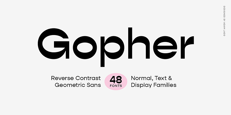
The Gopher Font Family, designed by the talented type designer Adam Ladd, is a modern sans-serif typeface that offers a delightful blend of geometric precision and humanistic warmth. Gopher stands out as a versatile, approachable, and highly functional typeface that manages to balance technical structure with a playful, friendly character. Whether for branding, editorial work, digital interfaces, or packaging, Gopher delivers a fresh, contemporary aesthetic that is both clean and engaging.
Adam Ladd, known for his innovative approach to typography, has once again created a font family that offers flexibility and uniqueness. With the Gopher Font Family, he combines sharp lines with soft curves, making the typeface adaptable for a variety of uses. Its wide range of weights and styles ensures that designers have the tools they need to create dynamic and cohesive typographic systems across different media.
Adam Ladd: A Designer of Distinct and Functional Typefaces
Adam Ladd has earned recognition in the typography world for his ability to design fonts that are both aesthetically appealing and practically versatile. His typefaces often strike a balance between functionality and creativity, making them ideal for a broad range of design projects. Ladd’s design philosophy centers on creating fonts that can serve the diverse needs of modern designers while maintaining a strong visual identity.
With the Gopher Font Family, Ladd has once again demonstrated his expertise in crafting a typeface that offers both precision and personality. The typeface’s clean lines and geometric forms are balanced by soft curves and subtle quirks that give it a friendly, approachable feel. This duality makes Gopher a typeface that can be used in both formal and informal contexts, allowing designers to create designs that are both professional and engaging.
Design Philosophy and Inspiration
The Gopher Font Family is rooted in the principles of geometric sans-serif typography but incorporates humanistic elements that add warmth and character to the design. The typeface is designed to be functional and highly legible, making it ideal for both print and digital use. However, Ladd has also infused Gopher with a sense of playfulness, giving it a unique personality that sets it apart from more rigid geometric sans-serifs.
The name “Gopher” reflects the typeface’s approachable and industrious character, much like the small, hardworking animal. Ladd wanted to create a font family that felt dependable and versatile but also carried a touch of whimsy, making it suitable for a wide range of applications. Gopher’s combination of sharp angles and soft curves ensures that the typeface is both structured and inviting, making it a valuable tool for designers looking to add personality to their work.
Key Features of the Gopher Font Family
The Gopher Font Family is defined by several key design features that contribute to its versatility and contemporary appeal. These features make Gopher an excellent choice for designers who need a typeface that can handle a variety of tasks while maintaining a distinct and engaging visual presence.
- Geometric Precision with Humanistic Touches: Gopher’s letterforms are based on geometric shapes, giving the typeface a clean, structured appearance. However, Ladd has softened the design with humanistic elements, such as rounded terminals and subtle curves, which add warmth and approachability. This combination of geometric and humanistic features ensures that Gopher is both functional and friendly, making it suitable for a wide range of design contexts.
- Wide Range of Weights and Styles: The Gopher Font Family offers an extensive range of weights, from Thin to Black, as well as matching italics. This variety gives designers the flexibility to create dynamic typographic hierarchies and adapt the typeface to different design needs. Whether used for headlines, body text, or callouts, Gopher’s range of styles ensures that it can be used effectively in both display and text settings.
- Open, Readable Letterforms: One of the key design priorities for Gopher was readability. Ladd has crafted each character to be open and spacious, ensuring that the typeface performs well in both small and large sizes. This focus on legibility makes Gopher an excellent choice for long-form text, editorial layouts, and digital interfaces, where clarity is essential.
- Modern, Playful Aesthetic: Gopher’s modern design is balanced by its playful personality, making it a versatile typeface that can be used in both formal and informal contexts. The typeface’s geometric structure gives it a clean, contemporary feel, while its humanistic details add a sense of warmth and individuality. This duality allows Gopher to work equally well in corporate branding as it does in more creative or whimsical projects.
- Versatile for Both Print and Digital: Gopher is designed to perform well across both print and digital platforms. Its clean, geometric shapes ensure that the typeface remains crisp and legible in a variety of settings, from high-resolution print to on-screen applications. This versatility makes Gopher a valuable tool for designers who need a typeface that can transition seamlessly between different media.
- Extended Character Set and Multilingual Support: Gopher includes an extended character set that supports multiple languages, diacritical marks, and typographic symbols. This makes the typeface suitable for international projects and ensures that it can be used in multilingual designs without sacrificing its visual integrity.
Use Cases for the Gopher Font Family
The Gopher Font Family’s versatility and approachable design make it suitable for a wide range of design applications. Its combination of geometric precision and humanistic warmth allows it to be used across different industries and platforms. Below are some of the most common use cases for Gopher:
- Branding and Corporate Identity: Gopher’s clean, modern aesthetic makes it an excellent choice for corporate branding and identity design. The typeface conveys professionalism and reliability, while its subtle quirks and rounded forms add a touch of approachability. This makes Gopher ideal for logos, business cards, letterheads, and other branding materials, where clarity and personality are key.
- Web and User Interface Design: Gopher’s open, readable letterforms ensure that it performs well in digital environments, making it a great option for websites, apps, and user interfaces. The typeface’s geometric structure provides a clean and organized look, while its humanistic elements make it feel welcoming and user-friendly. Gopher’s range of weights allows designers to create engaging typographic systems within digital products.
- Editorial and Magazine Design: The flexibility of Gopher’s weights and styles makes it well-suited for editorial design, particularly for use in magazines, blogs, and long-form articles. The typeface’s open, legible design ensures that it performs well in body text, while its bolder weights add impact in headlines, pull quotes, and subheadings.
- Advertising and Marketing: Gopher’s bold, geometric forms and friendly character make it an excellent choice for advertising and marketing campaigns. The typeface’s clean design ensures that it communicates messages clearly and effectively, while its playful personality makes it engaging and memorable. Whether used in print ads, social media posts, or digital marketing materials, Gopher helps create designs that capture attention.
- Signage and Display Typography: The bold weights of the Gopher Font Family make it highly effective for signage and display typography. Whether used in retail environments, exhibitions, or large-scale advertising, Gopher’s sharp, clean letterforms ensure that the message is delivered with clarity and impact.
- Creative and Product Packaging: For designers working in creative industries, Gopher offers a typeface that is both modern and approachable. Its playful yet structured design makes it a great fit for product packaging, where it can communicate a sense of innovation and fun. The typeface’s versatility in weights and styles also allows for flexibility in creating cohesive packaging systems across different formats.
Gopher: A Typeface for Modern Design Needs
The Gopher Font Family is a dynamic and contemporary typeface that offers designers the flexibility and versatility needed in today’s fast-paced design environment. Adam Ladd has created a typeface that embodies the principles of modern typography—clarity, functionality, and adaptability—while maintaining a sense of personality and warmth. Whether used in branding, editorial layouts, digital interfaces, or advertising campaigns, Gopher delivers a clean, modern look that enhances any design.
Ladd’s attention to detail and his focus on creating typefaces that work across multiple platforms and media are evident in the design of Gopher. The typeface is built to perform in a variety of contexts, ensuring that it remains legible, impactful, and visually appealing in both print and digital formats.
Conclusion
The Gopher Font Family, designed by Adam Ladd, is a modern sans-serif typeface that combines geometric precision, humanistic warmth, and a versatile range of weights to meet the needs of contemporary designers. Its readability, flexibility, and modern aesthetic make it a valuable tool for a wide range of design applications, from branding and corporate identity to web design and editorial layouts.
Ladd has once again demonstrated his ability to create typefaces that balance form and function, offering designers a type family that can adapt to various platforms without losing its sharpness or impact. For those seeking a typeface that conveys modernity, clarity, and personality, the Gopher Font Family is an excellent choice.

