The Garlic Salt Font Family, designed by Adam Ladd from his eponymous foundry, is a charming and versatile hand-lettered typeface that combines playfulness with functionality. Known for his ability to blend aesthetic beauty with practicality, Ladd once again delivers a font family that is not only distinctive but also highly useful for a variety of design applications. The font family brings a casual, friendly tone to any project, making it perfect for branding, packaging, and other creative endeavors.
Overview of Garlic Salt Font Family
Garlic Salt stands out as a lively, semi-connected script that merges elements of traditional hand-lettering with a modern sensibility. The family exhibits rounded corners, smooth curves, and subtle brush-like strokes, which give it a handcrafted feel. Its organic, flowing design lends a sense of warmth and approachability to any piece of text. Whether you’re designing packaging for artisanal goods, working on a rustic wedding invitation, or looking to add a whimsical touch to branding, Garlic Salt provides the perfect solution.
This font family exudes personality, with each letterform radiating a sense of handcrafted care, making it ideal for projects where human touch and authenticity are paramount. Yet, despite its relaxed appearance, Garlic Salt is meticulously designed to ensure legibility and clarity, even at smaller sizes.
Stylistic Features of Garlic Salt
Garlic Salt’s defining feature is its hand-drawn quality, which gives it a personal and intimate feel. The font strikes a fine balance between casual charm and structured elegance, offering a range of styles that can be used individually or combined to create visually engaging typography.
Here are some key stylistic features of the Garlic Salt Font Family:
- Hand-lettered aesthetic: Garlic Salt mimics the flow of a pen or brush, with strokes that exhibit a natural, human quality. Each letter has a slightly irregular form, which enhances its authenticity and charm.
- Rounded forms: The soft, rounded corners and curves make the font approachable and warm. These subtle details prevent the font from feeling too rigid, instead giving it a friendly and organic personality.
- Semi-connected script: Although Garlic Salt falls into the script category, it features semi-connected strokes, which ensure readability while still maintaining the fluidity of hand-lettering.
- Casual elegance: While Garlic Salt has a casual, laid-back vibe, it also possesses a level of refinement and attention to detail, making it appropriate for more sophisticated projects.
- Stylistic alternates and ligatures: Adam Ladd has included a range of ligatures and alternate characters within the family, allowing designers to introduce variation into their text and further enhance the handcrafted look. These alternates enable designers to customize the font for a unique typographic experience.
The organic flow of the letters, coupled with their soft curves, makes Garlic Salt a versatile and approachable typeface. It performs equally well in digital or print mediums, ensuring clarity and appeal no matter where it is applied.
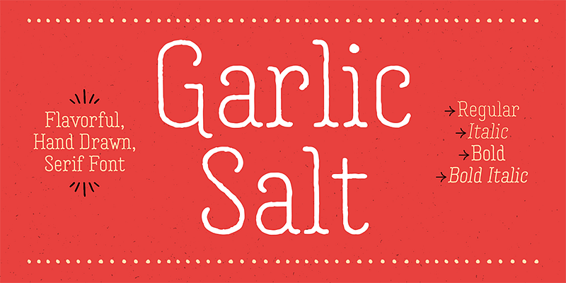
Weights and Styles
The Garlic Salt Font Family includes a range of styles and weights, offering designers the flexibility to tailor the font to specific needs. The family typically features several variations that can be used in different design contexts:
- Regular: The standard weight offers a balanced approach, perfect for branding, packaging, and invitations. It maintains the essential hand-drawn quality of the typeface while providing good legibility.
- Bold: For situations where a bolder statement is required, Garlic Salt’s bold version amplifies its presence without losing its friendly, welcoming tone. This style is ideal for headlines, signage, and logos.
- Condensed: The condensed variant of Garlic Salt offers a narrower form, making it suitable for instances where space is at a premium. Despite its narrower profile, it retains the same casual charm as the regular weight.
- Italic: Garlic Salt Italic takes the font’s natural flow to another level, emphasizing its script-like qualities. It works well in settings that call for a touch of elegance and movement, such as in quotes or taglines.
- Inline: One of the standout styles in the Garlic Salt family is the inline version, which adds a decorative inner line to the characters. This style is excellent for display purposes, particularly in vintage or rustic-themed projects.
By providing a variety of styles, Adam Ladd ensures that designers have the flexibility to mix and match within the family, maintaining a cohesive visual aesthetic across a project. This range also makes it easy to establish typographic hierarchy, which is crucial in multi-layered design work.
Applications and Uses
Garlic Salt’s approachable and friendly demeanor makes it highly versatile across various design applications. It’s particularly well-suited to projects that require a human touch, such as branding for small businesses, artisanal products, or food packaging. Its hand-drawn appearance instantly communicates warmth, trustworthiness, and creativity, key qualities for connecting with consumers.
- Branding and Packaging: The hand-crafted look of Garlic Salt is an excellent fit for branding projects, especially for businesses in the food, lifestyle, or artisan sectors. Whether it’s used in logo design or on product packaging, the font’s friendly and inviting nature makes a strong visual impression.
- Greeting Cards and Invitations: Garlic Salt’s script qualities make it ideal for invitations, greeting cards, and other stationery. Its warm and personal tone can set the mood for weddings, birthdays, and other special events.
- Editorial and Headline Use: The font’s bold and condensed versions are perfect for headlines or editorial projects where typography needs to make an impact. Its distinctive letterforms can capture attention on magazine covers, blogs, and more.
- Signage and Displays: Garlic Salt works well in signage and large display formats due to its legibility and decorative nature. Its bold version, in particular, shines in large-scale applications like storefront signage or event posters.
- Social Media and Digital Design: The relaxed vibe of Garlic Salt also makes it a favorite in digital spaces, where it can be used for social media posts, web banners, and email marketing. Its hand-lettered style adds a human element to digital designs, helping to foster connection and engagement.
Why Designers Love Garlic Salt
Designers appreciate Garlic Salt for its hand-crafted, organic quality, which adds character to any project. Its friendly, humanistic design makes it ideal for creating warm, inviting visual messages. The typeface offers a level of versatility that allows it to perform equally well in both casual and refined settings.
Additionally, the inclusion of multiple styles and weights within the family means that Garlic Salt can be used throughout an entire project, from headlines to body text, without losing consistency or cohesion. The wide range of stylistic alternates and ligatures further enhances its versatility, enabling designers to customize their typography to fit specific needs.
Adam Ladd’s attention to detail and his passion for functional, beautiful type design are evident in the Garlic Salt Font Family. This font not only looks great but also performs well in a variety of contexts, ensuring that it remains a go-to choice for designers who need a versatile, hand-lettered typeface.
Conclusion
The Garlic Salt Font Family by Adam Ladd is a delightful hand-lettered script font that embodies charm, versatility, and warmth. Its rounded letterforms, semi-connected strokes, and stylistic alternates make it a perfect choice for any project that requires a personal, handcrafted touch. Whether you’re working on branding, packaging, or editorial design, Garlic Salt has the versatility to meet your needs while adding a sense of whimsy and personality to your work.
With its blend of casual elegance and functional utility, Garlic Salt continues to be a beloved typeface among designers who appreciate its balance of playful aesthetics and professional versatility. Adam Ladd’s design philosophy shines through in this family, making it a staple for anyone looking to incorporate a hand-drawn, organic feel into their typography.

