The Fractul Variable Font Family, designed by Adam Ladd, is a modern and innovative geometric sans serif typeface that brings adaptability and precision to typography. It is a variable font, allowing designers the flexibility to adjust its weight, width, and other characteristics with ease, making it a versatile option for a wide range of design projects. Whether used for digital interfaces, branding, or editorial design, Fractul provides a perfect balance of modern design sensibilities and functional flexibility.
About Adam Ladd
Adam Ladd is a renowned type designer known for his sharp understanding of modern typography and its intersection with functionality. His fonts often feature clean, geometric forms and a minimalist aesthetic, designed to meet the needs of today’s designers in a fast-evolving digital landscape. Ladd’s focus on usability and flexibility has made his typefaces, including Fractul, a favorite among designers looking for typefaces that can be applied across different mediums without sacrificing aesthetic integrity.
Overview of the Fractul Variable Font Family
Fractul is a geometric sans serif font family that emphasizes clean lines, modern forms, and variable font technology, making it a highly adaptable and user-friendly typeface. Geometric sans serifs, known for their simplicity and clarity, are staples in modern design, and Fractul takes this tradition further with its customizable properties. The font’s variable feature allows users to dynamically adjust attributes such as weight and width, offering unparalleled control over the look and feel of the text in design.
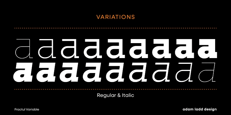
The Fractul Variable Font Family includes a full range of weights, from ultra-light to bold, and widths that range from condensed to extended. This wide spectrum of typographic possibilities gives designers the freedom to explore different design approaches, all within a single font family. Fractul is designed to excel in both print and digital environments, making it suitable for a broad range of applications, from websites and apps to editorial and advertising.
Key Features of Fractul
Fractul’s design is grounded in modern geometric principles, but its variable features and subtle stylistic touches make it stand out as a truly unique font family. Below are the key features that define Fractul:
1. Geometric Sans Serif Structure
Fractul’s letterforms are built on geometric principles, which give the typeface its clean, structured appearance. Each character is formed with a careful balance of circles, triangles, and rectangles, resulting in a minimalist, modern design. This geometric base makes Fractul a great choice for projects that require clarity and neutrality, from branding to digital interfaces.
2. Variable Font Technology
The defining feature of the Fractul Variable Font Family is its variable font technology, which allows users to seamlessly adjust the weight and width of the font. With traditional fonts, designers are often limited to selecting from predefined weights and widths. However, with Fractul, you can fine-tune these aspects to meet the exact needs of your design. This dynamic flexibility streamlines workflows, reduces the need for multiple font files, and allows for greater creative expression.
3. Multiple Weights and Widths
Fractul offers a comprehensive range of weights and widths, from light and thin styles to bold and extended ones. This variety makes it suitable for everything from body text to large, impactful headlines. The ability to scale the font’s width also means it can be used in tight spaces or for wide, stretched display typography, offering versatility across different design contexts.
4. High Legibility
One of Fractul’s strengths is its high legibility, which makes it ideal for both print and digital use. The clean, geometric letterforms are easy to read at any size, making it a reliable option for user interfaces, app design, and other contexts where clarity is essential. Its versatility in weights also ensures that it performs well across a variety of design mediums, from body copy to display text.
5. Minimalist Aesthetic
Fractul’s minimalist design is perfect for modern branding and editorial projects that require a neutral but stylish typeface. Its geometric shapes lend an air of precision and professionalism, while the variable font capabilities give it enough flexibility to adapt to a variety of tones and contexts. Whether you need something understated for long-form text or bold and eye-catching for headlines, Fractul can meet the demands of modern design.
6. Optical Adjustments for Consistency
Fractul has been carefully crafted with optical adjustments to ensure that the font appears balanced and visually harmonious across its different weights and widths. These subtle refinements, such as adjusted stroke thickness and spacing, help to maintain a consistent appearance at various sizes, which is especially important when using the font in different applications, from print to digital.
Practical Applications of Fractul
Fractul’s combination of variable font technology, geometric structure, and modern design makes it suitable for a wide range of design projects. Here are some of the primary applications where Fractul excels:
1. User Interfaces and Digital Design
Fractul’s high legibility and dynamic flexibility make it a natural choice for user interfaces and app design. The variable font features allow designers to adjust the weight and width of the font based on the screen size and user interaction needs, ensuring optimal readability and aesthetic appeal across different digital platforms. It works well in navigation menus, buttons, and body text, adapting seamlessly to responsive web design.
2. Branding and Logos
For branding projects, Fractul offers a modern, professional look that can be fine-tuned to fit the unique identity of a company or product. Its geometric structure communicates stability and clarity, while the variable font properties allow for custom adjustments that help the brand stand out. Whether used in a logo, tagline, or other branding materials, Fractul ensures that the visual identity remains consistent across various mediums.
3. Editorial and Print Design
Fractul’s range of weights and widths make it highly adaptable to editorial and print design, where typographic hierarchy and flexibility are important. It works well for both body text and headings, providing designers with a coherent font family that can unify the look of a magazine, newspaper, or book layout. The ability to adjust the font’s width also makes it ideal for column layouts, where tight or wide spacing may be required.
4. Advertising and Posters
Fractul’s bold, geometric forms make it an excellent choice for advertising and large-scale posters. Its variable font capabilities allow designers to create eye-catching, dynamic text treatments without needing to switch between multiple font styles. The ability to adjust the font’s width means that it can be used to fill space effectively, whether in a bold, condensed format for posters or a wider style for billboards and larger displays.
Why Use Variable Fonts?
Variable fonts like Fractul offer several benefits that make them a smart choice for modern design workflows. Here are some reasons why variable fonts are becoming increasingly popular:
- Efficiency: Instead of needing to install and manage multiple font files for different weights and styles, variable fonts include all these variations in a single file. This reduces file size and improves performance, particularly for web and app design.
- Creative Flexibility: Variable fonts give designers the ability to fine-tune the appearance of text by adjusting properties such as weight, width, and slant. This dynamic control allows for more precise design solutions.
- Responsive Typography: In the digital world, where responsive design is key, variable fonts can adapt to different screen sizes and formats seamlessly, offering better readability and a consistent look across devices.
- Consistency Across Media: With a single variable font file, designers can ensure that typography looks consistent across both print and digital media, reducing the need for separate font versions.
Pairing Suggestions for Fractul
Fractul’s clean, geometric forms make it a great pairing option for various font styles, adding contrast or complementing other typefaces depending on the design needs. Here are some pairing suggestions:
- With Serif Fonts: Pair Fractul with a serif font like Times New Roman or Merriweather for editorial designs that require contrast between headlines and body text. The geometric sans serif provides a modern look, while the serif adds a traditional touch.
- With Script Fonts: For branding or logo design, Fractul can be paired with a script font like Pacifico to add a playful, personal element to the design while maintaining clarity and professionalism.
- With Decorative Fonts: In advertising or creative projects, Fractul can be paired with a decorative font for contrast and visual interest. A bold, stylized font can enhance Fractul’s clean geometry, creating a dynamic visual hierarchy.
Conclusion
The Fractul Variable Font Family, designed by Adam Ladd, is a powerful and versatile tool for modern designers. Its geometric forms, coupled with the flexibility of variable font technology, make it an ideal choice for a wide range of applications, from digital interfaces and branding to editorial and print design. Whether you need a font that can adapt to different screen sizes or one that offers a wide range of weights and widths, Fractul delivers both functionality and style.
Adam Ladd’s expertise in crafting fonts that balance modern aesthetics with usability is evident in Fractul’s design. Its minimalist structure, variable features, and high legibility make it a reliable and dynamic choice for designers who seek a font family that can do it all. Whether used in branding, web design, or print, the Fractul Variable Font Family is a modern typographic solution that provides both precision and flexibility.

