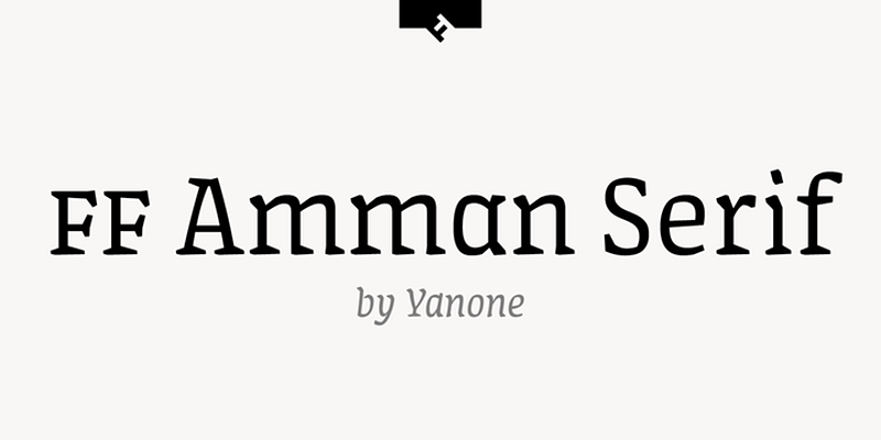
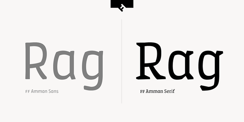
The FF Amman Serif Font Family, designed by Yanone and published by FontFont, is a remarkable serif typeface that was created as part of the typographic branding for the city of Amman, Jordan. The typeface, which includes both Latin and Arabic scripts, represents a fusion of cultural tradition and modern design. It is a continuation of the broader FF Amman type family, which also includes FF Amman Sans, designed to provide a cohesive and versatile typographic system for the city’s branding and communication needs.
FF Amman Serif is not only a highly functional font but also carries deep cultural significance, designed to reflect the unique identity of Amman, a city that sits at the crossroads of ancient heritage and contemporary urban development. In this article, we will explore the origins, design features, cultural importance, and various applications of the FF Amman Serif Font Family, highlighting why it is a standout example of culturally conscious typography.
The Origins and Concept of FF Amman Serif
The FF Amman Serif Font Family was designed in 2008 as part of a broader project to rebrand the city of Amman. The city’s government and various cultural bodies sought a typeface that could represent both its historical significance and its evolving status as a modern metropolis. The project was a landmark one, requiring a typeface that could harmonize Latin and Arabic scripts, ensuring that both languages would be represented equally and respectfully in the city’s visual identity.
Yanone, a German type designer known for his expertise in multilingual typography, was selected to lead this ambitious project. He worked closely with experts in Arabic calligraphy and typography to ensure that the design of FF Amman Serif paid homage to the rich tradition of Arabic script while also providing a functional, modern design for use in various official and public contexts.
The resulting typeface was intended to be highly versatile, able to adapt to both print and digital environments, and used in everything from signage and government documents to advertising and corporate branding.
Design Characteristics of FF Amman Serif
FF Amman Serif is a highly functional and aesthetically pleasing typeface that blends the elegance of serif fonts with the cultural nuances of Middle Eastern typography. Several key design characteristics define FF Amman Serif and contribute to its effectiveness in a wide range of applications:
- Classical Serif Elements with a Modern Twist: As a serif font, FF Amman Serif features the traditional strokes and serifs that are characteristic of this genre. The serifs themselves are sharp yet understated, providing a sense of authority and elegance without being overly ornate. The letterforms are clean and balanced, making the typeface suitable for both formal and informal uses. Yanone’s approach was to maintain a classical serif structure while introducing modern design elements, such as geometric precision and even stroke weight.
- Harmonization of Latin and Arabic Scripts: One of the most important aspects of FF Amman Serif is its ability to seamlessly integrate both Latin and Arabic scripts. Yanone worked closely with Arabic calligraphy experts to ensure that the Arabic script was not merely an adaptation of the Latin version, but an authentic and culturally appropriate design that respects the nuances of Arabic letterforms. The Arabic characters maintain their traditional elegance, with graceful curves and fluid transitions, while still aligning harmoniously with the Latin script in terms of overall weight and proportions.
- Wide Range of Weights and Styles: FF Amman Serif offers a comprehensive range of weights, from light to bold, providing designers with the flexibility to use the typeface in a variety of contexts. Whether used for body text, headings, or branding, FF Amman Serif’s versatility ensures that it can handle different levels of emphasis and create a clear visual hierarchy. The inclusion of italic styles adds further flexibility, allowing designers to emphasize key text elements while maintaining a cohesive design.
- Enhanced Legibility: One of the primary design goals for FF Amman Serif was to ensure high legibility, especially for use in long-form text and public signage. The typeface achieves this through carefully considered proportions, open apertures, and balanced stroke contrast. These features ensure that the font remains readable across a wide range of sizes, from small body text to large headlines.
- Cultural Sensitivity in Design: Yanone’s attention to cultural context is evident in every aspect of FF Amman Serif’s design. The Arabic script, in particular, reflects the traditional aesthetic of Arabic calligraphy, with a focus on flowing curves and organic shapes. At the same time, the Latin version of the typeface maintains a modern, geometric structure, resulting in a harmonious blend of old and new.
- Neutral Yet Expressive: While FF Amman Serif is designed to be neutral enough for a wide variety of applications, it still retains a sense of expressiveness. The subtle detailing in the serifs and the humanist influences in the letterforms give the typeface a warm, approachable quality, making it suitable for both formal and creative projects.
The Aesthetic and Cultural Appeal of FF Amman Serif
FF Amman Serif’s aesthetic appeal lies in its ability to blend classical and modern elements while remaining deeply rooted in cultural tradition. The typeface is elegant and refined, with a sense of sophistication that makes it ideal for use in formal contexts, such as government documents, official communications, and corporate branding.
However, what sets FF Amman Serif apart from other serif typefaces is its cultural significance. The design is a reflection of Amman’s unique identity as a city that is steeped in history but also looks to the future. The typeface’s integration of both Latin and Arabic scripts symbolizes the city’s multiculturalism and its role as a bridge between the East and the West.
For Amman, FF Amman Serif is more than just a typeface—it is a representation of the city’s values, its heritage, and its aspirations. The design speaks to the importance of cultural preservation while also embracing modernity and innovation.
Ideal Applications for FF Amman Serif
FF Amman Serif is a highly versatile typeface that can be used in a wide range of design applications. Some of the most common and effective uses for FF Amman Serif include:
- City Branding and Government Communication: The primary use of FF Amman Serif is in the city of Amman’s branding and communication efforts. From street signs and wayfinding systems to government documents and municipal websites, the typeface creates a cohesive visual identity for the city. Its legibility and cultural sensitivity make it ideal for public signage, ensuring that the text is easy to read while still reflecting the city’s heritage.
- Corporate and Business Branding: FF Amman Serif’s neutral yet expressive design makes it an excellent choice for corporate branding, particularly in sectors that require a balance of professionalism and cultural authenticity. The typeface’s serif structure gives it a formal, authoritative feel, while the humanist elements add warmth and approachability. This makes it ideal for use in logos, corporate communications, and marketing materials.
- Editorial and Print Design: The clarity and legibility of FF Amman Serif make it well-suited for editorial and print design. Whether used in books, magazines, brochures, or annual reports, the typeface’s range of weights and styles allows for effective visual hierarchy and easy readability. Its balanced proportions ensure that it remains readable even in long-form text, making it an excellent choice for body copy.
- Signage and Wayfinding: FF Amman Serif’s geometric precision and open letterforms ensure that it performs well in signage and wayfinding systems, where clarity and legibility are crucial. The typeface’s cultural resonance also makes it ideal for use in culturally significant spaces, such as museums, heritage sites, and public buildings.
- Web and Digital Design: As a modern typeface, FF Amman Serif translates well to digital environments. Its clean lines and even stroke weights ensure that it remains legible on screens, making it an excellent choice for websites, mobile apps, and digital interfaces. The typeface’s bilingual capabilities also make it ideal for websites and platforms that cater to both Arabic and Latin-based languages.
Yanone’s Design Legacy
Yanone’s work on the FF Amman Serif Font Family is a testament to his expertise in creating typefaces that bridge cultural divides. Known for his innovative approach to multilingual typography, Yanone has created a typeface that not only serves the practical needs of a modern city but also reflects its cultural identity.
His collaboration with Arabic calligraphy experts and his respect for the traditions of Arabic typography are evident in every aspect of FF Amman Serif’s design. By creating a typeface that harmonizes both Latin and Arabic scripts, Yanone has contributed to the growing appreciation for cross-script typography in the global design community.
Conclusion
The FF Amman Serif Font Family, designed by Yanone and published by FontFont, is a beautifully crafted serif typeface that represents a unique fusion of tradition and modernity. Its ability to seamlessly integrate Latin and Arabic scripts makes it a powerful tool for branding, signage, and communication in the city of Amman and beyond.
By balancing the elegance of classical serif typography with the functionality required for modern design applications, FF Amman Serif offers a versatile and culturally significant typeface that can be used across a wide range of contexts. Its design speaks to the importance of cultural preservation, while its modern aesthetic ensures that it remains relevant in today’s global design landscape.

