In the ever-evolving world of typography, designers are constantly seeking versatile fonts that can adapt to various design needs without sacrificing aesthetic integrity. One such font family that stands out for its adaptability and sleek design is the Config Variable Font Family, designed by the talented Adam Ladd. Config is a modern sans serif font that is not only visually striking but also technologically advanced, offering variable font functionality to cater to a wide range of applications.
About Adam Ladd
Adam Ladd is a renowned type designer whose work is characterized by a commitment to clarity, functionality, and creativity. Ladd has a deep understanding of typography’s role in communication, and his designs reflect a balance of contemporary aesthetics and time-tested principles. His work spans a diverse array of typefaces, from display fonts to highly functional sans serifs, always aiming to enhance the user experience in both print and digital media. Ladd’s approach to font design marries modernity with simplicity, and Config is an excellent embodiment of this philosophy.
Overview of the Config Variable Font Family
The Config Variable Font Family is a modern, geometric sans serif typeface that is engineered for flexibility. As a variable font, Config allows designers to adjust its weight, width, and other characteristics with precision. This adaptability makes Config ideal for a wide variety of design contexts, from digital interfaces and editorial layouts to branding and advertising. Whether you need something light and airy or bold and commanding, Config has you covered.
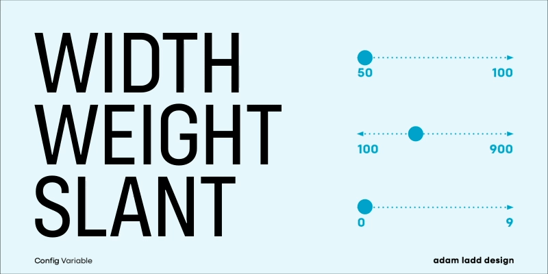
Config is available in multiple static styles, but its most innovative feature is the variable version, which gives designers the power to manipulate the font’s weight, width, and other typographic parameters seamlessly in design software that supports variable fonts. This variability saves time and simplifies workflows, offering a dynamic range of options without needing to switch between different fonts.
Design Characteristics
Config’s design is based on the geometric sans serif tradition, but with a contemporary twist. The clean lines and modular shapes give it a distinctly modern feel, while subtle curves add warmth and approachability to the otherwise rational forms. It’s a font that can be both neutral and expressive, depending on how it’s used.
Key Features of Config:
- Geometric Simplicity: Config is grounded in geometric shapes, giving it a sense of balance and order. The letterforms are crafted with precision, which makes it excellent for both display and text purposes.
- Variable Weights and Widths: One of the standout features of the Config Variable Font is its ability to be adjusted on a spectrum from light to bold, narrow to wide, and everything in between. This makes it incredibly versatile for a range of design tasks. You no longer need multiple weights and styles in your font palette—Config allows you to fine-tune the design with its variable functionality.
- Tall x-height: The typeface boasts a tall x-height, which enhances legibility, especially at smaller sizes. This makes Config a great choice for body text in digital interfaces and for use in mobile app design, where clarity is paramount.
- Balanced Letterforms: Each character in Config has been meticulously crafted to ensure consistent proportions and balance. The result is a font that maintains harmony across different sizes and weights, making it perfect for multi-purpose usage.
- Minimalist Aesthetic: Config’s clean, minimalist aesthetic makes it suitable for a wide range of design styles. Whether you’re working on a sleek, modern website or a corporate branding project, Config can fit seamlessly into your design.
- Optical Precision: Adam Ladd has paid close attention to the optical adjustments in Config, ensuring that each letter appears visually balanced. For instance, curves and diagonals have been subtly refined to avoid awkward gaps or imbalances that can sometimes occur in geometric sans serif fonts.
Config in Use: Practical Applications
The versatility of the Config Variable Font Family makes it a strong contender for a wide range of projects. From user interfaces and app design to editorial layouts and advertising, Config’s flexibility makes it a reliable choice for both digital and print applications.
1. User Interfaces and Web Design
Config’s clarity and legibility make it an excellent choice for web design and user interfaces. Its tall x-height and clear, geometric forms ensure that text remains readable at small sizes, while its variable weights and widths allow for dynamic use in headers, buttons, and body text without requiring separate fonts. Designers can adjust the font’s width and weight to create unique typographic hierarchies, enhancing user experience by guiding attention across different parts of the interface.
2. Branding and Logos
In branding, Config’s clean and modern look offers a professional, contemporary vibe. The variability allows for a tailored approach to logos, enabling subtle adjustments to create a unique look that stands out while maintaining consistency across a brand’s visual identity. Because of its versatility, Config can be bold and eye-catching in one setting, while remaining understated and functional in another.
3. Editorial and Print Design
For editorial designers working on magazines, newspapers, or books, Config’s adaptability means that it can be used for both headings and body text, ensuring visual coherence throughout. Its geometric form lends a modern touch to editorial layouts, while its legibility makes it suitable for long-form reading.
4. Advertising and Marketing
In advertising, Config’s wide range of weights and widths offers plenty of creative potential. The font can convey different tones depending on how it’s used—bold and confident for a headline, or light and approachable for body copy. Config’s minimalist aesthetic also ensures that the type will not distract from the overall message, making it a powerful tool for delivering clear, impactful advertising content.
Benefits of Variable Fonts
The rise of variable fonts has transformed the design industry, and Config is a prime example of the benefits this technology offers. Traditional font families require designers to download and manage numerous font files for different weights, widths, and styles. With Config’s variable version, all of these options are contained within a single file, streamlining the design process.
This also leads to improved performance in web environments, as variable fonts reduce the need for multiple HTTP requests to load different styles. For developers and designers working in the digital space, Config’s variable nature improves efficiency without compromising on quality.
Config’s Aesthetic Appeal
Config’s visual style is grounded in its geometric nature, but what sets it apart from other geometric sans serifs is its attention to detail. The straight lines and clean curves create a sense of order, while the subtle tweaks in the letterforms add a touch of personality. Config is both professional and approachable, making it an excellent choice for corporate branding, tech companies, and creative agencies alike.
Conclusion
The Config Variable Font Family designed by Adam Ladd represents a perfect balance between form and function. With its geometric shapes, versatile variable font capabilities, and minimalist aesthetic, Config stands as a prime example of modern typography’s ability to adapt to the changing needs of design. Whether you’re designing for print, digital interfaces, or branding projects, Config offers a wealth of possibilities, all wrapped in a visually appealing, user-friendly package.
Adam Ladd’s expertise shines through in Config’s attention to detail and versatility, making it a go-to choice for designers who demand both precision and flexibility in their typography. If you’re looking for a typeface that can do it all while maintaining clarity, professionalism, and visual appeal, the Config Variable Font Family is a top-tier option.

