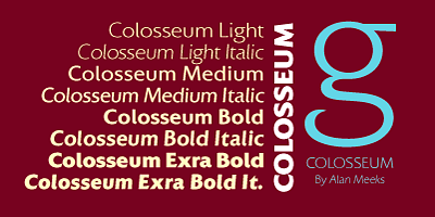
The Colosseum Font Family, designed by the celebrated British type designer Alan Meeks, is an impressive serif typeface that draws inspiration from classical Roman architecture and lettering. Like the iconic structure from which it takes its name, Colosseum embodies grandeur, strength, and timelessness. Designed with a deep respect for the history of typography, the Colosseum Font Family captures the essence of Roman letterforms while offering a modern versatility that makes it suitable for a wide range of design applications.
Alan Meeks has an extensive background in creating typefaces that blend traditional craftsmanship with contemporary needs, and the Colosseum Font Family is a shining example of his expertise. With its bold strokes, sharp serifs, and meticulously balanced letterforms, this font family stands out as a powerful and authoritative typeface that can be used in both print and digital media. Whether for branding, editorial design, or formal documents, Colosseum delivers a sense of elegance and strength that few typefaces can match.
Alan Meeks: A Designer with Classical Inspiration
Alan Meeks is well known for his ability to create typefaces that combine beauty with functionality. Over the course of his career, he has developed fonts that span various styles, from formal serif typefaces to decorative scripts and sans-serifs. Meeks’ approach to typography is deeply informed by a respect for historical letterforms, and his work on the Colosseum Font Family reflects this passion for classical design.
In designing Colosseum, Meeks was inspired by the letterforms of ancient Roman inscriptions, particularly those found on monumental structures such as the Colosseum in Rome. These inscriptions are renowned for their precision, balance, and timeless beauty, and Meeks has incorporated these qualities into the Colosseum Font Family. By blending the grandeur of classical Roman letterforms with the functionality required for modern design, Meeks has created a typeface that bridges the gap between the ancient and the contemporary.
The Design Philosophy Behind Colosseum
The Colosseum Font Family is grounded in the principles of classical Roman typography, which is known for its clarity, strength, and balanced proportions. Meeks’ goal was to create a typeface that could convey a sense of authority and timelessness while remaining highly functional across a range of design applications. The resulting typeface is bold yet elegant, with sharp serifs and well-defined strokes that give it a commanding presence on the page.
At its core, Colosseum is a typeface that emphasizes structure and proportion. Meeks has carefully designed the font family to ensure that each letterform is balanced, with clean lines and consistent spacing that make it easy to read at both large and small sizes. The serifs are sharp and angular, adding to the typeface’s sense of strength, while the overall design retains a refined elegance that makes it suitable for formal and professional use.
One of the key aspects of Colosseum’s design is its versatility. While it is inspired by the monumental letterforms of Roman inscriptions, Meeks has ensured that the typeface can be used in a variety of contemporary contexts. Whether for headlines, body text, or display purposes, Colosseum maintains its clarity and visual impact, making it a valuable tool for designers working in different mediums.
Key Features of the Colosseum Font Family
The Colosseum Font Family is defined by several key design features that set it apart from other serif typefaces. These features contribute to its versatility, readability, and timeless appeal, making it a popular choice for designers seeking a strong, classical aesthetic.
- Roman-Inspired Letterforms: Colosseum is directly inspired by the monumental letterforms of ancient Rome, particularly the inscriptions found on classical architecture. The typeface features bold, geometric shapes with sharp serifs, evoking the precision and strength of Roman typography. This gives the font a sense of grandeur and authority, making it ideal for formal and impactful designs.
- Balanced Proportions: One of the defining characteristics of Colosseum is its balanced proportions. The letterforms are carefully designed to ensure even spacing and consistent weight distribution, resulting in a typeface that is both visually harmonious and easy to read. This balance makes Colosseum suitable for both large-scale display use and smaller body text applications.
- Strong, Angular Serifs: The sharp, angular serifs of Colosseum give the typeface a distinctive look, adding to its sense of authority and strength. These serifs are reminiscent of classical Roman stone carvings, where precision and clarity were paramount. The strong serifs also enhance the readability of the typeface, particularly in headlines and titles.
- High Contrast Between Strokes: Colosseum features a high contrast between thick and thin strokes, a characteristic commonly found in classical Roman typefaces. This contrast adds to the overall elegance of the font and makes it particularly effective for use in larger sizes, where the details of the letterforms can be fully appreciated. The high contrast also helps to enhance the legibility of the typeface in both print and digital formats.
- Versatile Weight Range: The Colosseum Font Family includes multiple weights, from light to bold, providing designers with the flexibility to create dynamic typographic hierarchies. The lighter weights are ideal for more delicate, refined designs, while the bold weights make a strong impact in headlines and display settings. This versatility allows Colosseum to be used in a wide variety of design contexts.
- Extended Character Set: Colosseum comes with an extended character set that supports a range of languages and typographic symbols. This makes the font family suitable for international projects and ensures that it can be used in multilingual designs. The inclusion of ligatures, alternate characters, and other typographic features adds to the versatility of the typeface, allowing designers to customize their typography to fit specific needs.
Use Cases for the Colosseum Font Family
The Colosseum Font Family is highly adaptable and can be used across a wide range of design applications. Its bold, classical aesthetic makes it particularly well-suited for projects that require a sense of formality, authority, and timelessness. Below are some of the most common use cases for Colosseum:
- Branding and Corporate Identity: Colosseum’s strong, authoritative appearance makes it an excellent choice for corporate branding and identity design. The typeface conveys a sense of professionalism and gravitas, making it ideal for logos, business cards, letterheads, and other branding materials. Its bold letterforms ensure that the brand stands out, while its classical roots lend an air of sophistication and credibility.
- Editorial and Publishing Design: Colosseum is frequently used in editorial and publishing design, particularly for book covers, titles, and headings in magazines or newspapers. Its high contrast and sharp serifs give it a strong visual impact, making it ideal for headlines and display typography. At the same time, its balanced proportions and high readability make it suitable for body text in longer editorial pieces.
- Formal Documents and Certificates: The classical, refined look of Colosseum makes it a popular choice for formal documents, certificates, and awards. The typeface’s Roman-inspired letterforms convey a sense of tradition and authority, making it perfect for use in contexts where formality and gravitas are required.
- Creative and Luxury Branding: Colosseum’s bold yet elegant design makes it a natural fit for luxury branding and high-end products. Its strong, refined letterforms can be used to create a sense of exclusivity and prestige, making it ideal for brands in the fashion, jewelry, or luxury goods industries.
- Signage and Display Typography: With its bold letterforms and high contrast, Colosseum is particularly effective in signage and display typography. The typeface’s sharp serifs and strong proportions make it stand out in large formats, while its classical design ensures that it remains timeless and authoritative.
Colosseum: A Typeface for Timeless Elegance and Strength
The Colosseum Font Family is a remarkable achievement in type design, offering a balance between classical inspiration and modern usability. Alan Meeks has successfully created a typeface that embodies the strength and elegance of Roman letterforms while ensuring that it remains versatile enough for contemporary design applications. Whether used in branding, editorial design, or formal documents, Colosseum delivers a sense of authority and refinement that elevates any project.
Meeks’ attention to detail and his respect for the traditions of typography are evident in every aspect of the Colosseum Font Family, from its sharp serifs to its balanced proportions. The typeface is a testament to Meeks’ ability to create fonts that are both beautiful and functional, making it a valuable tool for designers seeking a typeface that combines timeless elegance with modern versatility.
Conclusion
The Colosseum Font Family, designed by Alan Meeks, is a powerful and elegant typeface that draws inspiration from the classical Roman letterforms found on ancient monuments. With its bold strokes, sharp serifs, and balanced proportions, Colosseum is a typeface that conveys a sense of authority, strength, and timelessness. Whether used for corporate branding, editorial design, or formal documents, Colosseum offers designers a versatile and impactful typeface that enhances any project.
Alan Meeks’ work on the Colosseum Font Family is a testament to his mastery of type design, blending historical inspiration with modern functionality to create a font that stands the test of time. For designers seeking a typeface that combines classical elegance with contemporary usability, the Colosseum Font Family is a perfect choice.

