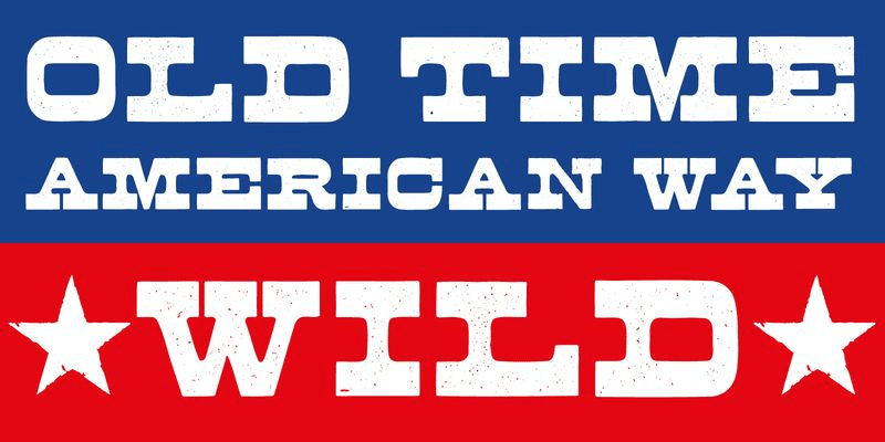
The Buckboard Font Family, designed by Aerotype, is a distinct, Western-inspired typeface that combines the nostalgia of the Old West with modern typographic design principles. With its bold letterforms, rugged details, and vintage flair, Buckboard is a standout font family perfect for designs that need to evoke a rustic, adventurous, and classic Western aesthetic.
Aerotype, known for its playful and historically influenced typefaces, has crafted Buckboard as an homage to the iconic typography of the 19th-century American frontier. The font family captures the essence of hand-painted signage, woodblock prints, and the rough-hewn look of pioneer-era graphics. Whether used in branding, posters, or packaging, the Buckboard Font Family brings an undeniable Western charm to any project.
The Foundry: Aerotype
Aerotype, the foundry behind the Buckboard Font Family, is celebrated for its innovative type designs that often draw inspiration from historical periods and artistic movements. Aerotype’s fonts are known for their character and playfulness, often pushing the boundaries of traditional typography while staying true to the principles of legibility and versatility. With fonts ranging from retro scripts to modern display typefaces, Aerotype continues to offer designers creative tools to make their projects stand out.
The Buckboard Font Family is a reflection of Aerotype’s dedication to creating typefaces that evoke emotion and storytelling. By bringing the visual language of the Wild West into the digital age, Aerotype has created a typeface that’s both nostalgic and functional for contemporary design.
Design Inspiration and Historical Context
The Buckboard Font Family is steeped in the visual culture of the American frontier, where the typography of saloons, general stores, and traveling circuses set the tone for much of the signage and advertisements of the time. The typefaces used in these contexts were often bold, decorative, and utilitarian, meant to grab the attention of passersby in bustling, often chaotic environments.
Hand-painted signs, woodcuts, and stencil lettering played a significant role in the typographic style of the 19th century, and the Buckboard font draws heavily from these techniques. The font family’s thick strokes, angular serifs, and distressed details are all reminiscent of the handcrafted nature of the era, where imperfect yet functional designs were the norm.
The term “buckboard” itself refers to a simple, sturdy wagon with a flatbed that was used by pioneers and settlers to traverse the rugged terrain of the West. This practical yet enduring symbol of the frontier aligns perfectly with the font’s aesthetic—hard-wearing, bold, and built to last.
Key Characteristics of Buckboard
1. Western and Vintage Aesthetic
At the heart of Buckboard is its unmistakable Western aesthetic. Each letter is designed to evoke the ruggedness and adventurous spirit of the Old West, making it a go-to font for projects that need to reflect a vintage or Americana theme. The heavy, bold strokes and decorative flourishes are a nod to classic Western typography seen in rodeo posters, saloon signs, and antique advertisements.
2. Rugged, Distressed Look
One of the standout features of Buckboard is its intentionally distressed appearance. The subtle imperfections in the letterforms give it a hand-crafted feel, as if the letters were carved out of wood or stamped onto fabric by a rough-hewn press. This distressed effect lends authenticity to the typeface, making it feel aged and worn, perfect for designs that want to evoke a sense of history and character.
3. Bold and Attention-Grabbing
With its thick, heavy letterforms, Buckboard is designed to be eye-catching and impactful. The font family is ideal for headlines, logos, posters, and signage, where legibility and boldness are key. Whether used for product packaging or event promotion, Buckboard commands attention and delivers a strong visual punch.
4. Decorative Serifs and Flourishes
Buckboard’s letterforms feature angular serifs and decorative flourishes that enhance its Western theme. These elements give the font a sense of movement and character, reminiscent of the ornate typography used in 19th-century poster design. The serifs are prominent, adding both visual interest and a sense of sturdiness to the typeface.
5. Versatile in Display Settings
While the Buckboard Font Family is highly stylized, it is also versatile in display settings. It works well in a variety of applications, from branding and packaging to large-format print materials. Its bold forms and decorative details make it adaptable for projects that need to stand out in both print and digital formats.
Styles and Weights in the Buckboard Font Family
The Buckboard Font Family offers a range of styles and weights that give designers flexibility in how they use the typeface. Each style is designed to maintain the font’s rugged charm while offering different levels of intensity and emphasis.
1. Regular Weight
The Regular weight of Buckboard is perfect for most display applications, including headlines, logos, and signage. It captures the essence of Western typography with its bold strokes and distressed details, making it an ideal choice for projects that need to make an immediate impact.
2. Bold and Extra Bold
For projects that require even more visual weight, the Bold and Extra Bold versions of Buckboard amplify the font’s boldness and decorative features. These weights are ideal for large-scale designs, such as posters, billboards, or packaging where maximum attention is needed. The extra thickness of the letterforms enhances the distressed texture, giving it an even more authentic, worn-in look.
3. Distressed Variants
In addition to its regular styles, Buckboard includes distressed variants that enhance the vintage, handcrafted feel of the typeface. These variants emphasize the worn-out, imperfect nature of the letterforms, making them look as though they’ve been weathered by time. This feature is perfect for designs that need a more rustic, old-world appearance.
4. Inline and Shadow Effects
Buckboard also includes inline and shadow effects within its family, offering even more stylistic options for designers. The inline version adds a decorative element to the letterforms, giving them a more detailed, ornamental appearance. Meanwhile, the shadow effect adds depth, creating a three-dimensional look that can be especially impactful in large-format display designs.
Ideal Applications for Buckboard Font Family
The Buckboard Font Family is well-suited for a variety of design projects, particularly those that want to evoke a sense of nostalgia, adventure, or vintage charm. Its strong visual presence and Western aesthetic make it perfect for the following applications:
1. Branding and Logos
Buckboard’s bold, distinctive look makes it an excellent choice for branding, especially for companies that want to convey a rugged, outdoorsy, or vintage identity. Whether for breweries, restaurants, or retail stores, Buckboard’s Western flair helps brands stand out and tell a story.
2. Posters and Event Promotion
For events such as rodeos, fairs, or music festivals, Buckboard’s bold and decorative style is perfect for creating eye-catching posters and promotional materials. Its Western aesthetic fits well with outdoor events or themes related to adventure, Americana, and heritage.
3. Product Packaging
Buckboard is ideal for product packaging in industries that value a handcrafted or rustic aesthetic, such as food and beverage, clothing, or artisanal goods. The distressed look of the font can enhance the packaging of products like craft beer, organic foods, or handmade items, giving them a sense of authenticity and nostalgia.
4. Signage and Environmental Graphics
Buckboard’s strong letterforms and high readability make it suitable for signage and environmental graphics. Whether used for storefronts, wayfinding signs, or interior decor, the typeface’s boldness ensures that it remains legible from a distance, while its distressed details provide a unique visual identity.
5. Vintage-Themed Editorial Design
For editorial projects that want to evoke a vintage or Western feel, Buckboard is an excellent choice. Its bold, decorative letterforms can be used for section headers, pull quotes, and titles in magazines, books, or brochures that focus on historical or adventurous themes.
Pairing Suggestions
To create a cohesive typographic hierarchy, Buckboard pairs well with more neutral, modern typefaces that balance its boldness and decorative flair. Some pairing suggestions include:
- Sans-Serif Pairing: A simple sans-serif font like Helvetica or Futura can complement Buckboard’s heavy, ornate style by providing contrast in body text or secondary headings.
- Serif Pairing: A classic serif font like Garamond or Georgia can add a refined touch when paired with Buckboard, especially in editorial design or more formal applications.
Conclusion
The Buckboard Font Family from Aerotype is a bold, vintage-inspired typeface that brings the spirit of the Old West to modern design. With its rugged, distressed look and decorative details, Buckboard is ideal for projects that need to evoke a sense of history, adventure, or Americana. Its versatility across different weights and styles allows it to be used in a wide range of applications, from branding and packaging to posters and signage.
Aerotype’s thoughtful design ensures that Buckboard remains a functional, highly readable typeface despite its decorative features. For designers looking to add a touch of the Wild West to their projects, the Buckboard Font Family offers a perfect blend of nostalgia and modern typographic design.

