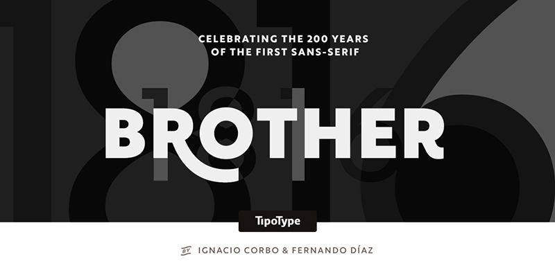
The Brother 1816 Font Family, designed by Fernando Díaz and Ignacio Corbo from TipoType, represents a harmonious union of classic typography principles and contemporary design sensibilities. This typeface serves as a remarkable tribute to typographic history while meeting the needs of modern visual communication. Inspired by the simplicity and clarity of 19th-century typefaces, Brother 1816 is a versatile type family that effortlessly fits into a wide range of design contexts, from editorial use to branding projects.
A Historical Inspiration
The name “Brother 1816” itself is a nod to the historical influences behind the typeface. It draws inspiration from early 19th-century sans serifs, which were the precursors to the modern typefaces we know today. During that period, the world was witnessing a transition from the highly ornate styles of the 18th century to more straightforward, functional designs. This transition was reflected in typography, with the emergence of early sans serif styles that were simple, clean, and aimed at clarity.
Fernando Díaz and Ignacio Corbo have brilliantly captured this essence in Brother 1816. They took the solid foundation laid by historical sans serif typefaces and refined it to suit contemporary needs. The result is a type family that is as much a tribute to the past as it is a modern design tool, reflecting both nostalgia and forward-thinking aesthetics.
Design Characteristics
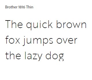
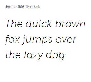
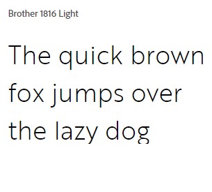
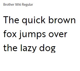
Brother 1816 is characterized by its balanced proportions, generous x-height, and geometric construction, making it highly legible and aesthetically pleasing across a range of sizes and applications. The typeface features smooth curves and clean lines, giving it a friendly, approachable appearance. The terminals are subtly rounded, lending warmth to the otherwise utilitarian design and making it suitable for a broad spectrum of uses, from corporate identities to advertising.
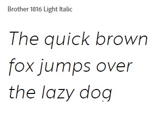
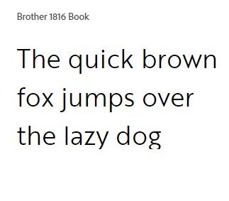
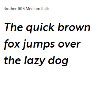
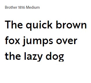
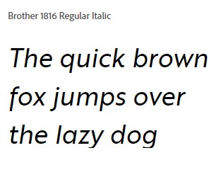
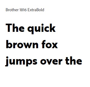
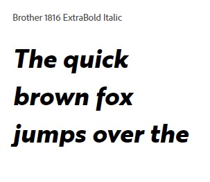
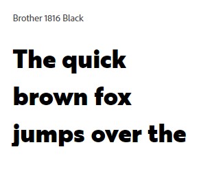
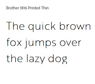
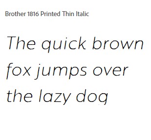
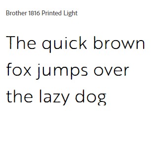
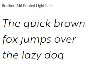
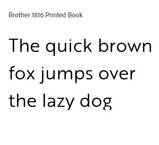
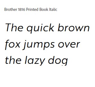
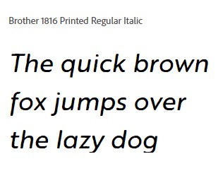
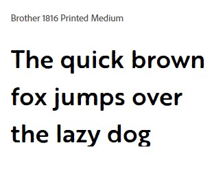
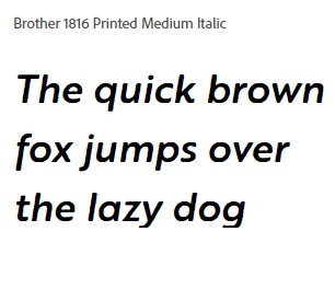
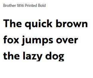
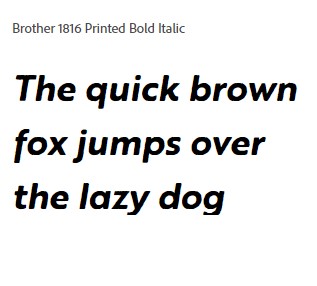
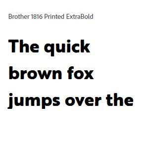
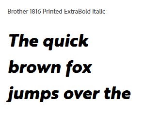
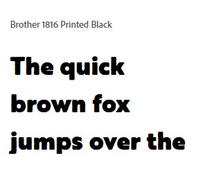
The family includes a range of weights, from Thin to Black, each with matching italics, providing designers with the flexibility to create a cohesive typographic hierarchy. The italics are not merely slanted versions of the upright styles; instead, they exhibit unique characteristics that add dynamism and movement, making them ideal for emphasis or creating contrast within a design.
Versatility Across Applications
One of the key strengths of Brother 1816 is its versatility. The typeface performs well in both print and digital formats, ensuring consistency across various media. Its legibility at small sizes makes it an excellent choice for body text in editorial layouts, while the bolder weights are well-suited for headlines and display use. The family’s range of weights and styles allows designers to build sophisticated typographic systems, ensuring visual harmony throughout a project.
Brother 1816’s adaptability also extends to branding and identity projects. Its clean, modern aesthetic combined with subtle historical references makes it a fitting choice for brands that want to communicate a sense of reliability and heritage, while still appearing fresh and contemporary. The typeface’s neutrality and balance mean it can adapt to different brand personalities without overpowering the message, allowing it to complement rather than compete with other design elements.
Attention to Detail
What sets Brother 1816 apart from many other sans serif typefaces is the attention to detail that Díaz and Corbo have put into its design. The typeface strikes a careful balance between geometry and humanist warmth. The rounded corners and terminals soften the rigid geometry, giving the typeface a more approachable and human feel. This balance of form makes Brother 1816 both timeless and welcoming, inviting the reader in without sacrificing readability or precision.
The open apertures, consistent stroke contrast, and well-crafted kerning pairs ensure that Brother 1816 maintains its readability in any context. The typeface also includes a comprehensive set of numerals, punctuation, and special characters, making it a fully equipped workhorse for a wide range of typographic needs. Multilingual support is another significant feature, ensuring that Brother 1816 can be used in global contexts without limitations.
A Contemporary Typeface with a Classic Soul
Brother 1816’s ability to bridge the gap between classic and contemporary design is what makes it so appealing. It manages to evoke the spirit of early sans serif typefaces while presenting a thoroughly modern aesthetic. This duality gives it a unique voice—one that is confident, reliable, and versatile. Whether used in editorial projects, branding, web design, or advertising, Brother 1816 brings a sense of sophistication and clarity that elevates any visual composition.
Practical Uses and Applications
Designers who use Brother 1816 will find it especially useful for projects where clarity and versatility are paramount. Its robust design means that it can handle diverse settings—magazines, corporate reports, websites, posters, and even packaging. The various weights offer endless possibilities for creating contrast and hierarchy within a layout, while the italic styles add a touch of flair where needed.
For editorial designers, Brother 1816 is an excellent choice for body text due to its high legibility and even texture. The typeface’s large x-height and open apertures ensure that long passages of text remain comfortable to read. Meanwhile, its bolder styles can be effectively used for section headings and callouts, creating a cohesive yet varied typographic palette within the same publication.
In branding, Brother 1816’s approachable yet professional appearance makes it suitable for a wide range of industries, from finance and technology to fashion and lifestyle. It conveys a sense of modernity without being overly trendy, making it a solid choice for brands looking to build a timeless visual identity.


Conclusion
The Brother 1816 Font Family is a testament to the skill and vision of Fernando Díaz and Ignacio Corbo. By drawing on historical influences and blending them with contemporary design principles, they have created a typeface that is both timeless and modern. Brother 1816’s versatility, legibility, and balanced aesthetic make it an invaluable tool for designers across disciplines. Whether used for editorial projects, branding, or digital interfaces, this type family stands out as a sophisticated, reliable, and beautifully crafted choice.
With its roots in typographic history and its eyes set firmly on the future, Brother 1816 is more than just a typeface—it is a bridge between the past and the present, offering designers the best of both worlds. Its classic soul and modern form make it a font family that will undoubtedly continue to inspire and serve the design community for years to come.

