The Zuume Edge Font Family, designed by Adam Ladd from Adam Ladd, is known for its distinctive modern appeal, strong geometric forms, and sharp edges. Zuume Edge embodies a futuristic and versatile design that can suit a wide variety of projects, from tech and innovation-focused branding to editorial use. Finding the right complementary fonts and alternatives to Zuume Edge can enhance its bold character and ensure cohesive typography that enhances the overall design. In this article, we’ll explore some of the best font pairings and alternatives for Zuume Edge, helping you make informed design choices for your next project.
Why Choose Zuume Edge?
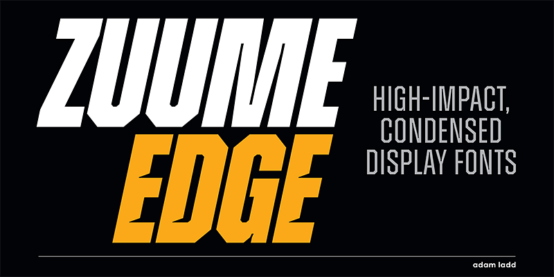
Zuume Edge stands out due to its contemporary and impactful style, which makes it highly suitable for branding, advertising, editorial layouts, and tech-related designs. Its sharp corners, angled terminals, and condensed appearance make it both eye-catching and versatile, perfect for use in headings, posters, and digital graphics. The clear geometry of Zuume Edge helps create a professional look that conveys a sense of confidence and modernity.
However, like any strong, characteristic font, the key to using Zuume Edge effectively is choosing the right fonts to pair with it. Balancing the boldness of Zuume Edge with more neutral and subtle typefaces can help create a dynamic and well-rounded design.
Best Pairings for Zuume Edge
The challenge in pairing fonts with Zuume Edge lies in finding fonts that either contrast its sharpness while maintaining harmony or amplify its bold energy without competing for attention. Here are some of the best options:
1. Roboto
Roboto is a popular sans-serif font known for its clean and geometric design, making it an ideal pairing for Zuume Edge. Roboto’s neutral character contrasts well with the sharp and edgy design of Zuume Edge, balancing the overall visual impact without overshadowing it. Use Roboto for body text or captions while using Zuume Edge in headlines or as a visual focal point.
2. Lora
For a sophisticated and dynamic pairing, Lora works wonderfully with Zuume Edge. Lora is a serif font with a slight calligraphic feel, bringing softness and a humanistic touch to a design dominated by Zuume Edge’s sharp geometry. The combination of a modern sans-serif like Zuume Edge with a classic serif like Lora can create an intriguing contrast perfect for editorial projects, especially when you want to combine readability with a strong visual statement.
3. Montserrat
Montserrat is another sans-serif font that can pair beautifully with Zuume Edge. With its geometric forms and slightly rounded terminals, Montserrat brings a friendly and approachable feel that complements the bold, modern look of Zuume Edge. Montserrat is versatile enough to be used for body text or secondary headings while Zuume Edge takes the spotlight in primary headings or callouts.
4. Merriweather
Merriweather is a humanist serif font that pairs well with a wide variety of sans-serif fonts. Its warm and classic appearance balances the boldness of Zuume Edge, creating an aesthetically pleasing contrast between the two typefaces. This pairing is particularly well-suited for projects that require a mix of traditional and modern elements, such as editorial layouts or branding that combines heritage with innovation.
5. Source Sans Pro
Source Sans Pro, Adobe’s first open-source typeface, is a highly readable and neutral sans-serif font. It complements Zuume Edge with its clarity and simplicity, which works well to tone down Zuume Edge’s edginess and allow the focus to remain on the core message. This pairing is ideal for digital applications such as websites or tech presentations.
6. Playfair Display
To add a sense of elegance to Zuume Edge, consider pairing it with Playfair Display. This serif font has high contrast between its thick and thin strokes, adding a sense of sophistication that contrasts well with the stark, geometric nature of Zuume Edge. Playfair Display is perfect for use in headings or subheadings, while Zuume Edge could be used to create striking logos or impactful titles.
Best Alternatives to Zuume Edge
While Zuume Edge is unique in its sharp aesthetic, there are other typefaces that can serve as excellent alternatives if you’re looking for something similar but with a slightly different flair.
1. Neographik
Neographik is a strong geometric sans-serif that can be a great alternative to Zuume Edge. With its bold structure, Neographik offers a similar level of impact but is more versatile in certain contexts. It works well in branding and editorial design and carries a slightly more minimalistic approach, making it a great choice for projects needing a cleaner aesthetic.
2. Gilroy
Gilroy is a popular geometric sans-serif font with clean lines and rounded corners. It’s slightly softer than Zuume Edge, providing a friendlier look while maintaining a contemporary feel. Gilroy’s versatility and range of weights make it a strong alternative for projects where a modern, yet approachable look is desired.
3. Rift
Rift, designed by Connary Fagen, is a modern display typeface that also features sharp geometric angles similar to Zuume Edge. Rift’s futuristic style makes it a fitting substitute for projects focusing on technology or science fiction themes. The bold cuts and strong visual presence are comparable to Zuume Edge, making it an ideal alternative.
4. Antipasto Pro
Antipasto Pro offers a softer and more rounded take on geometric sans-serif fonts, making it a suitable alternative to Zuume Edge when a more inviting tone is needed. It retains the boldness and modern appeal but with a touch of warmth. Antipasto Pro can be used for branding, social media, and advertising campaigns that want to project both modernity and friendliness.
5. Neue Machina
Neue Machina, designed by Pangram Pangram, has an industrial and futuristic appearance, similar to Zuume Edge. It features sharp cuts, mechanical influences, and geometric precision. Neue Machina can be used as an alternative in projects that require a more technical or high-impact look, ideal for gaming, tech, or automotive brands.
Final Thoughts
Zuume Edge is a font that demands attention with its strong geometric shapes and sharp edges. When pairing Zuume Edge with other fonts, the key is to create balance and harmony—whether through contrasting serifs or neutral sans-serifs that balance its boldness. Likewise, there are several great alternatives that offer similar aesthetics while providing unique touches that set them apart.
Whether you choose to pair Zuume Edge with a contrasting serif like Playfair Display or opt for an alternative like Gilroy for a different vibe, the decision ultimately depends on the needs and tone of your project. Experimenting with pairings and alternatives can lead to stunning results that enhance the overall design and amplify your creative vision.

