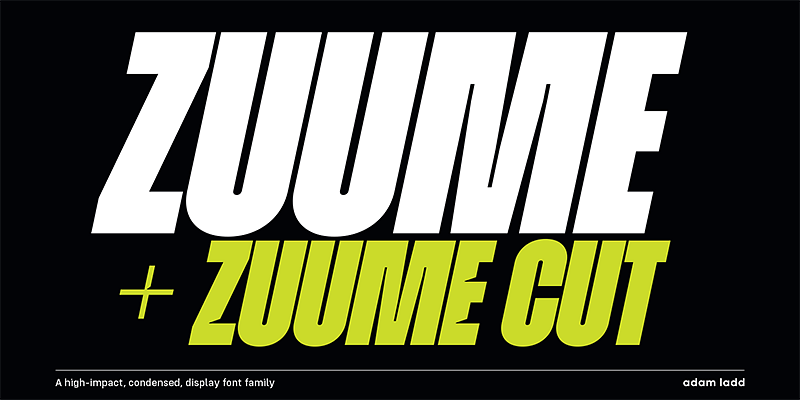
Zuume Cut is a modern and dynamic display typeface designed by Adam Ladd. It is characterized by sharp, angular cuts, and a bold presence that makes it ideal for headlines, branding, logos, and other impactful applications. With its striking, energetic appearance, Zuume Cut commands attention and brings an edgy, contemporary feel to designs. However, achieving the right balance by pairing it with complementary fonts or finding similar alternatives can enhance its appeal and extend its versatility. In this article, we’ll explore the best font pairings and alternatives to get the most out of Zuume Cut.
1. Overview of Zuume Cut
Zuume Cut is part of the Zuume type family, designed to convey energy and modernity. Its unique characteristics, such as sliced terminals and sharp edges, give it a sense of movement and power, making it ideal for projects that need a distinct, eye-catching look. Whether used for branding, posters, sports-related designs, or music festival graphics, Zuume Cut leaves a lasting impression.
2. Best Font Pairings with Zuume Cut
Pairing Zuume Cut with other fonts requires finding a balance between its dynamic, high-impact design and a complementary typeface that adds visual contrast without competing for attention. Here are some of the best fonts to pair with Zuume Cut:
2.1. Zuume Cut + Roboto
Roboto is a versatile sans-serif that works exceptionally well with the bold energy of Zuume Cut. The geometric, straightforward design of Roboto complements the sharp angles of Zuume Cut without overpowering it. This combination is perfect for creating a clean, modern look, and is ideal for branding, website design, or posters where readability and visual impact are essential.
2.2. Zuume Cut + Lora
Lora, a contemporary serif typeface, provides an excellent contrast to the edgy nature of Zuume Cut. While Zuume Cut delivers the visual punch needed for headlines, Lora adds warmth, elegance, and readability to body text. This pairing is particularly effective for editorial designs, brochures, and marketing materials that need to balance boldness with sophistication.
2.3. Zuume Cut + Montserrat
Montserrat is a modern sans-serif with a clean, friendly look that pairs well with Zuume Cut. Its rounded forms and even proportions contrast nicely with Zuume Cut’s sharp edges, helping to soften the overall design while retaining a sense of modernity. This pairing is well-suited for creative branding, posters, and social media graphics that require a harmonious, visually engaging balance.
2.4. Zuume Cut + Source Sans Pro
Source Sans Pro is a neutral and highly legible sans-serif that pairs effortlessly with Zuume Cut. Its simple, clear design allows Zuume Cut to take center stage while providing a sturdy and readable counterpart for longer text. This combination is ideal for web design, presentations, and other projects where a dynamic headline is paired with easy-to-read body text.
2.5. Zuume Cut + Playfair Display
Playfair Display is an elegant serif typeface with high contrast, making it an excellent pairing with Zuume Cut. The sophistication of Playfair Display contrasts with Zuume Cut’s bold, modern look, creating an eye-catching balance between classic and contemporary styles. This pairing works beautifully for editorial content, fashion lookbooks, and luxury branding, where visual contrast and elegance are desired.
3. Best Alternatives to Zuume Cut
If you’re looking for an alternative to Zuume Cut, whether for stylistic reasons or due to licensing restrictions, there are several typefaces that offer a similar bold, energetic aesthetic. Here are some of the best alternatives:
3.1. Bebas Neue
Bebas Neue is a popular, bold sans-serif with a condensed structure, making it a great alternative to Zuume Cut. It features clean lines and a striking appearance that works well in headlines, posters, and branding projects. Bebas Neue has a slightly softer look compared to Zuume Cut but still delivers a powerful visual impact.
3.2. Anton
Anton is another strong display typeface that serves as a viable alternative to Zuume Cut. With its bold, geometric letterforms, Anton conveys a similar sense of energy and modernity. It is well-suited for headlines, advertising, and any project that needs a dynamic, attention-grabbing font.
3.3. Impact
Impact is a classic display typeface known for its thick, heavy letterforms that create an assertive, in-your-face design. While Impact lacks some of the angular cuts of Zuume Cut, it serves as an excellent alternative when boldness and visual weight are required. This typeface is great for posters, branding, and impactful messaging.
3.4. Blackout
Blackout, designed by The League of Moveable Type, is a bold, condensed display typeface that has a similarly aggressive feel to Zuume Cut. With its geometric structure and sliced letterforms, Blackout offers a striking look that works well in posters, logos, and branding. It is a great choice when you need something that feels edgy and experimental.
3.5. Rift
Rift is a modern display typeface with a futuristic look and sharp edges, similar to Zuume Cut. It features angular letterforms that give it a dynamic, high-tech feel, making it suitable for projects in technology, gaming, or sports. Rift is a great alternative if you want a bold, modern typeface with a bit of an edge.
4. Practical Tips for Pairing and Alternatives
- Create Visual Hierarchy: Zuume Cut is best used for headlines and attention-grabbing elements. When pairing it with another typeface, make sure to create a clear visual hierarchy by choosing a neutral font for body text that complements, rather than competes with, Zuume Cut.
- Balance the Boldness: Zuume Cut’s angular and dynamic design is highly distinctive, so balance it with a simpler, more readable font for body text. This ensures that the design doesn’t feel overwhelming and remains easy to navigate.
- Test in Context: When selecting pairings or alternatives, always test them in the context of your design. Seeing how the fonts interact with colors, images, and other design elements can help you make a more informed decision.
- Consider the Tone of Your Project: Zuume Cut has a modern, edgy feel, making it ideal for projects that want to convey energy and power. Consider the tone of your project when selecting a pairing or alternative to ensure that the final design is cohesive and communicates the desired message.
Conclusion
Zuume Cut is a bold and energetic typeface that can bring a modern, edgy look to any design project. Pairing it with fonts like Roboto, Lora, or Playfair Display can create a visually appealing contrast that elevates the design while maintaining readability and balance. Alternatively, fonts like Bebas Neue, Anton, or Impact can serve as excellent replacements when you need a similar visual impact with slightly different characteristics.
The key to working with Zuume Cut lies in creating harmony between its striking features and the other elements of your design. Experiment with different combinations to find the pairing or alternative that best fits your project’s goals, and always keep readability and tone in mind for the most effective results.
If you need further assistance or have questions about using Zuume Cut or its alternatives, feel free to reach out. Typography is an art of balance, and finding the perfect pairing or alternative is a crucial step in creating captivating, effective designs.

