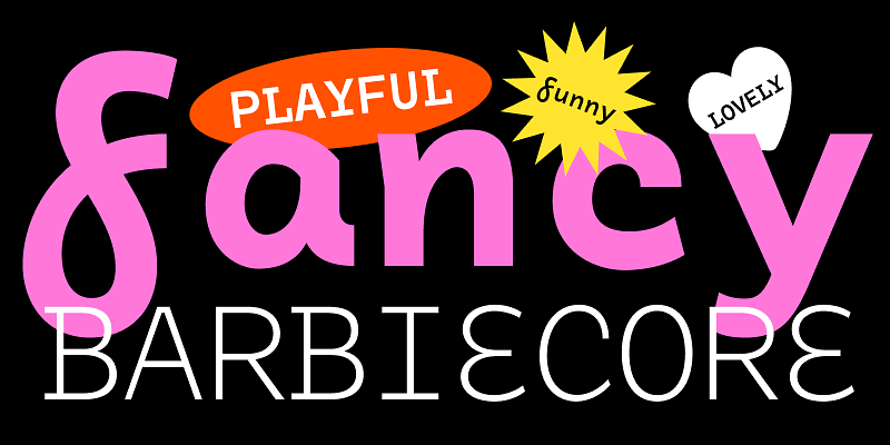
Designed by Dave Rowland (Schizotype/Dave Rowland Type), Tchig Mono is a monospaced grotesque font with a whimsical, lightly offbeat character. Its stylistic alternates and small‑caps-like lowercase make it ideal for playful, postmodern layouts—from indie film titles to pop‑up branding or anything seeking an unexpected twist on technical or code‑style visuals.
The font comes in five weights—Light, Regular, Medium, Bold, and Black—and supports Latin languages with advanced OpenType features like small caps, stylistic sets, and alternates.

Suggested Pairings: How to Complement Tchig Mono
Pairing a quirky monospaced font like Tchig Mono is about balance—either building contrast or enhancing its playful texture. Here are a few ideas:
Contrasting Serifs
- Modern slab-serif: Use a clean, bold slab serif for headings or subheads—its structure contrasts nicely with Tchig Mono’s uneven rhythm.
- Elegant humanist serif: Fonts like Merriweather add warmth and readability, great for body text that needs to feel refined against Tchig Mono’s offbeat charm
Clean Sans-Serifs
- Neutral sans like Open Sans or Lato: Offers a straightforward and modern counterpoint, grounding Tchig Mono’s more experimental tone ManyPixels.
- Geometric sans (e.g., Montserrat, Futura): Their precision and balance can highlight Tchig Mono’s unconventional shapes effectively.
Same-Family Play
- If your project uses Tchig Mono across styles—e.g. Regular for body and Black for display—you maintain visual harmony while maximizing expressiveness.
Alternatives & Free Look-Alikes
If Tchig Mono’s licensing or quirky nature isn’t ideal for your project, consider these alternatives:
Similar Paid Fonts
- From Eclectotype: Galix Mono, Odisseia Plau, and Calling Code offer comparable monospaced character with stylistic flavor
Free or Freely Available Options
- Generative matches like CrucifixSansOne, Leon Light, and SeoulNamsan B/M/vert—all monospaced, clean, and suitable for technical contexts—but less expressive than Tchig Mono
- Well-known free standard picks: Inconsolata or Lucida Console—functional, well‑balanced monospace faces
Practical Application & Use Cases
Here’s how you might creatively apply Tchig Mono and its alternatives:
| Use Case | Primary Type (Tchig Mono or Alternative) | Pairing Font Type |
|---|---|---|
| Indie Film Title or Poster | Tchig Mono Black (display weight) | Minimal serif or geometric sans |
| Coding, Terminal, or Tech UI | Inconsolata or SeoulNamsan (technical feel) | Clean sans serif (Lato, Open Sans) |
| Editorial Layout with Contrast | Tchig Mono Regular (body) | Slab vs humanist serif for headings |
| Pop-up Brand Identity or Menu Text | Tchig Mono (quirky) | Neutral sans or bold serif |
Final Thoughts
Tchig Mono stands out with its playful personality and rich OpenType features—making it a perfect choice when you want your sans-serif monospaced typography to be expressive rather than utilitarian. Pair it with stable, clean fonts (serif or sans) to anchor your design, or use creative weight contrasts within its own family for dynamic layouts.
