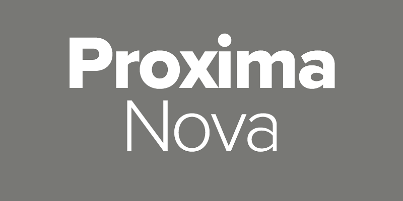
Proxima Nova, designed by Mark Simonson in 1994 and released in 2005, is a highly versatile sans-serif that brilliantly blends geometric formality with humanist warmth—a middle ground between Futura and Akzidenz Grotesk. Known for its broad x-height, generous proportions, and extensive weight range (Thin to Black, including condensed styles), it’s a go-to choice for both web and print contexts thanks to its clarity and adaptability.

Top Font Pairings for Proxima Nova
Here are key pairings that elevate different design needs:
1. Proxima Sera (Sans Companion)
The official serif companion crafted by the same designer offers seamless harmony for refined typographic systems.
2. Freight Text (Serif)
A balanced serif with character, it brings editorial depth when paired with Proxima Nova.
3. Futura PT (Geometric Sans)
Creates a layered, stylish sans-serif combination with a nod to heritage geometric forms.
4. Cubano (Display Sans)
A bold, expressive sans for striking headings that still feels unified with Proxima Nova body copy.
5. Skolar (Serif)
Subtle and elegant, it complements Proxima Nova with graceful contrast—ideal for body, subheads, or editorial use.
6. Rockwell (Slab Serif)
Offers strong typographic contrast—great for logos or headlines that need structure and visual weight.
7. Garamond / Century / Georgia
Mark Simonson himself suggests these timeless serifs for their clarity and balanced tone when mixed with Proxima Nova .
Additional pairings noted in typographic showcases include: Helvetica Neue, Adobe Garamond, Futura PT, Merriweather, etc., reinforcing Proxima Nova’s cross-style versatility .
Visual Pairing Quick Reference
| Pairing Font | Style | Best Use Case |
|---|---|---|
| Proxima Sera | Serif companion | Unified serif-sans systems |
| Freight Text / Skolar | Serif | Editorial content & body copy |
| Futura PT / Cubano | Sans Display | Modern stylized headings or titles |
| Rockwell | Slab Serif | Strong, structured headlines/logos |
| Garamond / Georgia | Classic Serif | Traditional long-form or classic design |
Great Alternatives to Proxima Nova
When licensing or availability is an issue, these fonts offer similar design DNA:
- Montserrat – Closely resembles Proxima Nova in form, widely accessible via Google Fonts .
- Raleway – Offers geometric structure; with some OpenType tweaks, can feel very similar .
- Avenir, Helvetica Neue, Gotham – All share the same neutral, modern clarity with variations in tone and weight .
- Gibson, GT Eesti, Sailec, Calibre – Lesser-used but excellent-quality alternatives that step away from familiarity while keeping the same essence .
- Draft and Gibbs – Noted by the original designer as among the closest matches in feel .
Why These Pairings & Alternatives Work
- Contrast & Harmony: Combining Proxima Nova with serif faces like Freight Text or Rockwell creates legible contrast while preserving typographic cohesion.
- Design Flexibility: From digital UI to editorial layouts and branding, these pairings provide functional sophistication.
- Accessibility Without Compromise: With strong free options like Montserrat or Raleway, designers can achieve a polished look without licensing hurdles.
Final Take
Proxima Nova remains a modern classic—clean, friendly, and remarkably versatile. To build with typographic intent:
- Choose Proxima Sera or Freight Text for elegant serif contrasts.
- Opt for Futura PT or Cubano for modern, attention-grabbing sans headers.
- Use Rockwell or Century-style serifs for structural weight and personality.
- If you don’t have access, Montserrat, Raleway, or Avenir make solid alternatives.
