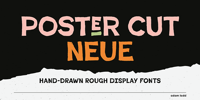
Post Cut Neue is a modern typeface designed by Adam Ladd from the Adam Ladd foundry. With its bold, sharp, and confident style, Post Cut Neue is perfect for making a visual statement in both digital and print projects. The typeface is characterized by its angular forms and unique letter shapes, giving it a contemporary and edgy appeal that can elevate the aesthetics of branding, posters, and editorial designs. In this article, we’ll explore some of the best fonts to pair with Post Cut Neue, as well as some notable alternatives that can deliver a similar style or vibe for your creative projects.
Why Choose Post Cut Neue?
Post Cut Neue is ideal for projects where boldness and impact are crucial. Its geometric features, clean lines, and sharp edges make it highly suitable for display use, such as in logos, advertisements, or magazine headlines. Its modern and avant-garde design can be used to convey a strong sense of style and assertiveness, making it a good choice for tech companies, fashion brands, and creative agencies.
Post Cut Neue’s versatility also extends to pairing with other fonts. Choosing the right complementary typefaces is key to maximizing its visual impact while maintaining harmony across your design. Below, we’ll discuss some great font pairings that work well with Post Cut Neue.
Best Pairings for Post Cut Neue
The challenge when pairing Post Cut Neue is finding fonts that either complement its bold, modern look or create a pleasing contrast that draws attention. Here are some ideal pairings:
1. Lato
Lato is a sans-serif typeface that works well with the bold forms of Post Cut Neue. Its clean and neutral design complements Post Cut Neue’s distinctive letter shapes, providing balance to your design. Lato is ideal for use in body text, while Post Cut Neue can take center stage in headings and titles. This pairing works especially well in editorial layouts or web design, where readability and visual contrast are essential.
2. Playfair Display
Playfair Display is a serif typeface that offers an elegant contrast to the bold and angular forms of Post Cut Neue. With its high contrast between thick and thin strokes, Playfair Display brings a touch of sophistication that pairs well with Post Cut Neue’s modernity. This pairing works well for branding, fashion editorials, and high-end product packaging, creating a mix of contemporary and classic elegance.
3. Roboto
Roboto is a versatile sans-serif font that pairs beautifully with Post Cut Neue, thanks to its modern and highly readable letterforms. Roboto’s neutrality provides a good backdrop to Post Cut Neue’s edgy design, making the pairing perfect for web projects, presentations, and digital marketing. Roboto can be used for body copy, allowing Post Cut Neue to shine in headings or hero text.
4. Source Serif Pro
Source Serif Pro is a serif font that provides a good contrast to Post Cut Neue. The softer and more traditional forms of Source Serif Pro create a pleasant juxtaposition with the sharp and bold forms of Post Cut Neue. This pairing is effective in editorial layouts, brochures, and promotional materials that require a combination of strong visual hierarchy and readability.
5. Montserrat
Montserrat is a geometric sans-serif font that pairs well with Post Cut Neue, especially in modern branding projects. Its rounded letterforms and even spacing provide a contrast to the sharp angles of Post Cut Neue, creating a well-balanced visual appeal. Use Montserrat for subtitles or supporting text to enhance the overall design without overwhelming the main headline set in Post Cut Neue.
6. Nunito
Nunito is a well-rounded sans-serif typeface that pairs effectively with Post Cut Neue. The rounded letterforms of Nunito provide a softer and more welcoming feel that contrasts well with the sharp edges and boldness of Post Cut Neue. This pairing is well-suited for digital projects, such as websites, apps, and social media graphics, where a combination of bold headlines and readable body text is needed.
Best Alternatives to Post Cut Neue
If you like the overall aesthetic of Post Cut Neue but are looking for some alternatives that offer a similar vibe, here are some excellent options:
1. Avenir Next
Avenir Next is a modern geometric sans-serif font that can serve as a versatile alternative to Post Cut Neue. Avenir Next has a more refined and rounded design, offering a contemporary look while maintaining a sense of softness. It’s ideal for use in branding, editorial layouts, and digital designs where a clean and bold look is required without the sharp angles of Post Cut Neue.
2. Neue Haas Grotesk
Neue Haas Grotesk is a neutral, bold sans-serif that provides a similar sense of modernity to Post Cut Neue, but with a more classic touch. Its clean lines and robust letterforms make it suitable for projects where an impactful, bold typeface is needed. It works well in branding, advertising, and editorial contexts, offering a timeless yet contemporary appeal.
3. Gilroy
Gilroy is a geometric sans-serif typeface that offers an excellent alternative to Post Cut Neue. With its clean lines and modern aesthetic, Gilroy shares a similar boldness while maintaining a more straightforward and minimalist feel. Gilroy is a great option for use in logos, posters, and branding where you want to make an impact without the sharper characteristics of Post Cut Neue.
4. Rift
Rift, designed by Connary Fagen, is another solid alternative to Post Cut Neue. Rift is a futuristic display font that features geometric forms and a similar sharpness, making it perfect for tech and gaming brands. The bold strokes and angular shapes create a comparable visual impact, making Rift a fitting substitute when you need something with the same bold and edgy qualities.
5. TT Lakes Neue
TT Lakes Neue is a geometric sans-serif typeface that can work as an alternative to Post Cut Neue. It has a modern, minimalist design that still feels bold and authoritative. TT Lakes Neue works well for branding, web design, and editorial projects, offering a versatile option that maintains a contemporary vibe similar to Post Cut Neue.
6. Bebas Neue
Bebas Neue is a condensed sans-serif typeface that can be used as an alternative to Post Cut Neue, especially for headlines and display purposes. Bebas Neue has a strong and impactful style, with its tall letterforms giving it an authoritative presence similar to Post Cut Neue. It works well in posters, advertising, and social media graphics where boldness and legibility are key.
Final Thoughts
Post Cut Neue is a bold, modern typeface that brings a unique character to any design project. Its sharp edges and geometric forms make it ideal for impactful use in branding, headlines, and editorial designs. When pairing Post Cut Neue with other fonts, it’s essential to find complementary typefaces that balance its strong characteristics while enhancing the overall visual composition. Fonts like Lato, Roboto, and Montserrat provide excellent options for achieving a balanced and cohesive look.
For those looking for alternatives, Avenir Next, Neue Haas Grotesk, and Gilroy provide similar bold aesthetics with varying degrees of sharpness and versatility. Choosing the right typeface depends on the mood and message of your design, so experiment with different pairings and alternatives to find the perfect combination that elevates your creative work.

