Ofelia Display is an elegant and sophisticated typeface that stands out in large headlines, branding, and promotional materials. With its refined shapes, delicate serifs, and a graceful structure, Ofelia Display exudes an air of timeless style and class. It is an ideal choice when you want to make a statement or bring an element of high fashion or luxury to your project. However, pairing Ofelia Display with complementary typefaces or finding the right alternatives can enhance its impact even more. In this article, we’ll explore some of the best font pairings and alternatives that will help you get the most out of Ofelia Display.
1. Overview of Ofelia Display
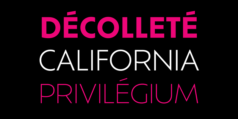
Ofelia Display is a serif typeface characterized by high contrast, sharp terminals, and a sophisticated silhouette that captures attention with its elegant lines and refined forms. It is particularly well-suited for headlines, logos, posters, and any project that requires a distinct and elegant typographic presence. The typeface’s strong personality and striking features make it highly effective for projects in luxury branding, editorial layouts, fashion advertising, and creative promotional designs.
2. Best Font Pairings with Ofelia Display
Pairing Ofelia Display with other fonts requires a balance of visual contrast and harmony. Here are some of the best typefaces to use alongside Ofelia Display to create a cohesive and captivating design.
2.1. Ofelia Display + Roboto
Roboto is a versatile sans-serif typeface that works seamlessly alongside Ofelia Display. Its clean, modern lines provide a nice contrast to the intricate details of Ofelia Display, helping to balance the elegance with simplicity. This combination works particularly well for editorial content, fashion magazines, and professional websites where readability and aesthetics go hand in hand.
2.2. Ofelia Display + Lato
Lato, a humanist sans-serif, brings a subtle warmth and approachability to the pairing. While Ofelia Display commands attention with its elegance and sharpness, Lato’s smooth curves provide a complementary tone that feels inviting and friendly. This pairing is great for brand identities, social media graphics, and promotional materials that aim for a refined yet approachable look.
2.3. Ofelia Display + Merriweather
Merriweather is a traditional serif typeface that makes for an excellent body text option when paired with the bold and dramatic nature of Ofelia Display. The contrast between the two creates a visual hierarchy that feels balanced and highly readable. This pairing is perfect for editorial layouts, fashion catalogs, and websites that want to create a sense of elegance with a strong, readable foundation.
2.4. Ofelia Display + Montserrat
Montserrat is a modern, geometric sans-serif that adds a contemporary touch to the classic sophistication of Ofelia Display. The simple and clean structure of Montserrat provides a pleasing contrast that allows Ofelia Display to shine as the headline or display text. This pairing is ideal for branding projects, posters, and web design that require a mix of elegance and modernity.
2.5. Ofelia Display + Open Sans
Open Sans is a highly legible and neutral sans-serif that pairs well with Ofelia Display, allowing it to take center stage while providing a simple, readable counterpart. Open Sans’s neutrality makes it a great choice for longer blocks of text, ensuring that the overall design remains uncluttered and accessible. This pairing is great for professional presentations, marketing materials, and editorial content where clarity and elegance are key.
3. Best Alternatives to Ofelia Display
If you’re looking for typefaces that can capture the spirit of Ofelia Display but offer a slightly different take, there are several fantastic alternatives that share its elegance and bold aesthetic.
3.1. Playfair Display
Playfair Display is a high-contrast serif typeface that captures much of the same luxurious and classic qualities as Ofelia Display. Its elaborate forms and elegant style make it a suitable alternative when you need a typeface with a similar impact but want a slightly more romantic feel. Playfair Display is perfect for editorial projects, luxury brands, and high-fashion advertising.
3.2. Cormorant Garamond
Cormorant Garamond is another great alternative to Ofelia Display, bringing with it a high level of elegance and readability. It has a more traditional feel, with beautiful flourishes and a classical influence that make it suitable for projects looking for a timeless and refined look. Cormorant Garamond works particularly well for book covers, invitations, and high-end branding.
3.3. Bodoni
Bodoni is a classic serif typeface known for its high contrast and timeless elegance, much like Ofelia Display. Bodoni’s sharp edges and distinctive forms provide a striking and sophisticated aesthetic, making it a fantastic substitute for headlines, logos, and fashion-related designs. Its versatility across various media makes it a solid choice for both print and digital design.
3.4. Abril Fatface
Abril Fatface is a strong, high-contrast display serif that conveys a similar level of drama as Ofelia Display. Its bold, curvaceous forms are well-suited for headlines and attention-grabbing elements. Abril Fatface can serve as an alternative when you need a bit more playfulness or a bolder impression, perfect for posters, editorial work, and promotional materials.
3.5. Butler
Butler is a serif typeface that blends elements of both Didone and stencil styles, resulting in a modern, elegant typeface that is well-suited as an alternative to Ofelia Display. Butler retains the luxury and sophistication of Ofelia Display but adds an interesting twist with its unique character details. This makes Butler an excellent choice for branding projects, book covers, and high-end packaging.
4. Practical Tips for Pairing and Alternatives
- Create Visual Hierarchy: Ofelia Display is best used for headlines and attention-grabbing elements. When pairing it with a typeface for body text, opt for a clean and neutral typeface that allows Ofelia Display to stand out.
- Balance Elegance and Readability: The high contrast and sharp details of Ofelia Display make it eye-catching, but it’s important to balance that with a more subdued font for body copy to ensure overall readability.
- Test the Pairing in Context: Always test font pairings in the context of your design to ensure that the visual tone matches your project’s goals. Whether it’s for a luxury brand or an editorial layout, make sure the fonts work well together and convey the desired mood.
- Consider the Medium: Ofelia Display shines in large formats, such as posters, billboards, and headlines, but for smaller sizes or longer text blocks, make sure to choose an alternative or a pairing that maintains legibility and doesn’t overwhelm the design.
Conclusion
Ofelia Display is a striking and refined typeface that works beautifully in projects where elegance, luxury, and sophistication are desired. By pairing it with typefaces like Roboto, Lato, or Montserrat, you can create balanced and visually captivating designs. If you’re in search of alternatives, options like Playfair Display, Bodoni, and Abril Fatface can provide similar qualities while bringing their own unique flavor.
Typography is all about creating harmony and expressing the right mood for your project. Ofelia Display, with its distinctive elegance, can be made even more powerful when thoughtfully paired or replaced with a well-considered alternative. Experiment with these combinations, and find the perfect fit to make your designs truly shine.
If you have any questions about pairing or choosing an alternative for Ofelia Display, feel free to reach out. The right combination can make all the difference in elevating your design work!

