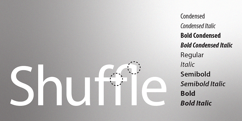
Myriad is a humanist sans-serif typeface crafted by Robert Slimbach and Carol Twombly in 1992 for Adobe Systems. It’s known for its clean, neutral style, open letterforms, and excellent legibility. Notable for its slanted cut on the “e” and distinctive “y” tail, Myriad earned widespread use—including Apple’s corporate identity from 2002 to 2017.

Best Font Pairings for Myriad
Pairing Myriad with complementary typefaces can elevate design by adding depth, hierarchy, and contrast. Here are some standout combinations:
- Minion Pro — a classic serif that pairs beautifully with Myriad’s modern simplicity. This combo is heavily favored in editorial and corporate settings.
- Sabon (serif) — creates a refined, elegant contrast when paired with Myriad, ideal for sophisticated layouts
- Adobe Garamond, Adobe Caslon, Chaparral (and Chaparral Pro) — each brings warmth, tradition, and readability, adding classical character to designs that use Myriad
- FF Enzo, Museo Slab — for a bolder, statement-making pairing, these slab serifs offer texture and visual weight alongside Myriad’s clarity
- Helvetica Neue — a neutral, modern sans that pairs well when you want to retain a minimalist aesthetic while establishing typographic hierarchy
Notable Insights from Designers
On Reddit, designers note:
“Minion Pro is a nice serif font that pairs well with Myriad Pro.”
For sans options: “Franklin Gothic” also pairs harmoniously
CreativeBloq highlights how Myriad Black + Minion can establish clear visual hierarchy and drama in headlines and body text, respectively.
Alternatives & Similar Fonts to Myriad
When licensing or availability is limited, these fonts offer a similar feel:
- Open Sans — a Google-friendly, humanist sans with open forms and excellent legibility
- Lato, Source Sans Pro, Roboto, Fira Sans, Noto Sans, PT Sans — each maintains a neutral, friendly tone akin to Myriad, suitable for both web and print.
- PT Sans and Open Sans again appear as top Google Fonts alternatives with close stylistic resemblance
- Broader lists of similar typefaces include Arimo, Avenir, Frutiger, Gill Sans, Montserrat, and Raleway, which offer varied aesthetics while retaining that modern sans appeal
- TT Fellows, TT Chocolates — premium fonts that mirror Myriad’s humanist structure closely for high-quality typographic consistency.
- Effra, Bernini Sans — noted by Typewolf as closely related web-safe alternatives.
- M+ — recommended within the design community as a strong alternative to Myriad Pro.
Summary Table
| Purpose / Style | Suggested Pairing or Alternative | Why It Works |
|---|---|---|
| Classic serif contrast | Minion Pro, Sabon | Establishes elegance and hierarchy |
| Modern serif or slab | Chaparral, Museo Slab | Adds weight and structure to modern layouts |
| Clean sans hierarchy | Helvetica Neue | Maintains minimalism with typographic separation |
| Free & accessible alternatives | Open Sans, Lato, Source Sans Pro | Offers similar readability and style across platforms |
| Premium look-alikes | Avenir, Frutiger, TT Fellows | High-quality variants with humanist sans feel |
Final Take
Myriad shines in its versatility and neutrality. To complement it:
- Choose serifs (like Minion, Garamond) for elegance and contrast.
- Stick with neutral sans (like Helvetica Neue) for subtle sophistication.
- Explore free alternatives (like Open Sans, Lato) for accessibility and flexibility.
- Consider premium look-alikes if you want a fresh yet familiar aesthetic.
