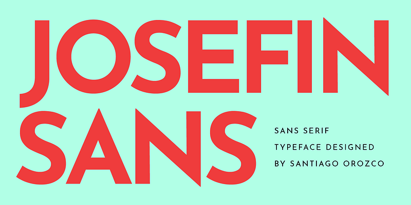
Josefin Sans, created by Santiago Orozco, is a geometric sans-serif inspired by 1920s design, blending vintage elegance with a contemporary twist. With tall letterforms and a distinctive aesthetic, it shines when used at larger sizes or for striking headings.
Great Font Pairings for Josefin Sans
Here are some tried-and-true pairings that create strong visual harmony:
- Playfair Display – A classic high-contrast serif that adds sophistication and visual contrast when paired with the clean geometry of Josefin Sans.
- Montserrat – A modern geometric sans, offering cohesive style with complementary letterforms and ample versatility.
- Merriweather – This readable, warm serif contrasts nicely with Josefin’s minimalism, ideal for text-heavy layouts.
- Lato & Raleway – Clean, neutral sans-serif fonts that pair seamlessly with Josefin Sans across digital and print designs.
- Cardo, Prata, Caudex, Kotta One, Minion Pro, Goudy – Rich serif options that complement Josefin Sans by adding texture and classic elegance.
- Yeseva One – A bold display serif with feminine energy, perfect when used as headers with Josefin handling the body or subheads.
- Fira Mono – A monospaced typeface offering a modern, tech-inspired contrast to Josefin’s stylized geometry.
Practical Pairing Combinations
| Pairing Font | Style | Best Use Case |
|---|---|---|
| Playfair Display | Serif | Elegant headers with sleek Josefin Sans body text |
| Montserrat | Geometric Sans | Cohesive, modern designs—both fonts for headings |
| Merriweather | Serif | Readable body text under geometric headings |
| Lato / Raleway | Sans-serif | Clean, versatile pairing for UI and print layouts |
| Yeseva One | Display Serif | Stylish, bold headlines with Josefin framing |
| Prata / Caudex etc. | Serif | Classic editorial or brand applications |
| Fira Mono | Monospaced Sans | Tech-forward visuals with relaxed geometric tone |
Alternatives to Josefin Sans
Looking for something similar but unique? Check out these alternatives:
- Jost – A free, open-source geometric sans with a clean, modern character, praised for being a great parallel to Josefin Sans.
- LibreFranklin, Work Sans Light, kiddySans – Light sans-serif alternatives that mirror the skinny elegance of Josefin Sans.
- Quicksand, Comfortaa, Futura-style fonts – Rounded or geometric sans-faces that evoke a similar feel.
Why These Pairings Work
- Visual contrast: Combining minimalist Josefin Sans with serifs like Playfair Display or Merriweather elevates hierarchy and readability.
- Harmonious styling: Sans-with-sans pairings (Montserrat, Lato) maintain a balanced modern aesthetic.
- Brand versatility: Strong serif choices (Yeseva One, Prata) add flair for branding or editorial layouts.
- Flexible design: Alternatives like Jost offer similar charm with novelty and legal peace of mind.
Final Thoughts
Josefin Sans is a standout font when you want geometric style with a touch of vintage elegance. To make the most of it:
- Opt for Playfair Display or Merriweather to add depth and contrast.
- Use Montserrat, Lato, or Raleway for clean, typographic continuity.
- Choose Yeseva One or classic serifs like Prata when sophistication is key.
- Experiment with Jost or Work Sans Light as fresh stylistic alternatives.

