Gravesend Sans is a versatile typeface known for its clean lines, modern aesthetic, and ability to seamlessly integrate into a wide range of designs. Whether you’re designing a branding package, a website, or print materials, the key to a successful design often lies in how well you pair Gravesend Sans with other typefaces or find the perfect alternative. This guide will explore some of the best font pairings and alternatives to elevate your projects and make them stand out.
Gravesend Sans: A Quick Overview
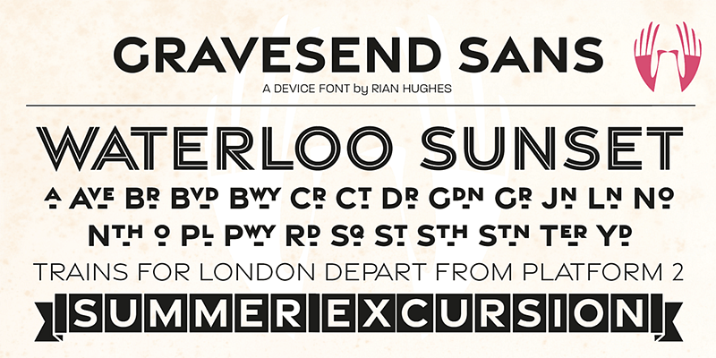
Gravesend Sans is celebrated for its geometric structure and humanist touches, making it a go-to font for designers who seek a contemporary yet approachable look. It is highly readable in both digital and print formats, and its versatility means it can be used across a range of industries, from tech startups to editorial design. The neutrality of Gravesend Sans allows it to complement other typefaces beautifully, adding balance and visual interest to your designs.
1. Best Font Pairings with Gravesend Sans
1.1. Gravesend Sans + Merriweather
Merriweather, a classic serif with a warm personality, makes an excellent pairing with Gravesend Sans. The contrast between the modern, geometric look of Gravesend Sans and the more traditional, literary qualities of Merriweather creates a refined yet accessible aesthetic. This pairing is ideal for blogs, editorial websites, and any design project that requires a balance of old and new.
1.2. Gravesend Sans + Playfair Display
Playfair Display is another great choice if you want a pairing that emphasizes elegance and sophistication. The contrast between Gravesend Sans’s clean lines and Playfair Display’s high-contrast serif adds drama to headlines while keeping body text readable. This combination works particularly well for luxury brands, fashion editorials, and stylish portfolios.
1.3. Gravesend Sans + Lora
Lora is a serif typeface with roots in calligraphy, which brings a sense of warmth and human touch to any project. Paired with Gravesend Sans, Lora offers a natural yet polished look, making it perfect for creative agencies or personal projects that want to evoke a sense of authenticity.
1.4. Gravesend Sans + Raleway
For a minimalist, modern look, pairing Gravesend Sans with Raleway creates a sense of cohesiveness and simplicity. Raleway’s thin weight contrasts nicely with Gravesend Sans without overpowering it, making it ideal for digital interfaces, clean websites, or presentations that need to emphasize clarity and modernity.
1.5. Gravesend Sans + Source Serif Pro
Source Serif Pro brings a technical but elegant tone that works seamlessly alongside the geometric simplicity of Gravesend Sans. This pairing is especially effective for professional reports, financial documents, and infographics where readability and a polished look are essential.
2. Best Alternatives to Gravesend Sans
While Gravesend Sans is a fantastic typeface, there may be times when you’re looking for something slightly different, either for stylistic reasons or due to licensing restrictions. Here are some excellent alternatives that capture a similar essence:
2.1. Montserrat
Montserrat shares a lot of the characteristics that make Gravesend Sans so appealing: geometric shapes, balanced proportions, and versatility. Montserrat is slightly rounder and friendlier, making it a solid choice if you’re looking for a more approachable alternative that maintains a modern feel.
2.2. Futura
Futura is a classic geometric sans-serif with a long history in graphic design. While it has a more rigid and formal feel compared to Gravesend Sans, Futura is an excellent alternative when you want something with a bit more historical presence. Its clean lines and iconic look make it ideal for timeless branding projects and minimalist compositions.
2.3. Avenir
Avenir, designed by Adrian Frutiger, provides a more humanist interpretation of a geometric sans, much like Gravesend Sans. It has a slightly warmer tone, thanks to its more subtle curves, making it perfect for projects that require a balance of professionalism and approachability. Avenir works particularly well for corporate branding, lifestyle magazines, and sophisticated websites.
2.4. Proxima Nova
Proxima Nova is a modern classic in the world of sans-serif fonts and serves as a highly versatile alternative to Gravesend Sans. Its rounded shapes give it a friendly look, while the balanced structure ensures readability. Proxima Nova is well-suited for web design, app interfaces, and branding, where you want a clean, straightforward aesthetic.
2.5. Gotham
Gotham is a popular alternative for those seeking a bold, clean, and highly legible typeface. It has a slightly more robust and architectural quality than Gravesend Sans, which makes it great for headlines and impactful branding. Gotham’s versatility allows it to work in a variety of settings, from political campaigns to fashion advertising.
2.6. Neue Haas Grotesk
Neue Haas Grotesk, the predecessor of Helvetica, offers a similar level of versatility but with a slightly different character. Its neutral appearance makes it an excellent alternative to Gravesend Sans if you need something timeless and universally appealing. This font works well in editorial, advertising, and corporate design.
3. Practical Applications and Tips for Pairing and Alternatives
When using Gravesend Sans in your design work, consider the following practical tips for effective pairing and selecting alternatives:
- Establish Hierarchy: When pairing fonts, make sure you establish a clear typographic hierarchy. Use Gravesend Sans for body text and a contrasting serif for headings or vice versa. This helps guide the viewer’s eye and creates an appealing contrast.
- Maintain Balance: Balance is key when choosing an alternative to Gravesend Sans. If Gravesend Sans is too modern for a specific project, an alternative like Avenir or Futura can give you a different nuance while still fitting within a modern aesthetic.
- Consider Mood: Every typeface conveys a different mood. Gravesend Sans is quite neutral, so the font you pair it with should enhance the emotional tone of your project. Playfair Display, for example, brings elegance, whereas Lora adds warmth.
- Test in Context: Always test pairings and alternatives in the context of your design. Seeing how they interact with colors, images, and other elements can help you make the best decision for your project.
Conclusion
Gravesend Sans is a highly versatile and aesthetically pleasing typeface that pairs well with many other fonts, from traditional serifs like Merriweather to modern classics like Playfair Display. Finding the right pairing can help bring balance and sophistication to your work, while alternatives like Montserrat, Futura, or Avenir can be valuable when you need a similar feel but with slight variations.
No matter which route you choose—pairing or finding an alternative—the goal is to enhance your design and convey the desired mood effectively. Play around with these combinations, test them in your projects, and let the visual harmony guide your audience’s journey through your work.
Feel free to experiment and see which pairings or alternatives resonate most with your audience or brand! The perfect combination is out there waiting to be discovered, and hopefully, this guide has sparked some inspiration for your next project.

