Your resume serves as the first point of contact between you and a potential employer. It’s more than just a summary of your work experience and skills—it’s a reflection of your professionalism, attention to detail, and communication skills. An often overlooked but highly significant part of your resume’s presentation is the choice of font. Choosing the best font for your resume can help you stand out from the crowd, ensure readability, and convey the right tone. This article will guide you through the top fonts for resumes, what makes them ideal, and how they can help you make a great first impression.
Why Font Choice Matters
While the content of your resume is crucial, the way it is presented can make or break your chances of being noticed. Hiring managers spend an average of just a few seconds scanning each resume before deciding if it’s worth further review. In that short window, an eye-pleasing and easy-to-read font can make a difference.
A poorly chosen font may come across as unprofessional, cluttered, or hard to read, causing potential employers to dismiss your resume before even getting to the substance. Choosing a professional, clean, and easily readable font shows that you value detail, presentation, and readability—qualities that many employers seek in a candidate.
Characteristics of a Good Resume Font
Before we dive into the best fonts for your resume, it’s helpful to understand what characteristics make a font suitable for this purpose:
- Readability: A font should be clear and legible, even at smaller sizes.
- Professional Appearance: It should convey a professional tone that’s appropriate for your industry.
- Neutrality: The font should not draw undue attention to itself but allow the content to shine.
- Space Efficiency: The font should be able to present information concisely while avoiding excessive space consumption.
Best Fonts for Your Resume
Here are some of the best fonts to consider when creating your resume, each chosen for its readability, style, and professional look:
1. Arial
Arial is a classic sans-serif font that offers a clean, straightforward, and professional look. It’s an excellent choice if you want to play it safe while ensuring readability. Arial is widely used in many professional documents, and its clean lines make it easy on the eyes, especially for resume screening software.
Pros:
- Highly readable and clear
- Universally available, making your resume display consistently across devices
Cons:
- Common and widely used, which may make it less distinctive
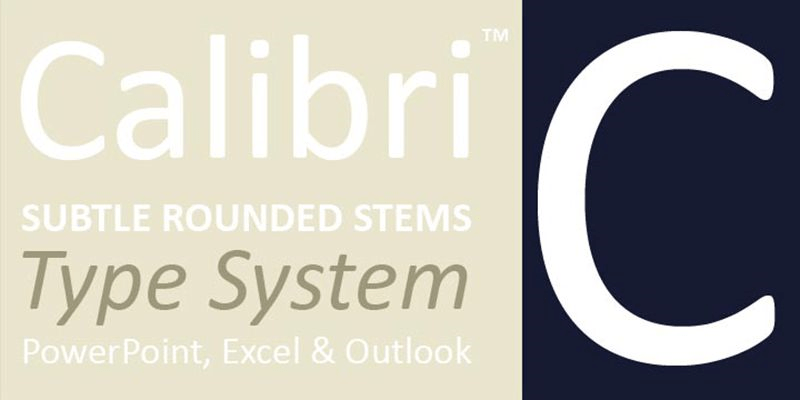
2. Calibri
Calibri is the default font for Microsoft Office, making it a familiar choice for many recruiters. It’s a modern sans-serif font that’s clean, easy to read, and has a friendly feel. Calibri is great for those who prefer a balance of modernity and professionalism.
Pros:
- Clean, modern, and highly readable
- Professional yet approachable
Cons:
- Might appear generic if overused
3. Times New Roman
Times New Roman is a traditional serif font that has been a go-to choice for professional documents for decades. It conveys a sense of formality and respectability. If you’re applying for a role in a conservative industry—such as law or finance—Times New Roman can be a safe bet.
Pros:
- Formal and classic
- Efficient use of space
Cons:
- Can appear outdated or overly formal in more creative industries
4. Garamond
Garamond is another serif font that provides a timeless and elegant feel, but it’s less common than Times New Roman. Its slightly more modern appearance can make your resume stand out while still being professional. Garamond works well for candidates who want to maintain a formal tone while showing a touch of individuality.
Pros:
- Elegant and sophisticated
- Readable yet distinctive
Cons:
- Not as modern as some sans-serif options
5. Helvetica
Helvetica is a classic sans-serif font that’s known for its clean and modern appearance. It’s widely used in advertising and design, but it also works well for resumes, providing a polished and straightforward look. If you’re applying for a role in a creative field, Helvetica’s modern aesthetic could be ideal.
Pros:
- Clean, neutral, and modern
- Gives a professional yet creative look
Cons:
- Not always available on Windows systems by default
6. Georgia
Georgia is a serif font that’s easy to read both on screen and in print. It has a more modern look compared to Times New Roman, with rounded edges that give it a friendlier appearance. Georgia is a good choice for those who want to use a serif font but also want to avoid appearing too conservative.
Pros:
- Modern, friendly, and easy to read
- Works well both in print and on screen
Cons:
- Can be less space-efficient than other fonts
7. Cambria
Cambria is another serif font that was designed specifically for on-screen reading, making it an excellent choice for resumes that will be submitted digitally. It’s professional without being too formal, providing a balance between classic and contemporary.
Pros:
- Highly readable on screen
- Professional without excessive formality
Cons:
- Less unique, as it’s a default Microsoft font
8. Verdana
Verdana is a sans-serif font that was designed to be extremely readable, even at small sizes. Its wide spacing makes it an excellent choice for resumes that need to be clear and straightforward, especially when you’re working with limited space.
Pros:
- Very readable, even at smaller sizes
- Has a clean, modern feel
Cons:
- Its wide letter spacing can take up more space, limiting content
Fonts to Avoid
Not all fonts are suitable for resumes, and using the wrong one can negatively affect your chances. Here are some fonts you should generally avoid:
- Comic Sans: Too informal and often viewed as unprofessional.
- Papyrus: Too decorative and unsuitable for a professional resume.
- Courier: Reminiscent of typewriters, it can look outdated and mechanical.
- Brush Script: Difficult to read and overly stylized.
Tips for Using Fonts Effectively
- Stick to One Font: Using multiple fonts can make your resume look cluttered and inconsistent. Stick with one font throughout to maintain a clean and professional appearance.
- Use Standard Sizes: A font size of 10-12 points is standard for most resumes. Your name and section headings can be slightly larger to stand out.
- Consistent Formatting: Make sure to use bold, italics, and underline sparingly and consistently to emphasize key information without overwhelming the reader.
- Print Test: If you’re submitting a physical copy, print your resume to ensure the font looks good on paper. Fonts can look different in print than they do on screen.
Matching Font Choice to Industry
The best font for your resume may vary depending on the industry you’re applying to:
- Corporate, Finance, and Law: Times New Roman, Garamond, or Cambria are safe bets for a formal and professional look.
- Creative Fields: Helvetica or Calibri can convey a clean, modern, and creative appearance without being over the top.
- Technology and Startups: Arial, Verdana, or Helvetica are modern and straightforward, fitting the informal and dynamic culture of tech industries.
Conclusion
Your resume is a tool to create a positive and lasting first impression, and your choice of font plays a significant role in how that impression is formed. Choosing a clean, professional, and readable font will ensure that your resume is easy to scan and effectively communicates your skills and experience. Whether you stick with the tried-and-true Times New Roman, the modern Calibri, or the elegant Garamond, the key is to choose a font that presents your qualifications clearly and professionally. Remember, the goal is to make it easy for hiring managers to see why you’re the perfect fit for the role.

