In the world of advertising, where catching attention is everything, choosing the right font can make or break your campaign. Typography is not just a design element; it’s an integral part of your message that speaks to your audience before they even read the words. The right font can evoke emotions, communicate values, and build brand recognition. In this article, we’ll explore some of the best fonts for advertising, focusing on how different fonts can create the ideal atmosphere for various types of campaigns.
Why Fonts Matter in Advertising
Fonts are an essential tool for conveying your brand’s personality and tone in advertising. Whether it’s a billboard, a social media ad, or a print campaign, the choice of font can influence how people perceive your brand. Here are some of the ways fonts play a role in advertising:
- Grabbing Attention: Advertising is all about catching the audience’s eye, especially in today’s media-saturated world. The right font will stand out without being distracting, drawing viewers to your message.
- Communicating Tone: Different fonts evoke different emotions. A playful script font may convey whimsy and fun, while a bold sans-serif may communicate strength and reliability.
- Creating Consistency: Using fonts that align with your brand’s identity creates a consistent visual experience across all your marketing materials, building trust and recognition with your audience.
- Improving Readability: Ads need to communicate quickly, and readability is key. A font that’s too intricate or condensed may lose its impact if viewers can’t read it easily.
Choosing the Best Fonts for Advertising
There are many types of fonts available, but not all of them are well-suited for advertising purposes. Here, we’ll take a look at some of the top fonts that work well for different advertising needs, from headlines to body text, and the kinds of emotions they can evoke.
1. Helvetica
Helvetica is a timeless classic that has been used in advertising for decades. It’s a clean, modern sans-serif font that’s known for its simplicity and readability. Brands like American Apparel and Lufthansa have used Helvetica for their advertising due to its versatility and ability to convey straightforward messages without distracting the viewer.
Pros:
- Highly legible, even at a distance
- Conveys modernity, simplicity, and professionalism
- Works well in both headlines and body text
Cons:
- Commonly used, so it may not help your brand stand out
2. Futura
Futura is a geometric sans-serif that gives a sense of modernity and forward-thinking. It’s a popular choice for brands wanting a clean, minimalist aesthetic, and has been famously used by brands like Volkswagen. Futura works especially well in advertising that aims to evoke a sense of innovation or technology.
Pros:
- Geometric shapes create a clean, modern feel
- Good for brands focused on technology, fashion, and design
- Highly versatile for both print and digital ads
Cons:
- Can appear too sterile for brands looking for warmth or friendliness
3. Bebas Neue
Bebas Neue is a popular sans-serif font known for its bold, impactful letterforms. It’s a great choice for headlines that need to stand out and grab attention instantly. Bebas Neue works particularly well in large-scale advertising formats, such as posters, billboards, and social media graphics.
Pros:
- Bold and attention-grabbing
- Works well for headlines and short phrases
- Conveys confidence and authority
Cons:
- Not ideal for body text due to its condensed form
4. Garamond
For more traditional advertising campaigns, Garamond is a great serif option. This classic font evokes a sense of history, elegance, and sophistication. Garamond is an excellent choice for luxury brands, high-end products, or advertisements where storytelling is key.
Pros:
- Elegant and sophisticated
- Works well for text-heavy ads, such as those in print media
- Conveys tradition and reliability
Cons:
- May not be as eye-catching as bolder sans-serif fonts
5. Impact
As the name suggests, Impact is a bold, condensed sans-serif that’s designed to grab attention. It’s perfect for short, punchy headlines that need to stand out immediately. The thickness and tight spacing of Impact make it ideal for large formats like posters and social media ads.
Pros:
- Extremely bold and eye-catching
- Great for short, impactful headlines
- Conveys strength and urgency
Cons:
- Limited to short phrases, not suitable for body text
- Can feel overwhelming if overused
6. Proxima Nova
Proxima Nova is a versatile sans-serif font that has become a favorite among advertisers. It’s modern, highly readable, and works well across different mediums, from digital ads to print campaigns. The approachable yet professional appearance of Proxima Nova makes it a great choice for brands looking to balance warmth with authority.
Pros:
- Modern and highly legible
- Works well in both headlines and body text
- Versatile across digital and print formats
Cons:
- May not stand out as much as more decorative fonts
7. Script Fonts (e.g., Lobster, Brush Script)
Script fonts, such as Lobster or Brush Script, can be highly effective in advertising when you want to convey a sense of personality, fun, or informality. These fonts are often used in ads for food and beverage brands, fashion, and lifestyle products. They bring a touch of creativity, making them ideal for campaigns aiming to create an emotional connection.
Pros:
- Conveys personality and creativity
- Ideal for lifestyle, fashion, and food advertising
- Creates a sense of movement and flow
Cons:
- Can be hard to read if overused or used in smaller sizes
- Not suitable for formal or corporate brands
8. Gotham
Gotham is a modern sans-serif that exudes confidence and authority. It’s well-known for being the typeface of choice in Barack Obama’s 2008 presidential campaign, and it has since become a popular option for brands that want a contemporary yet trustworthy feel. Gotham works well in both headlines and smaller text, making it versatile for various advertising formats.
Pros:
- Clean, modern, and highly legible
- Conveys authority and trustworthiness
- Works well across different advertising formats
Cons:
- Overuse may make it less distinctive
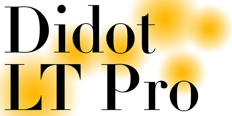
9. Didot
Didot is a high-contrast serif font that has an elegant, luxurious feel. It’s a great option for brands in the fashion, luxury, or beauty sectors. The dramatic contrast between thick and thin strokes makes Didot ideal for high-end, sophisticated advertising campaigns where aesthetics are paramount.
Pros:
- Luxurious and elegant appearance
- Great for high-end product advertising
- Conveys sophistication and style
Cons:
- Not ideal for long blocks of text due to its high contrast
Tips for Using Fonts in Advertising
- Pair Fonts Thoughtfully: In advertising, it’s common to use more than one font. Choose fonts that complement each other—typically a bold headline font paired with a simpler body font. For example, you could pair Bebas Neue for headlines with Helvetica for the body text.
- Consider the Medium: Different advertising formats may call for different fonts. A font that works well on a billboard may not be ideal for a social media ad. Test your chosen fonts on the medium to ensure they are legible and visually appealing.
- Create a Hierarchy: Use different weights, sizes, and styles to create a visual hierarchy. The headline should grab attention, while the body text should be easy to read.
- Stay On-Brand: Always ensure that the fonts you choose align with your brand’s identity. A consistent font style across all advertising helps build brand recognition.
Fonts to Avoid in Advertising
- Comic Sans: It’s playful but often overused and not suitable for most advertising contexts. It tends to come off as unprofessional.
- Papyrus: While unique, it can feel dated and is often associated with amateur design.
- Cursive Fonts for Body Text: While script fonts can be great for adding personality, they should be reserved for headlines or accents. Using them for body text can make your ad difficult to read.
Conclusion: Finding the Perfect Font for Your Advertising Campaign
The right font can elevate your advertising campaign, making it memorable, impactful, and aligned with your brand’s message. Whether you’re going for bold and attention-grabbing with Bebas Neue or sleek and sophisticated with Didot, your choice of font should reflect your brand values and resonate with your target audience.
Take time to test different fonts, consider the medium, and think about how your audience will react to the typography you choose. When done right, the perfect font will ensure that your message not only reaches your audience but also leaves a lasting impression.

