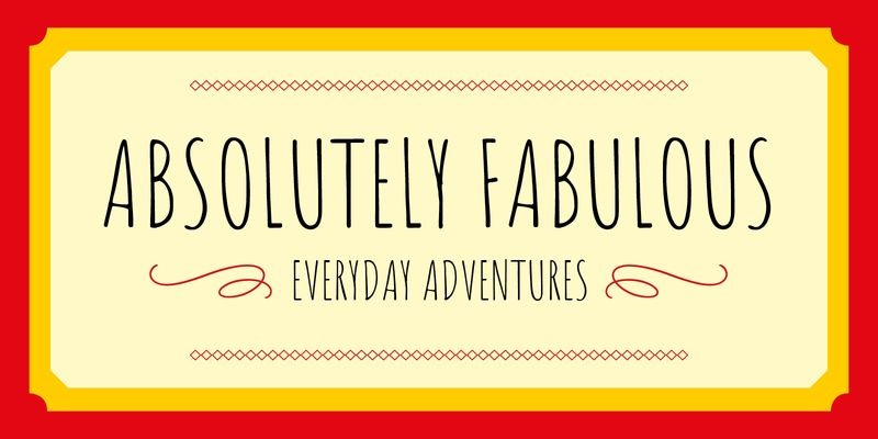
Understanding Amatic SC
Amatic SC, designed by Vernon Adams, is a quirky, hand-drawn small-caps typeface with both regular and bold weights. It carries a whimsical, informal vibe—perfect for eye-catching titles or accents in creative projects.

Best Pairings for Amatic SC
Josefin Sans
A clean, modern sans-serif with a vintage flair and tall x‑height. It contrasts beautifully with Amatic’s rough edges, offering clarity and balance. Primarily used for body text or subheaders alongside Amatic headings.
Merriweather
This serif font is elegant and highly readable on screens. Its classic structure complements Amatic’s playful nature, making it ideal for longer paragraphs or structured layouts.
Open Sans
A neutral, modern sans-serif—clean and versatile. It grounds Amatic’s personality and ensures legibility when used for longer text or UI content.
Playfair Display
A high-contrast serif with an elegant, formal tone. It beautifully offsets Amatic’s informal charm, creating eye-catching headers and refined typographic hierarchy.
Lora
A contemporary serif noted for its readable, slightly calligraphic shape. It introduces a subtle touch of warmth and sophistication when paired with Amatic headings.
Josefin Slab
Recommended by Toptal for its matching casual character. Its slab-serif structure and laid-back tone pair harmoniously with Amatic’s quirky feel.
Use Case Table
| Pairing Font | Style | Best Use Case |
|---|---|---|
| Josefin Sans | Sans-serif | Body text/UI under Amatic headings |
| Merriweather | Serif | Editorials, blogs needing warmth |
| Open Sans | Neutral sans | Clean, modern layouts & readability |
| Playfair Display | Elegant serif | Posters, invitations, refined designs |
| Lora | Serif | Casual but elegant body text scenes |
| Josefin Slab | Slab serif | Informal, playful headers + body text |
Alternatives Similar to Amatic SC
If you’re looking for fonts that evoke a similar vibe to Amatic, consider these:
- Pixelar, Caveat, Patrick Hand, Pacifico, Rock Salt, The Girl Next Door, Coming Soon, Gloria Hallelujah—all share expressive, hand-drawn aesthetics.
- Strangelove and Populaire are noted as stylistic peers or close alternatives on Typewolf.
5. Pairing Principles in Context
- Match the mood: Amatic works best when paired with fonts that feel organic—but not overly formal (e.g., avoid pairing with structured fonts like Baskerville).
- Contrast thoughtfully: Pairing a decorative font like Amatic with a simple, clean typeface helps maintain readability and visual hierarchy.
- Use sparingly: Amatic SC shines in headings or short bursts—not as body text—allowing the complementary font to carry the reading flow.
Final Take
Amatic SC brings charm and personality to any design—ideal for casual, creative, and engaging text elements. To build effective typographic systems:
- Use Josefin Sans, Open Sans, or Merriweather for readable body text.
- Choose Playfair Display or Lora for a refined yet expressive contrast.
- Explore similar decorative alternatives when you want a fresh hand-drawn option without using Amatic directly.
