The Astoria Sans Font Family, designed by the celebrated British type designer Alan Meeks, is a distinctive sans-serif typeface that merges the best of classical design principles with a sleek, modern aesthetic. Known for his mastery of traditional and transitional fonts, Meeks brings his exceptional eye for detail and balance to the Astoria Sans family, offering designers a versatile, clean, and highly functional typeface that retains a subtle connection to the classical roots of typography.
With its combination of clarity, versatility, and timelessness, the Astoria Sans Font Family has become a favorite for modern design applications, particularly in branding, editorial work, and user interfaces. While it remains grounded in traditional typographic principles, its contemporary feel ensures it’s a go-to choice for projects demanding a refined yet approachable look.
Alan Meeks: A Legacy of Excellence in Type Design
Alan Meeks is a revered name in type design, with decades of experience in creating fonts that stand the test of time. He is known for producing typefaces that balance elegance with functionality, and his understanding of typography’s historical traditions informs much of his work. Yet, Meeks is equally adept at creating typefaces that fit seamlessly into modern design landscapes, adapting to the ever-changing needs of designers and typographers.
Meeks has an impressive portfolio of work, ranging from serif to sans-serif designs, with a particular emphasis on clean, readable typefaces that enhance communication. His ability to craft fonts with universal appeal while maintaining an acute attention to detail is evident in the Astoria Sans Font Family, which continues to be a standout in his body of work.
Origins and Design Philosophy of Astoria Sans
The Astoria Sans Font Family was conceived as part of a broader type system, alongside its serif counterpart, Astoria, which was also designed by Alan Meeks. While the serif version takes inspiration from early 20th-century American typography and traditional book typography, Astoria Sans adopts a more streamlined, minimalist approach, perfectly suited for modern contexts.
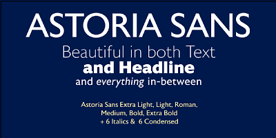
Meeks’ goal in designing Astoria Sans was to create a versatile, clean, and readable typeface that could serve multiple purposes. The result is a type family that performs well in both text-heavy layouts and display settings. Its versatility makes it a popular choice for branding, corporate identity, advertising, and web design, where readability and a contemporary look are essential.
Astoria Sans carries subtle influences from early 20th-century grotesques, with its geometric foundation and clean lines, but it incorporates softer details and more open letterforms that give it a welcoming, approachable feel. This blend of geometric precision and humanist warmth makes the font both functional and aesthetically pleasing, offering a balance between utility and design.
Key Design Features of Astoria Sans
Astoria Sans embodies several key design features that set it apart from other sans-serif typefaces. These characteristics contribute to its broad appeal and make it a versatile choice for various design applications:
- Clean and Open Letterforms: One of the most notable features of Astoria Sans is its clean, open letterforms, which allow for excellent legibility even at smaller sizes. This makes the font family particularly well-suited for body text in print and digital formats, where clarity is paramount.
- Geometric Foundation with Humanist Touches: While Astoria Sans is based on a geometric structure, it avoids the rigidity often associated with purely geometric fonts. Meeks has softened the forms with slight curves and variations that lend the typeface a more humanistic quality, making it feel more approachable and versatile.
- Balanced Proportions: The letterforms in Astoria Sans are well-proportioned, with a moderate x-height that enhances legibility without sacrificing style. The balance between the ascenders, descenders, and the main body of the letters ensures that the font looks harmonious and evenly spaced, making it a pleasure to read in both large and small formats.
- Versatile Weight Range: Astoria Sans offers a wide range of weights, from light to bold, ensuring that designers can create dynamic typographic hierarchies. This range makes the font family suitable for both headline and body copy, as well as for use in a variety of other design contexts.
- Uniform Stroke Width: Astoria Sans is characterized by its even stroke widths, which give the typeface a clean and polished appearance. This uniformity contributes to the overall clarity and simplicity of the design, allowing it to work well in minimalistic and modern layouts.
- Sans-Serif Simplicity with Classical Roots: Although Astoria Sans is a modern sans-serif font, it maintains subtle references to classical typography, particularly in the way certain letters are structured. This connection to traditional design adds an element of sophistication to the typeface, making it suitable for projects that require both modernity and a sense of tradition.
Use Cases for Astoria Sans
Astoria Sans has proven to be an incredibly versatile font family, suitable for a wide array of applications. Whether in print or on screen, this typeface excels in projects that demand a clean, contemporary look with strong legibility. Some of the most common uses of Astoria Sans include:
- Branding and Corporate Identity: The clean lines and modern simplicity of Astoria Sans make it an excellent choice for corporate branding and identity design. Its geometric foundation gives it a sense of stability and professionalism, while its softer humanist elements make it approachable. This balance is perfect for brands that want to convey both authority and friendliness.
- Editorial and Publication Design: Astoria Sans is frequently used in editorial and magazine design, particularly for body text and subheadings. Its high legibility at smaller sizes, combined with its refined aesthetic, makes it ideal for text-heavy projects where clarity and style are essential.
- User Interface and Web Design: Astoria Sans’ modern, clean lines translate well to digital environments, making it a popular choice for user interface (UI) design, websites, and mobile applications. Its even stroke widths and open letterforms ensure excellent readability across various screen sizes, while its simplicity enhances the overall usability of a website or app.
- Advertising and Marketing: The Astoria Sans Font Family is a favorite among marketers and advertisers looking for a clean and contemporary font that doesn’t overpower the design. Its range of weights allows for flexibility in creating dynamic layouts, making it suitable for both headlines and smaller, supportive text.
- Signage and Display: With its clean, bold letterforms and versatile range of weights, Astoria Sans is also highly effective in signage and display typography. Whether used in retail environments or large-format advertising, the typeface’s readability and sharpness ensure that it stands out and makes an impact.
- Packaging: For modern, minimalist packaging designs, Astoria Sans offers a sleek and professional look that can elevate the perceived value of a product. Its modern yet timeless aesthetic works well across a range of industries, from technology to luxury goods.
Astoria Sans: A Typeface for the Modern Era
What makes Astoria Sans such an effective and popular typeface is its ability to bridge the gap between classical and modern design. While its clean lines and geometric structure make it highly suited for contemporary applications, the subtle humanist influences and classical references ensure that it retains a sense of timelessness. This duality is what sets the Astoria Sans Font Family apart from other sans-serif typefaces on the market, making it a highly versatile tool for designers.
Astoria Sans is designed not just to be functional, but to offer a level of refinement that adds depth and sophistication to any design. Its carefully balanced proportions, wide range of weights, and strong legibility make it a highly practical choice for both print and digital formats, while its understated elegance ensures that it enhances rather than detracts from the overall design.
Conclusion
The Astoria Sans Font Family, designed by Alan Meeks, is a testament to the designer’s ability to merge classical design principles with contemporary needs. It is a typeface that offers versatility, clarity, and aesthetic appeal, making it a powerful tool for modern design projects. Whether used in branding, editorial layouts, digital interfaces, or signage, Astoria Sans delivers a refined and polished look that maintains its functionality across different contexts.
Meeks’ attention to detail and deep understanding of typography is evident in every letterform of Astoria Sans, from its clean lines to its carefully balanced proportions. As a result, the Astoria Sans Font Family continues to be a favorite among designers who value both beauty and utility in their type choices. With its blend of modernity and classicism, Astoria Sans remains a timeless and indispensable font family in the ever-evolving world of typography.

