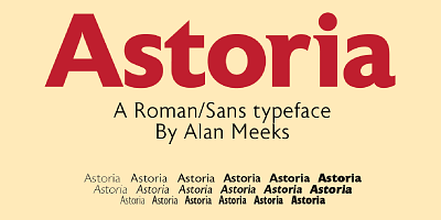
The Astoria Font Family, designed by the acclaimed British type designer Alan Meeks, is a sophisticated serif typeface that masterfully blends classical typography with modern functionality. With its strong roots in traditional serif design and a contemporary approach to form and structure, Astoria offers designers a highly versatile tool for a wide range of applications, from editorial work to corporate branding and creative projects.
Meeks, known for his ability to create typefaces that are both elegant and functional, has crafted Astoria with an eye toward preserving the beauty of classic serif fonts while ensuring it meets the needs of today’s design landscape. The result is a typeface that is not only visually striking but also highly readable and versatile, making it a valuable asset in any designer’s toolkit.
Alan Meeks: A Master of Timeless Design
Alan Meeks has earned a stellar reputation in the world of typography for his meticulous approach to design and his ability to create fonts that transcend trends. His body of work is characterized by a deep respect for typographic history, and he often draws inspiration from classical fonts and historical letterforms. At the same time, Meeks is adept at adapting these influences to create fonts that are practical for modern use, blending tradition with innovation.
With the Astoria Font Family, Meeks set out to create a typeface that encapsulates the best of both worlds: a timeless serif design that can perform across a variety of platforms and media. His attention to detail and commitment to craftsmanship are evident in every aspect of Astoria’s design, from its crisp serifs to its balanced proportions.
Design Inspiration and Philosophy
The Astoria Font Family takes inspiration from the refined serif fonts of the early 20th century, particularly those used in book publishing and formal documents. These typefaces were known for their strong serifs, well-balanced letterforms, and clear readability, all qualities that Meeks sought to incorporate into Astoria.
The name “Astoria” evokes a sense of grandeur and sophistication, reflecting the typeface’s roots in classical design. Meeks wanted to create a font family that could convey elegance and authority, making it ideal for projects where professionalism and refinement are key. However, he also aimed to ensure that Astoria would be versatile enough for contemporary use, with a range of weights and styles that allow it to be adapted to different contexts.
Key Features of the Astoria Font Family
The Astoria Font Family is distinguished by several key design features that make it a versatile and effective typeface. These features contribute to the font family’s appeal and functionality, allowing it to be used in a wide variety of design applications.
- Strong, Refined Serifs: One of the defining characteristics of Astoria is its strong, refined serifs. The serifs are well-proportioned and carefully crafted, giving the typeface a sense of structure and formality. They add to the readability of the typeface while also providing a touch of classical elegance, making Astoria suitable for both text-heavy designs and display typography.
- Balanced Proportions: Astoria features balanced proportions that ensure readability and visual harmony. The x-height, ascenders, and descenders are carefully calibrated to provide a clean, even appearance, making the typeface legible in both small and large sizes. This attention to proportion is key to Astoria’s versatility, as it allows the font to be used in a wide range of applications, from body text to headlines.
- High Contrast Between Strokes: Like many classic serif fonts, Astoria features a noticeable contrast between thick and thin strokes. This contrast adds a sense of dynamism to the letterforms, making the typeface more visually engaging. It also enhances the clarity of the font, ensuring that it remains legible and impactful even in more complex or decorative designs.
- Versatile Weight Range: The Astoria Font Family includes a variety of weights, from light to bold, providing designers with the flexibility to create typographic hierarchies and adapt the typeface to different design needs. The lighter weights are perfect for body text, offering excellent readability, while the bolder weights are ideal for headlines, titles, and other display settings.
- Classic Yet Modern Aesthetic: While Astoria is rooted in classical serif design, it has been carefully updated to suit modern design contexts. Its clean lines and crisp serifs give it a timeless quality, but its proportions and overall aesthetic ensure that it remains relevant for contemporary use. This blend of classic and modern elements makes Astoria a versatile typeface that can be used in a wide range of industries and design applications.
- Extended Character Set: Astoria includes an extended character set, offering support for multiple languages, diacritical marks, and typographic symbols. This makes the typeface suitable for international projects and ensures that it can be adapted to various linguistic and cultural needs.
Use Cases for the Astoria Font Family
The Astoria Font Family is a highly adaptable typeface that can be used across a wide range of design applications. Its classic yet modern design makes it suitable for projects that require both elegance and functionality. Below are some of the most common use cases for Astoria:
- Editorial and Publishing Design: Astoria’s balanced proportions and high legibility make it an excellent choice for editorial and publishing projects, particularly for use in books, magazines, and newspapers. The typeface’s refined serifs and high contrast make it highly readable in body text, while its bold weights work well for headlines and subheadings.
- Corporate Branding and Identity: Astoria is well-suited for corporate branding and identity design, particularly for companies that want to convey professionalism, reliability, and elegance. The typeface’s strong serifs and well-balanced letterforms give logos, business cards, letterheads, and other branding materials a sense of authority and refinement.
- Formal Documents and Certificates: The classic, formal design of Astoria makes it a popular choice for use in official documents, certificates, awards, and other formal communications. The typeface’s sharp serifs and balanced letterforms convey a sense of tradition and professionalism, making it ideal for contexts where formality is key.
- Web and Digital Design: Astoria’s clean, modern aesthetic ensures that it performs well in digital environments, making it a great option for websites, apps, and digital presentations. The typeface’s high legibility and versatile weight range allow designers to create dynamic, engaging layouts that work across different screen sizes and digital platforms.
- Signage and Display Typography: The bold weights of the Astoria Font Family make it highly effective for signage and display typography. Whether used in retail settings, corporate environments, or public spaces, the typeface’s strong serifs and high contrast ensure that it commands attention and communicates authority.
- Luxury and Creative Branding: Astoria’s refined, classic aesthetic makes it ideal for luxury branding and high-end product design. Whether used for fashion, cosmetics, or premium goods, the typeface adds a touch of elegance and exclusivity to any brand. Its blend of classic and modern elements also makes it suitable for creative industries, where it can be used to convey a sense of sophistication and style.
Astoria: A Typeface for Timeless Elegance and Modern Usability
The Astoria Font Family is a remarkable achievement in type design, offering a balance between classical serif typography and modern functionality. Alan Meeks has successfully created a typeface that embodies the elegance and refinement of traditional serif fonts while ensuring that it remains versatile and adaptable for contemporary use. Whether used in editorial design, corporate branding, or digital media, Astoria delivers a sense of professionalism, reliability, and timeless beauty.
Meeks’ attention to detail and his deep understanding of typography are evident in every aspect of the Astoria Font Family. The typeface is designed to offer flexibility without sacrificing beauty, making it a valuable tool for designers who need a typeface that can convey both formality and creativity.
Conclusion
The Astoria Font Family, designed by Alan Meeks, is a sophisticated serif typeface that blends classical design principles with modern usability. Its refined serifs, balanced proportions, and high contrast strokes make it a versatile and timeless choice for a wide range of design projects, from editorial and corporate branding to formal documents and digital media.
Alan Meeks has once again demonstrated his mastery of type design with Astoria, creating a font family that is both beautiful and functional. For designers looking for a font that conveys professionalism, elegance, and timeless style, the Astoria Font Family offers a powerful tool that can elevate any project.

