
The Arek Latin Font Family, designed by Khajag Apelian and published by Rosetta Type Foundry, stands as a unique and well-crafted typeface that bridges the gap between traditional Armenian and contemporary Latin scripts. Known for its versatility, readability, and subtle elegance, Arek is an excellent choice for designers and typographers looking for a font that brings both historical depth and modern functionality. This article explores the origins, design features, and the wide-ranging applications of the Arek Latin Font Family.
Origins and Inspiration
The Arek Latin Font Family draws much of its inspiration from Armenian typography, which is central to its designer Khajag Apelian’s heritage. Apelian is a renowned Armenian type designer and typographer who is particularly known for his work on both Armenian and Latin scripts. Arek, originally designed for Armenian script, was later expanded to include a Latin counterpart, making it a truly multilingual typeface.
The word “Arek” itself comes from Armenian and refers to a celestial concept, evoking a sense of the cosmic or heavenly. This nod to something vast and timeless is reflected in the typeface’s clean lines, harmonious letterforms, and graceful rhythm, making it suitable for projects that need a subtle, understated elegance without compromising on readability.
The Arek Latin Font Family was designed by Apelian to harmonize seamlessly with its Armenian counterpart, which was no small feat given the vastly different structures and histories of the two scripts. Nevertheless, the font achieves a cohesive and consistent visual language, offering users the flexibility to design with either script while maintaining a unified aesthetic.
Design Features of the Arek Latin Font Family
1. Humanist Influence
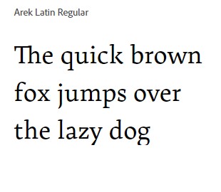
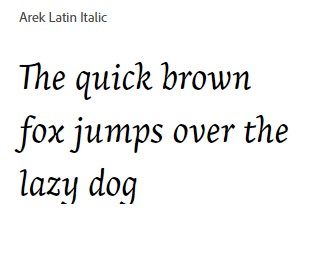
Arek’s design is grounded in humanist principles, particularly in its Latin form. The humanist influence is evident in the soft, organic curves and moderate contrast between thick and thin strokes. This design choice gives the font a warm and approachable feel, making it suitable for long-form text as well as display use. The humanist roots also ensure that the Arek Latin Font Family maintains high readability even at smaller sizes, an important consideration for designers working in editorial or web design.
2. Compatibility with Armenian Script
What sets Arek apart from many other multilingual fonts is its carefully crafted compatibility between Latin and Armenian scripts. Both the Latin and Armenian versions share similar proportions, weight, and contrast, ensuring a seamless transition between the two scripts. This feature is particularly important for projects that require a bilingual approach, allowing designers to use both languages in the same layout without sacrificing harmony or visual consistency.
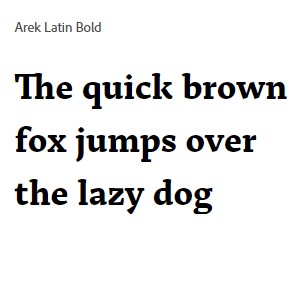
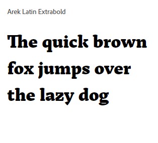
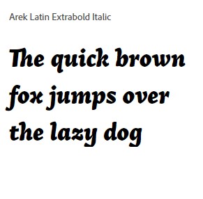
3. Wide Range of Weights
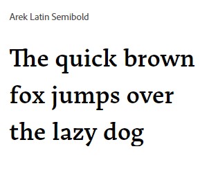
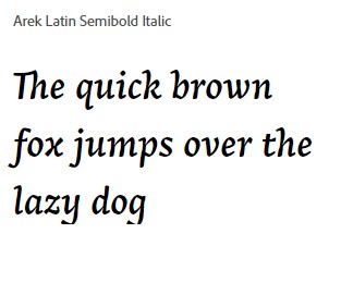
The Arek Latin Font Family is available in a variety of weights, from Thin to Black. This diversity allows designers to create strong typographic hierarchies in their projects. The lighter weights, such as Thin and Light, are perfect for more delicate applications like editorial titles, while the heavier weights like Bold and Black are ideal for impactful headlines or branding purposes. This broad range of weights ensures that Arek can be used in a variety of contexts, from print publications to digital interfaces.
4. Serif-less Design
One of Arek’s defining characteristics is its clean, serif-less design. While it is not a traditional sans-serif font, its lack of serifs gives it a modern and minimalist appeal. This makes the font especially well-suited for contemporary designs, including websites, app interfaces, and branding materials where clarity and modernity are key. At the same time, its subtle curvature and humanist traits prevent it from feeling too cold or mechanical, making it a great choice for content that needs a balance between friendliness and professionalism.
5. Clear and Open Forms
The letterforms in Arek are characterized by their clarity and openness, making them highly legible at both small and large sizes. The wide apertures and generously spaced counters ensure that each letter is distinct and easy to read, even in dense blocks of text. This feature makes the Arek Latin Font Family an excellent choice for editorial work, long-form content, and any design that requires clear, uninterrupted reading.

Applications of Arek Latin Font Family
The versatility of the Arek Latin Font Family makes it a strong choice for a variety of design projects. Its range of weights, high legibility, and modern yet friendly appearance allow it to adapt to different mediums and styles seamlessly.
1. Editorial and Print Design
Arek’s balance of warmth and clarity makes it ideal for editorial design, including magazines, newspapers, and books. The lighter weights work beautifully for body text, while the heavier weights can be used for attention-grabbing headlines and subheadings. Its readability at small sizes ensures that it works well for long-form content, such as articles and essays, where reader comfort is essential.
2. Digital Interfaces and Web Design
The font’s clear, open forms make it highly suitable for digital interfaces. In web design, the need for fonts that are both aesthetically pleasing and legible at various screen resolutions is crucial, and Arek excels in this area. The font’s minimalist design makes it an attractive choice for websites, apps, and user interfaces that require clean typography with a modern edge. Its variety of weights also allows for effective use in both headings and body text, maintaining visual hierarchy without overloading the design.
3. Branding and Logo Design
Arek Latin’s modern and clean design lends itself well to branding projects. The font’s bold weights offer strong, impactful choices for logos, packaging, and signage, while its lighter weights can be used for supplementary materials such as business cards or product descriptions. The font’s humanist influence and subtle curvature make it approachable and engaging, helping to create brands that feel both contemporary and personable.
4. Multilingual Projects
For designers working on multilingual projects, the Arek Latin Font Family is a particularly strong choice. Its compatibility with Armenian script ensures that bilingual designs remain consistent and cohesive, even when using vastly different scripts. This feature makes Arek ideal for publications, websites, or advertisements that cater to diverse audiences, particularly those involving both Armenian and Latin scripts.
Final Thoughts
The Arek Latin Font Family, designed by Khajag Apelian for Rosetta Type Foundry, stands as a versatile, modern typeface with deep roots in humanist design. Its seamless integration with the Armenian script, coupled with its wide range of weights and elegant, serif-less design, makes it a valuable tool for designers across various industries. Whether you’re working on editorial layouts, digital interfaces, or branding, Arek offers the clarity, flexibility, and sophistication required to elevate your project.
In a world increasingly reliant on multilingual communication and cross-cultural design, Arek Latin’s ability to maintain aesthetic harmony between different scripts is more important than ever. Its thoughtful design ensures that it will remain a reliable choice for designers seeking a typeface that combines both function and beauty.

