The Alegreya Sans Font Family, designed by Juan Pablo del Peral for Google, is a modern sans-serif typeface that captures the elegance and humanist quality of its serif counterpart, Alegreya. As part of the larger Alegreya family, Alegreya Sans was created to complement the original serif design, offering designers a versatile option that can work seamlessly in both contemporary and traditional design contexts. With its subtle calligraphic roots, balanced rhythm, and wide range of weights and styles, Alegreya Sans has become a beloved choice for digital and print media alike.
Origins and Purpose
Juan Pablo del Peral designed Alegreya Sans with the same underlying philosophy as the original Alegreya font: to enhance the reading experience while maintaining a unique and engaging visual identity. Alegreya Sans was developed as part of Google Fonts’ open-source library, making it accessible for a wide range of users, from professional designers to amateur creators.
The design of Alegreya Sans was inspired by humanist typefaces and the fluidity of calligraphy, much like its serif counterpart. However, the sans-serif version embraces a cleaner, more minimalist aesthetic, making it particularly suitable for modern applications such as websites, mobile interfaces, and branding materials. The goal of Alegreya Sans was to provide a versatile, high-performing typeface that could function equally well in large displays and small body text.
Design Features and Characteristics
The Alegreya Sans Font Family is defined by its clean lines, open shapes, and dynamic rhythm, which all contribute to its highly legible and modern appearance. Despite being a sans-serif typeface, Alegreya Sans retains the humanist warmth and elegance that are hallmarks of the Alegreya family.
- Open and Friendly Shapes: Alegreya Sans features wide letterforms with open counters, which makes it extremely readable at small sizes. This design choice also gives the typeface a friendly and approachable character, ideal for user interfaces and digital content.
- Dynamic Rhythm: Much like Alegreya Serif, Alegreya Sans maintains a dynamic rhythm through subtle variations in stroke thickness. This variation keeps the text visually interesting and reduces eye strain during long reading sessions.
- Calligraphic Influence: While sans-serif fonts are generally more geometric in nature, Alegreya Sans retains a calligraphic influence that can be seen in its flowing, organic lines. This connection to handwritten forms adds a touch of personality to the font, setting it apart from more mechanical or industrial sans-serifs.
- Extensive Character Set: Alegreya Sans comes with a wide range of characters, including accented letters, ligatures, and diacritical marks, making it suitable for multilingual projects. It supports a variety of scripts and languages, making it a go-to choice for global brands and digital platforms.
Weights and Styles for Maximum Flexibility
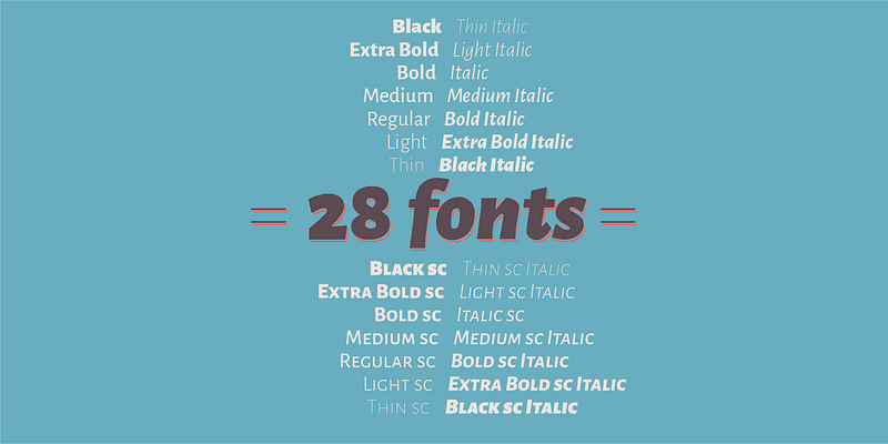
Alegreya Sans is available in a wide range of weights and styles, allowing it to be used across different design projects with ease. The family includes Alegreya Sans Light, Alegreya Sans Regular, Alegreya Sans Medium, Alegreya Sans Bold, and Alegreya Sans Black, as well as their corresponding italic styles. This range of options makes it an incredibly flexible font family that can create harmonious typographic hierarchies.
- Alegreya Sans Light is delicate and airy, making it ideal for subtle emphasis or for pairing with bolder typefaces.
- Alegreya Sans Regular is the workhorse of the family, offering a balanced design that works well in body text or more substantial passages of text.
- Alegreya Sans Bold and Alegreya Sans Black are designed for maximum impact, providing strong contrast and emphasis in headlines, titles, and calls to action.
The italic styles in Alegreya Sans are true italics, not merely slanted versions of the regular style. This attention to detail adds a sense of sophistication and fluidity, particularly in editorial or formal contexts. The italics also bring out more of the calligraphic influence, with graceful curves and strokes that add elegance to the text.
Readability and Use Cases
One of the key strengths of Alegreya Sans is its readability, which makes it highly effective in both print and digital formats. The typeface is particularly well-suited for user interfaces, apps, and websites where clarity and legibility are paramount. Its open shapes and consistent letter spacing ensure that it remains easy to read even at smaller sizes, making it an excellent choice for body text on screens or in mobile apps.
Alegreya Sans also shines in long-form content, such as books, reports, and essays. Its dynamic rhythm and humanist qualities prevent the text from feeling monotonous, making it comfortable for extended reading sessions. The different weights available allow designers to create clear typographic hierarchies, with lighter weights for body text and bolder weights for headings and subheadings.
Additionally, Alegreya Sans is frequently used in branding and logo design due to its clean and contemporary aesthetic. The combination of its approachable character and professional quality makes it ideal for businesses looking to convey trustworthiness and modernity.
Harmonizing with Alegreya Serif
One of the most appealing aspects of Alegreya Sans is how well it complements its serif counterpart, Alegreya Serif. Together, these two typefaces can be used to create sophisticated typographic systems that balance tradition and modernity. For example, Alegreya Serif can be used for body text in a long editorial piece, while Alegreya Sans is employed for headlines, captions, or pull quotes. This combination of serif and sans-serif fonts provides a harmonious yet dynamic contrast, enhancing the overall readability and visual impact of the text.
Global Reach and Multilingual Support
Alegreya Sans is designed to be versatile across different languages and scripts, supporting an extensive range of Latin-based languages as well as many other scripts. This multilingual capability makes it a powerful tool for global brands or international projects that need to communicate across diverse audiences. The inclusion of special characters and diacritical marks means that designers can use Alegreya Sans confidently in any language, without sacrificing consistency or visual appeal.
Open Source and Accessibility
As part of Google Fonts, Alegreya Sans is open-source and freely available to designers and developers around the world. This accessibility has helped it gain popularity in both professional and personal projects. Being open-source, Alegreya Sans can be used across a wide range of applications without any licensing fees, making it an attractive option for startups, nonprofits, and individual designers working with limited budgets.
Recognition and Popularity
Since its release, Alegreya Sans has received widespread acclaim from designers and typographers, not only for its aesthetic qualities but also for its practical functionality. The typeface has been featured in numerous design publications and has earned a place in many typographic best-of lists. It’s not uncommon to see Alegreya Sans used in everything from corporate branding to academic publications, thanks to its versatility and wide-ranging appeal.
Conclusion
The Alegreya Sans Font Family is a modern, humanist typeface that blends the warmth of calligraphy with the clean lines of contemporary design. Designed by Juan Pablo del Peral for Google, Alegreya Sans is an accessible, open-source font that provides designers with a versatile tool for both digital and print media. Its extensive range of weights and styles, coupled with its excellent readability, make it suitable for a variety of design projects, from editorial layouts to web interfaces and branding materials.
Alegreya Sans not only stands on its own as a powerful, modern typeface, but it also pairs beautifully with its serif counterpart, Alegreya, to create cohesive and dynamic typographic systems. Its global reach, multilingual support, and open-source nature make it an essential tool for today’s designers, and its timeless appeal ensures that it will remain a favorite for years to come.

