The Alegreya Font Family, designed by Juan Pablo del Peral, is one of the most admired and versatile typefaces available today. Originally developed for Google, it has gained widespread recognition due to its harmonious balance of aesthetics and functionality. Alegreya is part of Google Fonts’ extensive library and is available as an open-source font family, making it accessible for both personal and professional projects. In this article, we will explore the rich history, design philosophy, and various features that make Alegreya a standout choice among typefaces.
History and Inspiration
Juan Pablo del Peral, an Argentinian type designer, created Alegreya with a specific goal in mind: to develop a font that enhances the reading experience. Del Peral was inspired by traditional calligraphy and classical literature, which is evident in the font’s flowing, organic design. Initially designed for long-form reading material, Alegreya quickly grew into a comprehensive type system. Its versatility allows it to be used for a wide variety of design applications, from editorial and book layouts to websites and branding projects.
Alegreya was first released in 2011, and its immediate success led to the development of an expanded family that includes several styles and weights. The font’s adaptability stems from its origins as a literary typeface, where the focus is on readability and engagement. However, it quickly proved its ability to transcend its original purpose, earning acclaim from designers and typographers worldwide.
Design Features and Characteristics
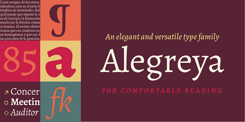
At its core, the Alegreya Font Family is rooted in humanist design principles. The strokes are expressive, with a dynamic rhythm that captures the essence of handwritten calligraphy. These subtle curves and variations provide a warmth that is often missing in more mechanical, geometric fonts.
- Serif Design: Alegreya is characterized by its elegant serifs, which give it a distinctive and timeless look. The serifs are relatively short and finely curved, contributing to the legibility and beauty of the text, especially in body copy.
- Dynamic Rhythm: One of the hallmarks of Alegreya’s design is its dynamic rhythm, where strokes alternate between thick and thin in a way that mimics the movement of a human hand. This natural variation adds a sense of motion and energy to text, making it more engaging for readers.
- Calligraphic Roots: Alegreya’s calligraphic origins are especially evident in its italic variants. The italics are true italics, not just slanted versions of the Roman style, and they feature flowing, cursive-like strokes that are both beautiful and functional.
- Character Diversity: Another key feature of Alegreya is its extensive character set. It supports numerous languages and scripts, including accented characters, ligatures, and diacritical marks, making it suitable for multilingual projects.
Versatility Across Weights and Styles
One of the strengths of the Alegreya Font Family is its wide range of weights and styles, making it a complete type system. It includes Alegreya Regular, Alegreya Italic, Alegreya Bold, and Alegreya Black, among others. In addition, the family has a sans-serif version, Alegreya Sans, which complements the original serif design while offering a more modern, minimalist aesthetic. This extensive family allows designers to maintain typographic consistency across various media while also providing enough diversity to create visual interest.
Each weight in the Alegreya family has been carefully crafted to ensure readability at different sizes and for different types of content. The regular weight is ideal for body text, providing a smooth and comfortable reading experience, while the bolder weights add emphasis and are perfect for headlines, subheadings, or calls to action.
The inclusion of bold and black weights allows Alegreya to excel in more dramatic typographic settings as well, where visual impact and contrast are crucial. The Alegreya Black weight, with its strong strokes and imposing presence, can make an excellent choice for posters, editorial headers, and large-format designs.
Alegreya Sans: A Complementary Design
The addition of Alegreya Sans adds to the family’s flexibility, offering designers a more modern alternative to the serif versions without losing the essence of the original design. Alegreya Sans maintains many of the humanist qualities of Alegreya Serif, such as its calligraphic influences and rhythmic strokes, but does so without serifs, making it more suitable for contemporary and minimalist design applications.
The sans-serif version retains the same dynamic rhythm and readability, making it a versatile choice for web design, user interfaces, and digital applications where clean, sharp lines are often preferred. When used together, Alegreya Serif and Alegreya Sans can create a harmonious typographic hierarchy, perfect for projects that require both traditional and modern typographic elements.
Readability and Use in Long-Form Text
Alegreya was designed with readability in mind, particularly for long-form text such as books, essays, and editorial layouts. Its humanist design principles make it highly readable even at smaller sizes, and its subtle variations in stroke width help guide the reader’s eye through the text. The balance between thick and thin strokes creates a pleasant rhythm, ensuring that the text doesn’t become monotonous or hard to read over time.
The italic variants, with their elegant, flowing lines, offer a beautiful contrast to the regular styles, making them ideal for emphasis, quotations, or footnotes. The legibility of Alegreya has made it a popular choice for both digital and print media, especially in projects where the content is dense or requires sustained attention.
Popularity and Recognition
Alegreya’s success has been recognized by various design awards and accolades, further solidifying its place as one of the top typefaces for modern design. In 2013, Alegreya was selected as one of the 50 Best Typefaces by Typographica. The font’s widespread use in both professional and educational settings is a testament to its reliability, versatility, and aesthetic appeal.
Today, Alegreya is frequently used in a variety of applications, from books and magazines to websites and branding projects. Its combination of old-world charm and modern functionality makes it a go-to choice for designers looking for a typeface that marries form and function seamlessly.
Conclusion
The Alegreya Font Family is a remarkable achievement in type design, blending the warmth of traditional calligraphy with the precision of modern typography. Designed by Juan Pablo del Peral for Google, it offers an extensive range of weights and styles that allow for versatile use across print and digital media. Whether used for books, websites, or branding, Alegreya provides a beautiful, highly readable, and expressive solution for any design project.
Its continued popularity and recognition in the design world affirm its status as a timeless and dependable typeface, offering both aesthetic appeal and functional versatility.

