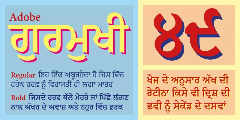
The Adobe Gurmukhi Font Family, designed by Paul D. Hunt and Vaibhav Singh from Adobe Originals, represents a thoughtful and meticulously crafted approach to the Gurmukhi script. Rooted in the rich cultural heritage of Punjab, India, this typeface is an invaluable tool for designers and typographers working with Gurmukhi text in both print and digital formats. Developed with a clear understanding of traditional letterforms while addressing the needs of contemporary typographic design, the Adobe Gurmukhi Font Family brings a perfect balance of readability, authenticity, and modern functionality.
The Designers: Paul D. Hunt and Vaibhav Singh
Both Paul D. Hunt and Vaibhav Singh are highly respected figures in type design, with significant contributions to the development of non-Latin typefaces. Hunt has been part of Adobe’s type development team since 2009 and has worked on a variety of scripts, ranging from Latin to Pan-African to Southeast Asian languages. Vaibhav Singh, on the other hand, brings deep expertise in Indic and complex writing systems, making him an invaluable collaborator on this project. Their combined knowledge and experience resulted in a high-quality Gurmukhi typeface that honors traditional letterforms while meeting the demands of modern digital environments.
Gurmukhi Script: A Brief Overview
Gurmukhi is the script used primarily for writing the Punjabi language, which is spoken by over 125 million people worldwide, particularly in the northern Indian state of Punjab. Gurmukhi holds immense cultural and religious significance, being the script in which the Guru Granth Sahib, the holy scripture of Sikhism, is written. The script is characterized by its unique geometric forms, rounded shapes, and a distinctive horizontal line called the siyaari, which connects the letters.
Designing a typeface for Gurmukhi requires not only an understanding of the script’s structural principles but also a sensitivity to its cultural importance. The Adobe Gurmukhi Font Family accomplishes this by preserving the traditional elements of the script while adapting it for modern usage in digital media and print publications.
Design Objectives and Principles
When designing the Adobe Gurmukhi Font Family, the primary objectives were to create a typeface that is both legible and aesthetically pleasing while remaining faithful to the script’s cultural and historical context. Key design principles included:
1. Maintaining Cultural Authenticity
The Adobe Gurmukhi Font Family was developed with a deep respect for the traditional letterforms of the Gurmukhi script. The designers meticulously studied historical manuscripts, calligraphy, and earlier print designs to ensure that the typeface would preserve the integrity of the script. This cultural authenticity is evident in the careful crafting of each character, which maintains the balance between geometric precision and the organic flow of handwritten Gurmukhi.
2. Optimizing for Digital and Print
In the digital age, typefaces need to work seamlessly across a variety of devices and screen resolutions. The Adobe Gurmukhi Font Family was designed with this in mind, ensuring that it remains highly legible in both print and digital formats. The letterforms are designed to be clear and crisp, even at smaller sizes, making it suitable for a wide range of applications, from body text in print publications to digital user interfaces.
3. Enhancing Readability
One of the key challenges in designing a typeface for Gurmukhi is ensuring that it remains readable at various sizes and in different contexts. Adobe Gurmukhi addresses this challenge by maintaining consistent stroke widths and avoiding overly ornate features that could impede legibility. The typeface strikes a balance between tradition and modernity, ensuring that the script remains accessible to a broad audience, from casual readers to those fluent in the language.
4. Versatility Across Weights and Styles
The Adobe Gurmukhi Font Family includes multiple weights, ranging from Light to Bold, allowing designers the flexibility to use the typeface in different typographic contexts. The Light weight offers a refined, elegant look for headings and titles, while the Bold weight provides a strong, impactful presence for emphasis in editorial and advertising materials. This range of styles ensures that the font family can be used across a variety of media and purposes, from headlines and posters to long-form reading materials.
Design Features of Adobe Gurmukhi
1. Balanced Proportions
One of the standout features of Adobe Gurmukhi is its balanced proportions. Each character in the typeface is carefully constructed to maintain harmony between the height and width of the letters. This proportionality ensures that the typeface is easy on the eyes, even in dense text settings. The characters are neither too tightly packed nor too widely spaced, creating an ideal rhythm that enhances readability in body text.
2. Refined Letterforms
The letterforms in Adobe Gurmukhi are crafted with precision and care. The strokes are consistent, and the curves are smooth, reflecting the fluidity of handwritten Gurmukhi while adhering to the geometric foundation required for modern digital fonts. The distinctive horizontal bar, known as the siyaari, is clearly defined but not overly dominant, maintaining the structural integrity of the script.
3. Attention to Diacritical Marks
In Gurmukhi, diacritical marks play an important role in denoting vowel sounds and modifying consonants. The Adobe Gurmukhi Font Family pays special attention to these marks, ensuring that they are clearly visible and correctly placed. This is particularly important in digital contexts where incorrect positioning can lead to misinterpretation of the text.
4. Wide Character Set
In addition to supporting the core Gurmukhi alphabet, the Adobe Gurmukhi Font Family includes additional characters and symbols required for a variety of languages and contexts. The typeface supports not only Punjabi but also other Indic languages that use the Gurmukhi script, as well as modern typographic conventions like punctuation, numerals, and special characters.
5. Flexible Weights
The Adobe Gurmukhi Font Family comes in a range of weights, from Light to Bold, giving designers the flexibility to create hierarchy and emphasis in their work. The Light weight is ideal for elegant, airy designs, while the Bold weight delivers a strong impact in headlines or callout text. The consistent stroke widths across weights ensure that the typeface remains cohesive, regardless of the specific weight used.
Applications of Adobe Gurmukhi
The Adobe Gurmukhi Font Family is a versatile tool that can be applied across a range of media, from traditional print to modern digital platforms. Its clean, balanced design makes it suitable for various uses, including:
1. Editorial Design
The Adobe Gurmukhi Font Family shines in editorial contexts, such as newspapers, magazines, and books, where legibility and readability are paramount. The typeface’s clean lines and balanced proportions ensure that it remains highly readable, even in long-form texts. It can be used for both body text and headlines, providing a consistent typographic experience throughout the publication.
2. Digital Interfaces
With the increasing demand for typefaces that perform well on screens, Adobe Gurmukhi has been optimized for digital use. Its clarity and sharpness ensure that it remains legible on a variety of devices, from desktop monitors to mobile screens. This makes it ideal for websites, apps, and digital publications targeting a Punjabi-speaking audience.
3. Religious and Cultural Publications
Given the significance of the Gurmukhi script in Sikhism and Punjabi culture, the Adobe Gurmukhi Font Family is a natural choice for religious texts, cultural literature, and educational materials. The typeface’s respect for traditional forms, combined with its modern functionality, makes it an ideal choice for publishing the Guru Granth Sahib or other religious scriptures, as well as for cultural publications that seek to preserve the heritage of the Punjabi language.
4. Branding and Advertising
In the realm of branding and advertising, Adobe Gurmukhi offers a modern and versatile solution for companies targeting Punjabi-speaking audiences. Its multiple weights allow for flexibility in creating visually distinct hierarchies, while its clean, polished look ensures that it can be adapted for various brand identities, from traditional to contemporary.
Conclusion
The Adobe Gurmukhi Font Family, designed by Paul D. Hunt and Vaibhav Singh from Adobe Originals, is a sophisticated and versatile typeface that masterfully blends tradition with modern functionality. Its clean, geometric forms, attention to detail, and cultural authenticity make it an invaluable tool for designers working in both print and digital environments. Whether for editorial design, branding, or religious publications, the Adobe Gurmukhi Font Family offers a flexible and high-quality solution that meets the needs of modern typography while honoring the script’s rich cultural heritage.
With its balance of legibility, aesthetics, and technical precision, Adobe Gurmukhi is an essential typeface for anyone working with Gurmukhi text in today’s digital landscape.

