The Acumin Font Family, designed by renowned type designer Robert Slimbach for Adobe Originals, is a modern sans-serif typeface that masterfully balances neutrality, versatility, and precision. Acumin stands out as one of the most flexible sans-serif families, covering a wide range of design needs from editorial layouts to branding and user interfaces. With its expansive range of weights, widths, and styles, Acumin offers designers an adaptable and comprehensive solution for contemporary design projects.
The Vision Behind Acumin
Robert Slimbach, the creative mind behind Acumin, is known for his attention to detail and his ability to craft typefaces that combine functionality with aesthetic beauty. His vision for Acumin was to create a typeface that would be extremely versatile, neutral, and unobtrusive, making it a perfect choice for a wide variety of applications.
Acumin was designed to be a workhorse font family—its clean lines, even proportions, and legible forms make it ideal for everything from corporate branding to long-form text. Unlike other typefaces that may carry distinctive stylistic features, Acumin was designed to fade into the background, allowing the content it conveys to take center stage. This design philosophy aligns Acumin with the ethos of modernist typography, where clarity and functionality are prioritized over ornate or expressive elements.
Design Characteristics of Acumin
Acumin is a neo-grotesque sans-serif typeface, a classification that places it in the same family as fonts like Helvetica, Univers, and Akzidenz-Grotesk. However, what sets Acumin apart is its careful attention to proportion, detail, and its extensive range of widths and weights. The following are some key design features of the Acumin Font Family:
- Geometric Precision: Acumin’s letterforms are designed with geometric precision, giving the typeface a clean, modern appearance. Each character is carefully balanced to ensure even spacing and consistency, which is crucial for legibility in body text.
- Neutral Design: One of Acumin’s defining characteristics is its neutrality. The design avoids any overly decorative elements, resulting in a typeface that can adapt to almost any context without imposing its own personality. This makes it an excellent choice for content-heavy designs where the text needs to communicate information clearly and efficiently.
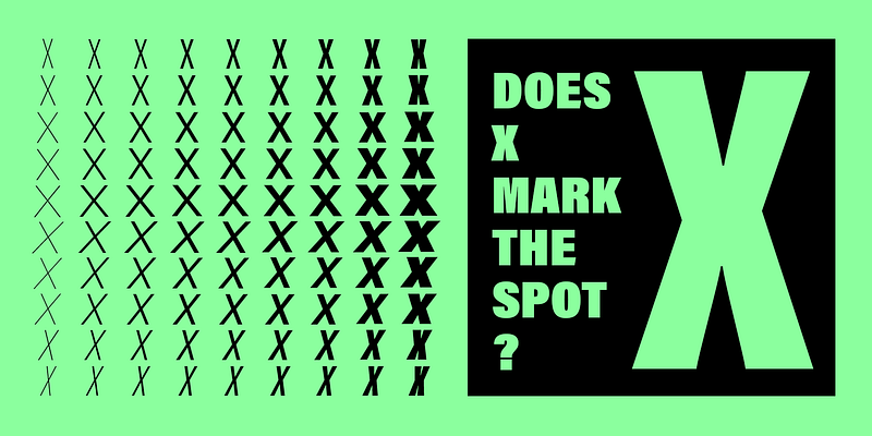
- Wide Range of Weights and Styles: Acumin is a highly versatile typeface family, offering a comprehensive range of weights from Thin to Black, with corresponding italics. Additionally, it includes a variety of widths, from ultra-condensed to extended, giving designers even more flexibility when working with complex typographic hierarchies.
- Legibility at All Sizes: Acumin was designed with legibility in mind, making it effective at both large and small sizes. Its clear letterforms hold up well in body text, while its bolder weights and extended styles make a striking impact in larger headlines or display text.
- Optical Sizes: In addition to its range of weights and widths, Acumin also offers optical sizes. This feature allows the typeface to be optimized for different sizes, ensuring that the text remains crisp and legible whether used in small captions or large headlines.
A Typeface for All Uses
Acumin’s greatest strength lies in its adaptability. This typeface can be used effectively across a variety of design disciplines, making it a go-to choice for designers seeking a clean, neutral sans-serif typeface. Below are some of the primary applications where Acumin shines:
- Editorial Design: Acumin’s legibility and neutrality make it an ideal choice for editorial design, whether for magazines, newspapers, or digital publications. Its range of weights and widths allows designers to create a clear typographic hierarchy, with heavier weights used for headlines and lighter weights for body text. Its neutrality ensures that it works across different types of content, from news articles to lifestyle features.
- Corporate Branding: Acumin’s geometric precision and clean design give it a professional, polished look, making it a popular choice for corporate branding. Its wide range of styles means that it can be used for everything from logos to business cards, websites, and corporate presentations. The neutrality of the design ensures that it won’t overshadow a brand’s message, allowing the content to stand out.
- User Interface Design: In the world of digital design, especially for user interfaces, clarity and legibility are paramount. Acumin’s clean lines and wide spacing make it an excellent choice for web and app design, where users need to quickly read and interpret text across various screen sizes. Its range of widths also makes it suitable for responsive design, where text needs to adapt to different devices.
- Wayfinding and Signage: Thanks to its high legibility, even at a distance, Acumin is well-suited for use in wayfinding systems and signage. The typeface’s bold weights and extended styles make it easy to create attention-grabbing signs that remain readable in various lighting conditions and from different angles.
- Advertising and Display: While Acumin is often praised for its neutrality, it can also make a strong impact in display settings. The typeface’s heavier weights and extended styles create a commanding presence when used in advertising, whether for print, digital, or outdoor media. The flexibility in its design allows it to be used for both minimalistic and more elaborate layouts, making it a versatile tool for advertising campaigns.
Acumin in Comparison to Other Sans-Serif Typefaces
Though Acumin belongs to the neo-grotesque category of typefaces, it sets itself apart from its predecessors like Helvetica and Univers in several ways:
- More Range: While Helvetica and Univers are highly versatile, Acumin offers an even wider range of weights and widths, allowing for more nuanced typographic expression. The inclusion of condensed and extended styles adds to its adaptability in various design situations.
- Greater Legibility in Digital Formats: One of the key advantages of Acumin is its optimization for digital formats. While Helvetica and Univers were originally designed for print, Acumin has been created with modern digital use cases in mind. Its crisp, clean letterforms hold up well on screens, making it an excellent choice for web and app design.
- More Neutrality: Although Helvetica and Univers are often described as neutral, Acumin takes this quality to another level. Its design is intentionally restrained to ensure that it can adapt to any context without carrying its own stylistic baggage. This makes Acumin an ideal choice for projects where the content itself should shine.
Robert Slimbach’s Design Philosophy
Robert Slimbach is one of the most respected type designers in the industry, known for his extensive body of work for Adobe Originals, including iconic typefaces like Minion, Garamond Premier, and Myriad. His approach to type design is characterized by deep historical research and an acute understanding of the practical needs of modern typography.
In designing Acumin, Slimbach aimed to create a typeface that could serve as a versatile tool for designers in an era where typography needs to work seamlessly across multiple platforms—print, web, and mobile. His commitment to neutrality, functionality, and clarity is evident in every aspect of Acumin’s design. Slimbach’s ability to blend historical typographic principles with cutting-edge digital design techniques has made Acumin a modern classic.
Conclusion
The Acumin Font Family is a testament to Robert Slimbach’s mastery of type design. It offers a balance of neutrality, versatility, and modernity that makes it an indispensable tool for designers working across various media. Whether in print, digital, or environmental design, Acumin’s clean, legible forms and extensive range of weights and styles ensure that it can meet the demands of any project.
Its adaptability to different contexts, combined with the precision and attention to detail that Robert Slimbach brings to all his typefaces, makes Acumin one of the most valuable sans-serif families in the modern designer’s toolkit. Whether you are working on editorial layouts, corporate branding, or user interface design, Acumin will always deliver a clear, professional result.

